
About
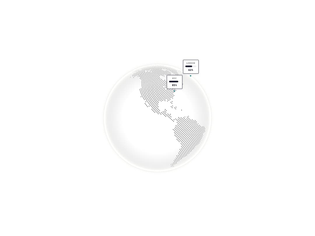
A WebGL globe with progress bar cards anchored to city markers showing completion percentages.
Built with React and Tailwind. Copy the prompt and paste it into Claude Code, Cursor or Lovable: your agent adds Globe Bars to your project and fits it to your theme.
Code
How Globe Bars is used: the demo's code. The component's own source comes with a free account.
Usage.tsx
"use client"

import { GlobeBars } from "@/components/ui/component"

export default function GlobeBarsDemo() {
  return (
    <div className="flex items-center justify-center w-full min-h-screen bg-white p-8 overflow-hidden">
      <div className="w-full max-w-lg">
        <GlobeBars />
      </div>
    </div>
  )
}
Dependencies
More by shuding
View all
COBE Globe
2.1K
Globe CDN
1.2K
Globe Pulse
1K
Globe Polaroids
581
Globe Interactive
560
Globe Live Badge
421
Globe Analytics
322
Globe Stickers
183