
About
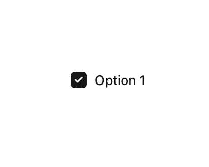
A control that toggles between two options, checked or unchecked.
Built with React and Tailwind. Copy the prompt and paste it into Claude Code, Cursor or Lovable: your agent adds Checkbox to your project and fits it to your theme.
Code
How Checkbox is used: the demo's code. The component's own source comes with a free account.
Usage.tsx
import { useState } from "react";
import { Checkbox } from "@/components/ui/checkbox-1";

export default function DefaultDemo() {
  const [checked, setChecked] = useState(false);

  return (
    <Checkbox checked={checked} onChange={(): void => setChecked((b) => !b)}>
      Option 1
    </Checkbox>
  );
}
Dependencies
More by tigran tumasov
View all
Product Hunt Badge
1.8K
Book
162
Calendar
152
Theme Switcher
135
Snippet
124
Table
123
Toggle
89
Feedback
88
More in Forms
View all

Premium Auth
497

Login 2
7
Authentication Card
45

Login 1
52

Contact Card
1K

Form
16

Form
136

Card Studio
41
