
About
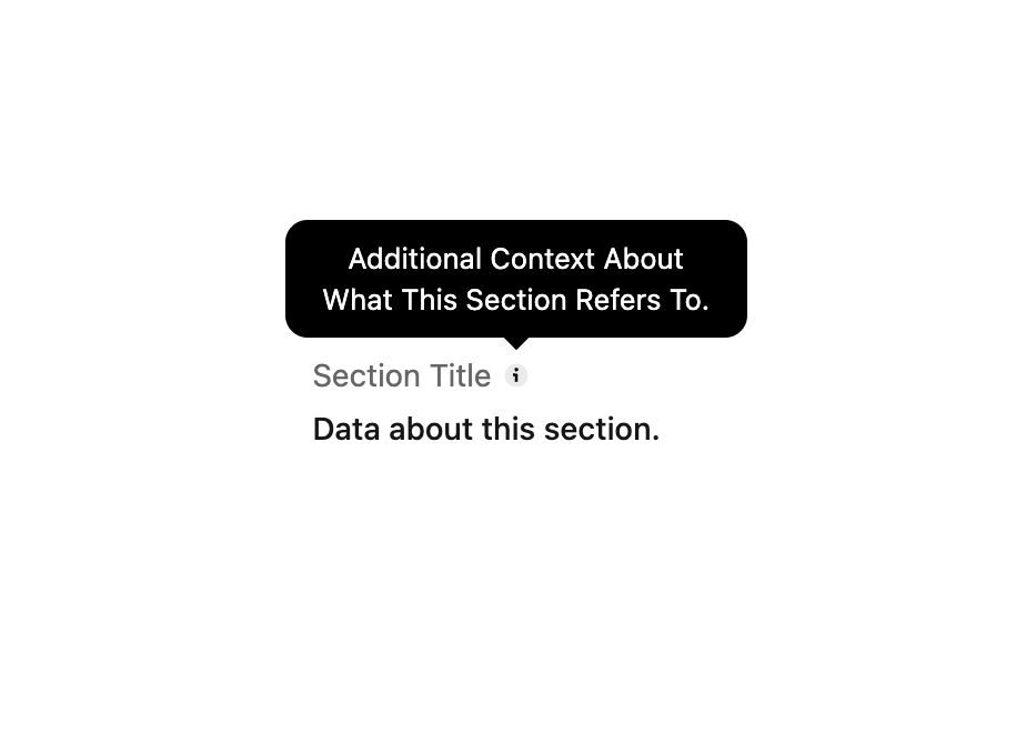
Displays a brief heading and subheading to communicate any additional information or context a user needs to continue.
Built with React and Tailwind. Copy the prompt and paste it into Claude Code, Cursor or Lovable: your agent adds Description to your project and fits it to your theme.
Code
How Description is used: the demo's code. The component's own source comes with a free account.
Usage.tsx
import { Description } from "@/components/ui/description-1";

export default function DefaultDemo() {
  return <Description
          content="Data about this section."
          title="Section Title"
          tooltip="Additional context about what this section refers to."
        />;
}
More by tigran tumasov
View all
Product Hunt Badge
1.8K
Book
162
Calendar
152
Theme Switcher
135
Snippet
124
Table
123
Toggle
89
Feedback
88