
About
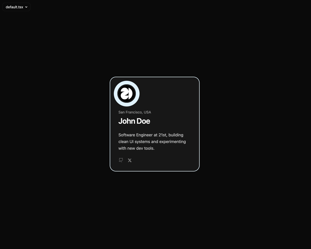
Animated Profile Card
Built with React and Tailwind. Copy the prompt and paste it into Claude Code, Cursor or Lovable: your agent adds Animated Profile Card to your project and fits it to your theme.
Code
How Animated Profile Card is used: the demo's code. The component's own source comes with a free account.
Usage.tsx
import { IdentityCardBody, RevealCardContainer } from "@/components/ui/animated-profile-card";

const GithubIcon = (props: React.SVGProps<SVGSVGElement>) => (
  <svg viewBox="0 0 24 24" fill="none" stroke="currentColor" {...props}>
    <path d="M15 22v-4a4.7 4.7 0 0 0-1-3.4c3 0 6-2 6-5.6a6 6 0 0 0-1-3.6c.3-1.2.3-2.4 0-3.6 0 0-1 0-3 1.4-2.7-.5-5.4-.5-8.1 0C6 2 5 2 5 2c-.3 1.2-.3 2.4 0 3.6A5.5 5.5 0 0 0 4 9c0 3.6 3 5.6 6 5.6-.4.5-.7 1.1-.9 1.7v3.7M9 18c-4.5 2-5-2-7-2" />
  </svg>
);
const TwitterIcon = (props: React.SVGProps<SVGSVGElement>) => (
  <svg viewBox="0 0 512 512" fill="currentColor" {...props}>
    <path d="M389 48h71L306 224l181 240H345L234 319 107 464H36L201 276 27 48h146l100 133L389 48zM364 422h39L151 88h-42l255 334z" />
  </svg>
);

const profile = {
  avatarUrl: "https://cdn.21st.dev/assets/mirror/cc/cc1666ad35e884243c88f8b5a2bb0754078cf51bdc01fbf012661b598df6d804.jpg",
  avatarText: "JD",
  fullName: "John Doe",
  place: "San Francisco, USA",
  about: "Software Engineer at 21st, building clean UI systems and experimenting with new dev tools.",
  socials: [
    {
      id: "gh",
      url: "https://github.com/21st-dev",
      label: "GitHub",
      icon: <GithubIcon className="h-5 w-5" />,
    },
    {
      id: "tw",
      url: "https://x.com/21st_dev",
      label: "Twitter",
      icon: <TwitterIcon className="h-4 w-4" />,
    },
  ],
};

export default function ProfileCardDemo() {
  return (
    <div className="flex min-h-[500px] w-full items-center justify-center bg-background p-6">
      <RevealCardContainer
        accent="#e0f2fe"
        textOnAccent="#0f172a"
        mutedOnAccent="#475569"
        base={
          <IdentityCardBody {...profile} scheme="plain" displayAvatar={false} />
        }
        overlay={
          <IdentityCardBody
            {...profile}
            scheme="accented"
            displayAvatar={true}
            cardCss={{ backgroundColor: "var(--accent-color)" }}
          />
        }
      />
    </div>
  );
}
Dependencies
More by SO called
View all

Developer Sign-In Flow
3.2K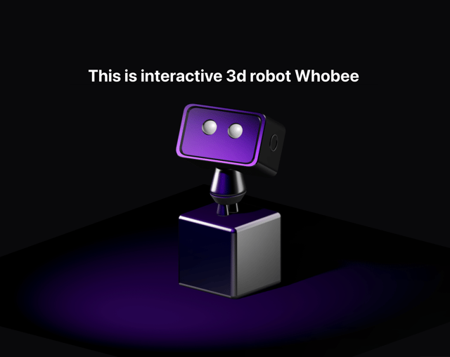
Interactive 3D Robot
2.1K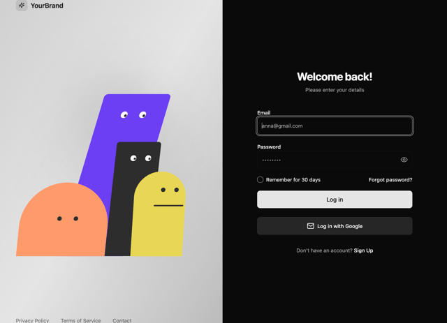
Animated Characters Login Page
1.6K
Interactive Galaxy Hero
1.4K
Product Mockup Section
1.4K
3D Boxes Hero
995
Expandable Content Card
990
AI Prompt Input
617
More in Cards
View all
Stats cards with links
33

Course Design Cards
1.1K

Card
70
Statistics Card 2
264
Statistics Card 10
263

Card
17

Card Studio
9
The Item one
3
