
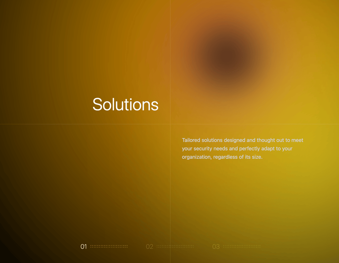
About
Component that creates a full-screen, scroll-controlled section for showcasing features, featuring a dynamic background gradient effect and visual progress indicators.
Built with React and Tailwind. Copy the prompt and paste it into Claude Code, Cursor or Lovable: your agent adds Interactive Feature Section to your project and fits it to your theme.
Code
How Interactive Feature Section is used: the demo's code. The component's own source comes with a free account.
Usage.tsx
// This is file of your component

// You can use any dependencies from npm; we import them automatically in package.json
import { useState } from "react";
import { cn } from "@/lib/utils";
import { FeaturesSection } from "@/components/ui/interactive-feature-section-1";

export default function DemoPage() {
  return (
    <main className="bg-black w-full text-white">
      <FeaturesSection />
    </main>
  );
}
Dependencies
More by SO called
View all

Developer Sign-In Flow
3.2K
Interactive 3D Robot
2.1K
Animated Characters Login Page
1.6K
Interactive Galaxy Hero
1.4K
Product Mockup Section
1.4K
3D Boxes Hero
995
Expandable Content Card
990
AI Prompt Input
617
More in Features
View all

Features 8
3K

Feature Sections
52

Grid Feature Cards
1.9K
Features Card
200
Feature with image
149
Feature Modern
20
Feature with advantages
278
Features 1
278


