
About
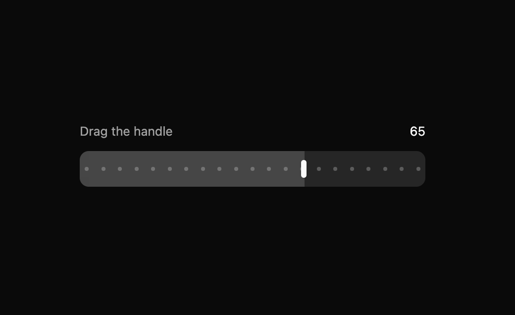
Built with React and Tailwind. Copy the prompt and paste it into Claude Code, Cursor or Lovable: your agent adds BeUI Range Slider to your project and fits it to your theme.
Code
How BeUI Range Slider is used: the demo's code. The component's own source comes with a free account.
Usage.tsx
"use client";

import { useState } from "react";

import { RangeSlider } from "@/components/ui/be-ui-range-slider";

export default function RangeSliderPreview() {
  const [value, setValue] = useState(40);

  return (
    <div className="flex w-full max-w-sm flex-col gap-3">
      <div className="flex items-center justify-between text-sm text-muted-foreground">
        <span>Drag the handle</span>
        <span className="tabular-nums text-foreground">{value}</span>
      </div>
      <RangeSlider value={value} onValueChange={setValue} step={5} aria-label="Value" />
    </div>
  );
}
Dependencies
More by Saurabh
View all
BeUI Tilt Card
369
BeUI Expandable Tabs
345
BeUI File Upload
293
BeUI Bouncy Accordion
200
BeUI Create Menu
199
BeUI Expanable Action Bar
184
Loader
173
BeUI 404 / Not Found
166