
About
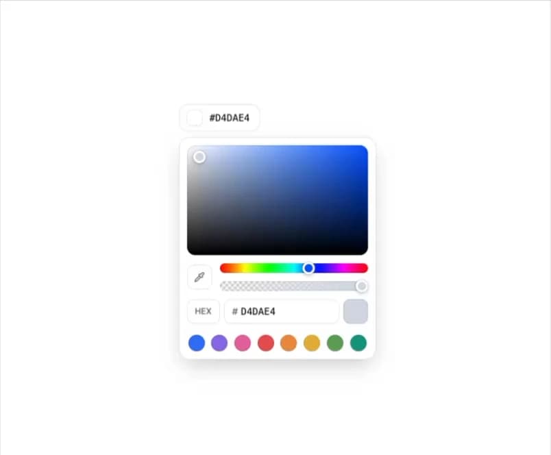
A composable color picker whose trigger chip morphs into a saturation/brightness panel, with hue and opacity sliders, hex/RGB/HSL fields, an eye dropper, presets and full keyboard support.
Built with React and Tailwind. Copy the prompt and paste it into Claude Code, Cursor or Lovable: your agent adds Color Picker to your project and fits it to your theme.
Code
How Color Picker is used: the demo's code. The component's own source comes with a free account.
Usage.tsx
"use client";

import {
  ColorPicker,
  ColorPickerAlpha,
  ColorPickerArea,
  ColorPickerChannels,
  ColorPickerContent,
  ColorPickerEyeDropper,
  ColorPickerHexInput,
  ColorPickerHue,
  ColorPickerPreset,
  ColorPickerPresets,
  ColorPickerSwatch,
  ColorPickerTrigger,
} from "@/components/ui/color-picker";
import { SPRING_SWAP } from "@/components/ui/color-picker-utils/ease";
import { AnimatePresence, motion, useReducedMotion } from "motion/react";
import { useState } from "react";

const FORMATS = ["hex", "rgb", "hsl"] as const;
type Format = (typeof FORMATS)[number];

const PRESETS = [
  { value: "#3478f6", label: "Blue" },
  { value: "#9270e8", label: "Purple" },
  { value: "#e66aa4", label: "Pink" },
  { value: "#e55656", label: "Red" },
  { value: "#ed9141", label: "Orange" },
  { value: "#e5b63c", label: "Amber" },
  { value: "#65a65a", label: "Green" },
  { value: "#169d83", label: "Teal" },
];

export function ColorPickerPreview() {
  const [color, setColor] = useState("#3478f6");
  const [format, setFormat] = useState<Format>("hex");
  const reduce = useReducedMotion();
  const next = FORMATS[(FORMATS.indexOf(format) + 1) % FORMATS.length];

  return (
    <div className="flex min-h-[460px] w-full justify-center pt-2">
      <ColorPicker
        aria-label="Brand color"
        value={color}
        onValueChange={setColor}
      >
        <ColorPickerTrigger />
        <ColorPickerContent aria-label="Brand color">
          <ColorPickerArea />
          <div className="flex items-center gap-3">
            <ColorPickerEyeDropper />
            <div className="flex flex-1 flex-col gap-3">
              <ColorPickerHue />
              <ColorPickerAlpha />
            </div>
          </div>
          <div className="flex items-start gap-1.5">
            <button
              type="button"
              onClick={() => setFormat(next)}
              aria-label={`Format ${format.toUpperCase()}, switch to ${next.toUpperCase()}`}
              className="relative inline-flex h-9 w-12 shrink-0 items-center justify-center overflow-hidden rounded-lg border border-border bg-background text-xs font-medium text-muted-foreground outline-none transition-colors hover:text-foreground focus-visible:ring-2 focus-visible:ring-ring"
            >
              <AnimatePresence mode="popLayout" initial={false}>
                <motion.span
                  key={format}
                  initial={{ opacity: 0, y: reduce ? 0 : 10 }}
                  animate={{ opacity: 1, y: 0 }}
                  exit={{ opacity: 0, y: reduce ? 0 : -10 }}
                  transition={SPRING_SWAP}
                >
                  {format.toUpperCase()}
                </motion.span>
              </AnimatePresence>
            </button>
            {format === "hex" ? (
              <ColorPickerHexInput />
            ) : (
              <ColorPickerChannels format={format} />
            )}
            {format === "hex" && <ColorPickerSwatch />}
          </div>
          <ColorPickerPresets
            aria-label="Presets"
            className="justify-between px-0.5 pt-1"
          >
            {PRESETS.map((preset) => (
              <ColorPickerPreset
                key={preset.value}
                value={preset.value}
                label={preset.label}
              />
            ))}
          </ColorPickerPresets>
        </ColorPickerContent>
      </ColorPicker>
    </div>
  );
}

export default ColorPickerPreview;
Dependencies
More by Saurabh
View all
BeUI Tilt Card
368
BeUI Expandable Tabs
344
BeUI File Upload
291
BeUI Bouncy Accordion
200
BeUI Create Menu
199
BeUI Expanable Action Bar
183
Loader
173
BeUI OTP Input
166