
About
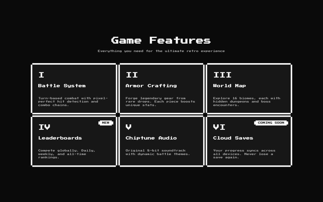
An 8-bit styled feature grid section. A centered title and description above a responsive grid of retro cards, each with a pixel icon, title, description, and an optional corner badge for highlights like NEW or COMING SOON.
Built with React and Tailwind. Copy the prompt and paste it into Claude Code, Cursor or Lovable: your agent adds 8bit Feature 1 Grid to your project and fits it to your theme.
Code
How 8bit Feature 1 Grid is used: the demo's code. The component's own source comes with a free account.
Usage.tsx
"use client";

import Feature1 from "@/components/ui/8bit-feature1";

export default function Default() {
  return (
    <div className="flex w-full min-h-screen items-center justify-center bg-background p-4 retro">
      <Feature1 />
    </div>
  );
}
More by OrcDev
View all
8bit CTA 1 — Comparison
295
8bit 404 Page
172
8bit Loading Screen
104
8bit Changelog
75
8-bit Login Form
59
8bit FAQ 2 — Card Grid
57
8-bit Stats Dashboard
55
8bit Timeline Horizontal
54
More in Features
View all

Features 8
3.1K
Features 2
322

Grid Feature Cards
1.9K

Feature Sections
52
Feature Modern
17
Feature with advantages
278
Feature Section with card gradient
169
Features 4
368


