
About
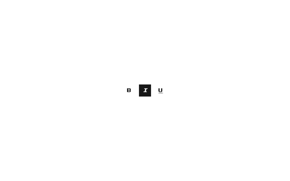
Pixel-art toggle button from 8bitcn.com — pressed state with retro pixel border. Wraps shadcn/ui Toggle.
Built with React and Tailwind. Copy the prompt and paste it into Claude Code, Cursor or Lovable: your agent adds 8-bit Toggle to your project and fits it to your theme.
Code
How 8-bit Toggle is used: the demo's code. The component's own source comes with a free account.
Usage.tsx
"use client";

import { Toggle } from "@/components/ui/8bit-toggle";

export default function Default() {
  return (
    <div className="flex w-full min-h-screen items-center justify-center bg-background p-8 overflow-hidden">
      <div className="flex items-center gap-3">
        <Toggle aria-label="Bold" className="font-pixel">B</Toggle>
        <Toggle aria-label="Italic" defaultPressed className="font-pixel italic">I</Toggle>
        <Toggle aria-label="Underline" className="font-pixel underline">U</Toggle>
      </div>
    </div>
  );
}
Dependencies
More by OrcDev
View all
8bit CTA 1 — Comparison
295
8bit 404 Page
172
8bit Loading Screen
104
8bit Changelog
75
8-bit Login Form
59
8bit FAQ 2 — Card Grid
57
8-bit Stats Dashboard
55
8bit Timeline Horizontal
54
More in Buttons
View all

Button
14
Button
34
Texture Button
92
Button Save
46

Button
64

Button Group
3

App Store Button
454

Notification Button
103

