
About
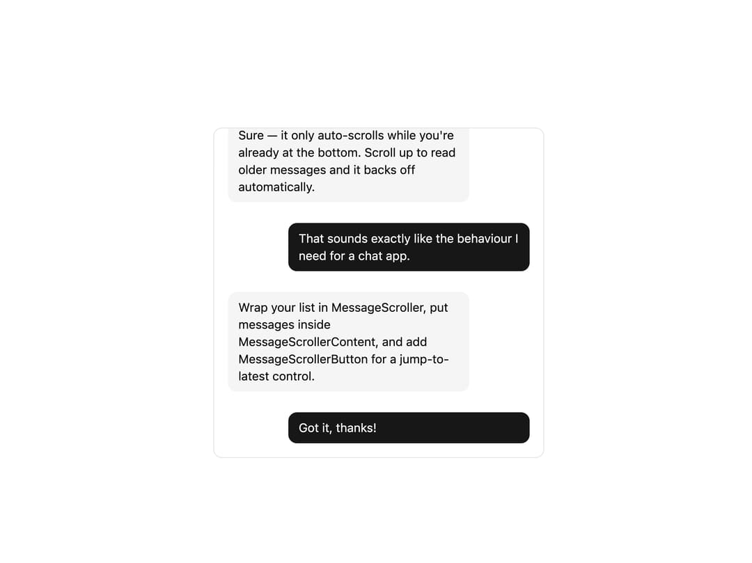
A scrollable container for chat transcripts that auto-scrolls to new messages, anchors conversation turns in view, and shows a jump-to-latest button when the reader scrolls away from the live edge.
Built with React and Tailwind. Copy the prompt and paste it into Claude Code, Cursor or Lovable: your agent adds Message Scroller to your project and fits it to your theme.
Code
How Message Scroller is used: the demo's code. The component's own source comes with a free account.
Usage.tsx
"use client";

import {
  MessageScroller,
  MessageScrollerButton,
  MessageScrollerContent,
  MessageScrollerItem,
  MessageScrollerProvider,
  MessageScrollerViewport,
} from "@/components/ui/message-scroller";

const messages = [
  { id: "1", role: "assistant", text: "Hi! How can I help you today?" },
  {
    id: "2",
    role: "user",
    text: "Can you explain how MessageScroller keeps the viewport pinned to the bottom while streaming?",
  },
  {
    id: "3",
    role: "assistant",
    text: "Sure — it only auto-scrolls while you're already at the bottom. Scroll up to read older messages and it backs off automatically.",
  },
  {
    id: "4",
    role: "user",
    text: "That sounds exactly like the behaviour I need for a chat app.",
  },
  {
    id: "5",
    role: "assistant",
    text: "Wrap your list in MessageScroller, put messages inside MessageScrollerContent, and add MessageScrollerButton for a jump-to-latest control.",
  },
  { id: "6", role: "user", text: "Got it, thanks!" },
];

export default function MessageScrollerDemo() {
  return (
    <MessageScrollerProvider autoScroll>
      <MessageScroller className="mx-auto h-96 w-full max-w-sm rounded-lg border bg-background">
        <MessageScrollerViewport className="px-4">
          <MessageScrollerContent className="py-4">
            {messages.map((message) => (
              <MessageScrollerItem key={message.id}>
                <div
                  className={
                    message.role === "user"
                      ? "ml-auto max-w-[80%] rounded-lg bg-primary px-3 py-2 text-sm text-primary-foreground"
                      : "mr-auto max-w-[80%] rounded-lg bg-muted px-3 py-2 text-sm text-foreground"
                  }
                >
                  {message.text}
                </div>
              </MessageScrollerItem>
            ))}
          </MessageScrollerContent>
        </MessageScrollerViewport>
        <MessageScrollerButton />
      </MessageScroller>
    </MessageScrollerProvider>
  );
}
Dependencies
More by uiable
View all

Feature Highlights Grid
341
Card Tabs
101
Financial Bento Grid
71
Chart Tooltip
67
Portfolio Showcase Grid
58
Marketing Hero Section
58
Sidebar with Search and Profile
50
Position Sonner
48