HomeBookmarks
uiableuiable
uiable

uiable

Free, open-source React component library built on shadcn/ui and Base UI, with copy-paste components you fully own.

UIby uiable
168components576.9Kviews1.5Kbookmarks

Installs all 354 components. Without our CLI, run instead.

Auto-indexed

uiable contents

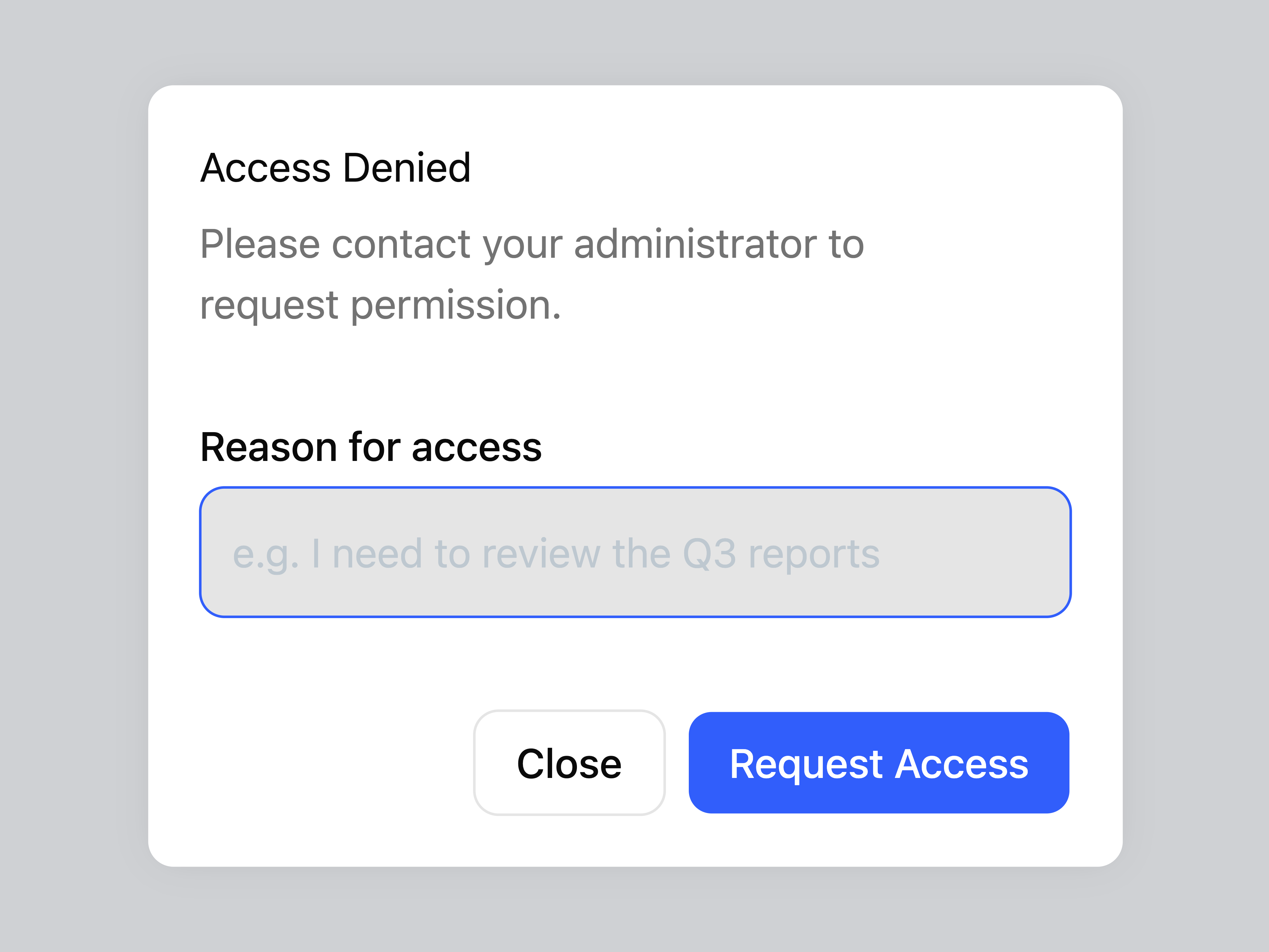
  • Alert Dialog BasicAlert Dialog Basic

    Alert Dialog Basic

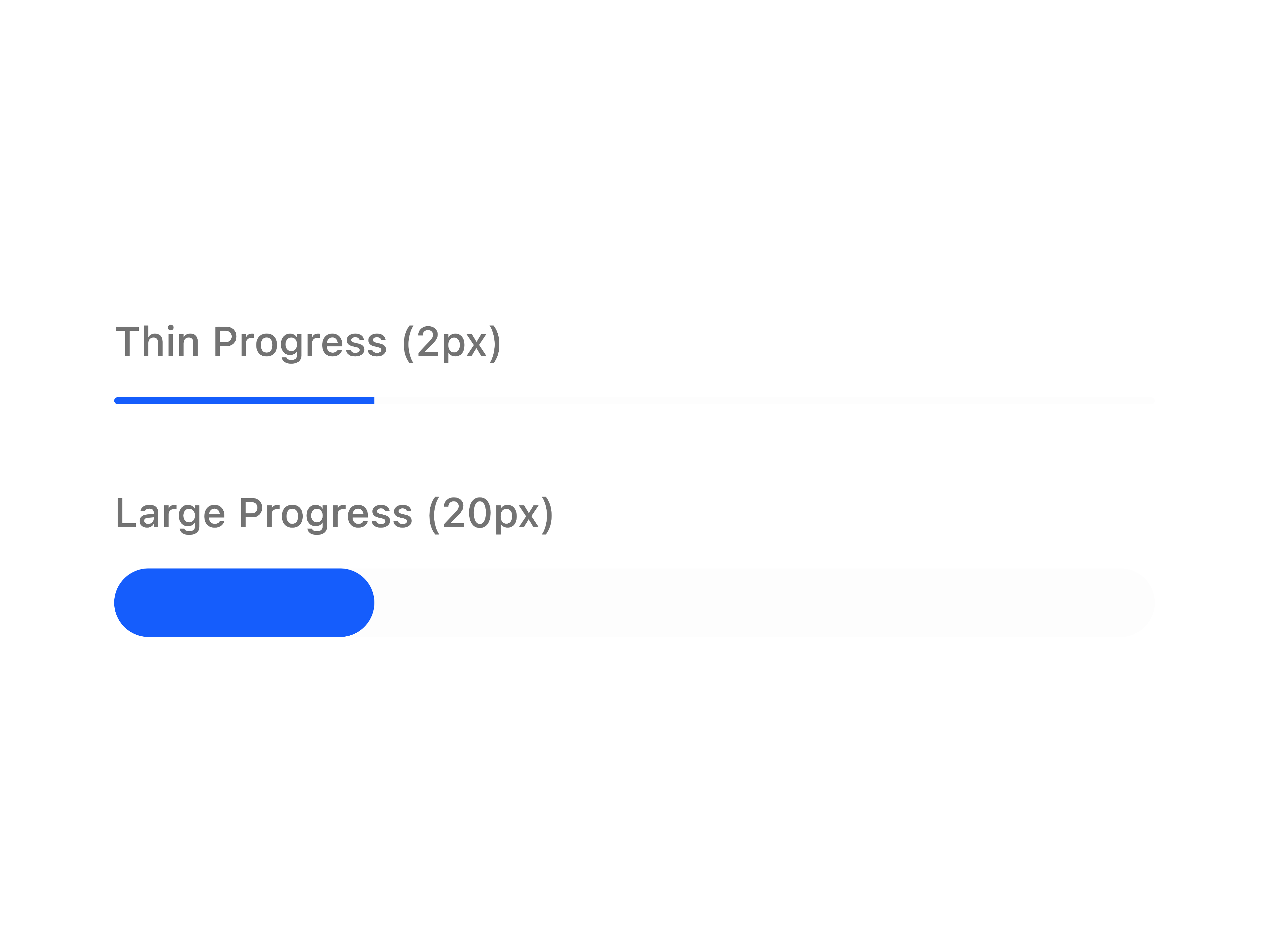
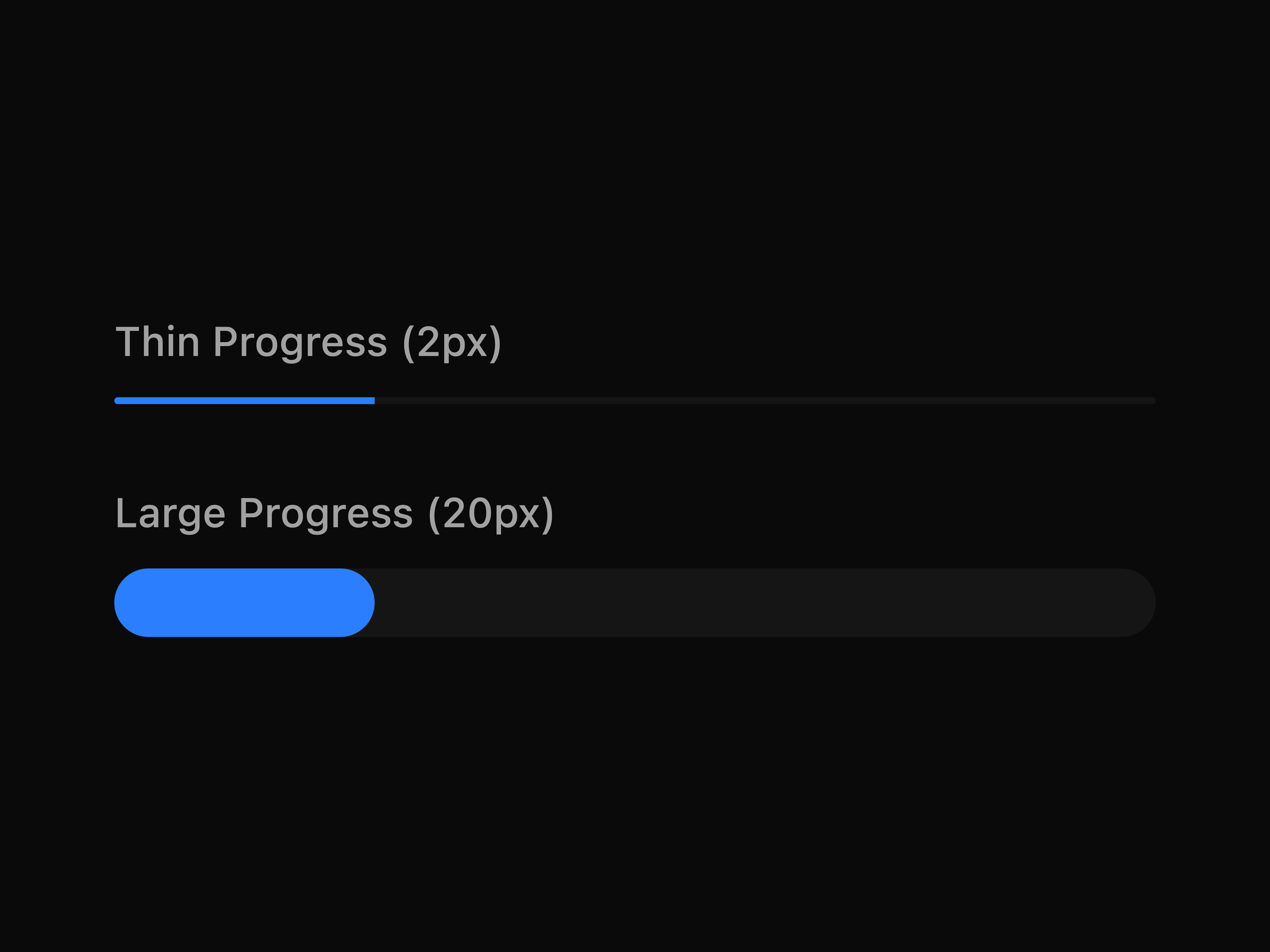
  • Progress HeightProgress Height

    Progress Height

  • Alert Dialog LockAlert Dialog Lock

    Alert Dialog Lock

  • Accordion CustomAccordion Custom

    Accordion Custom

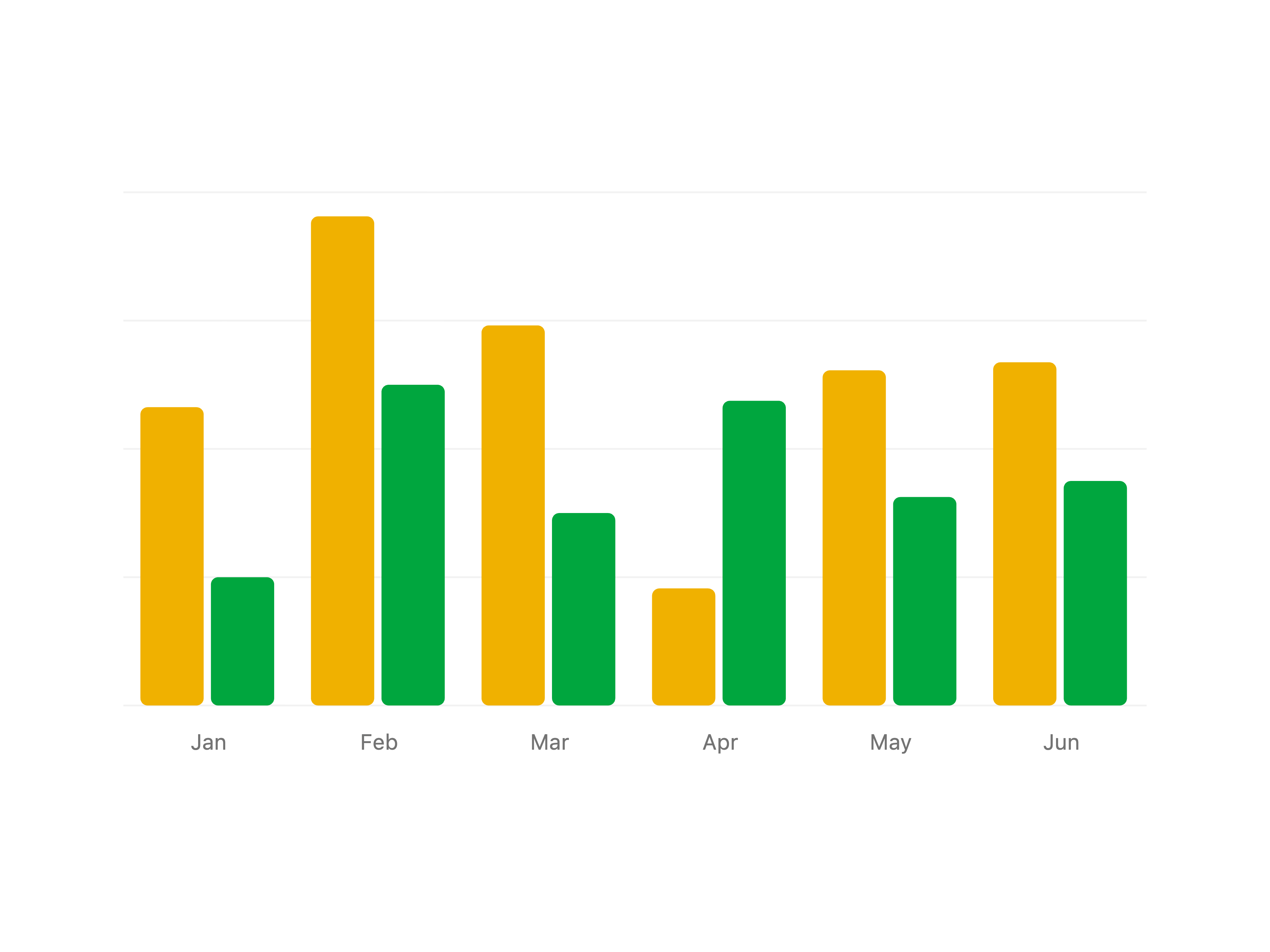
  • Bar Chart with TooltipBar Chart with Tooltip

    Bar Chart with Tooltip

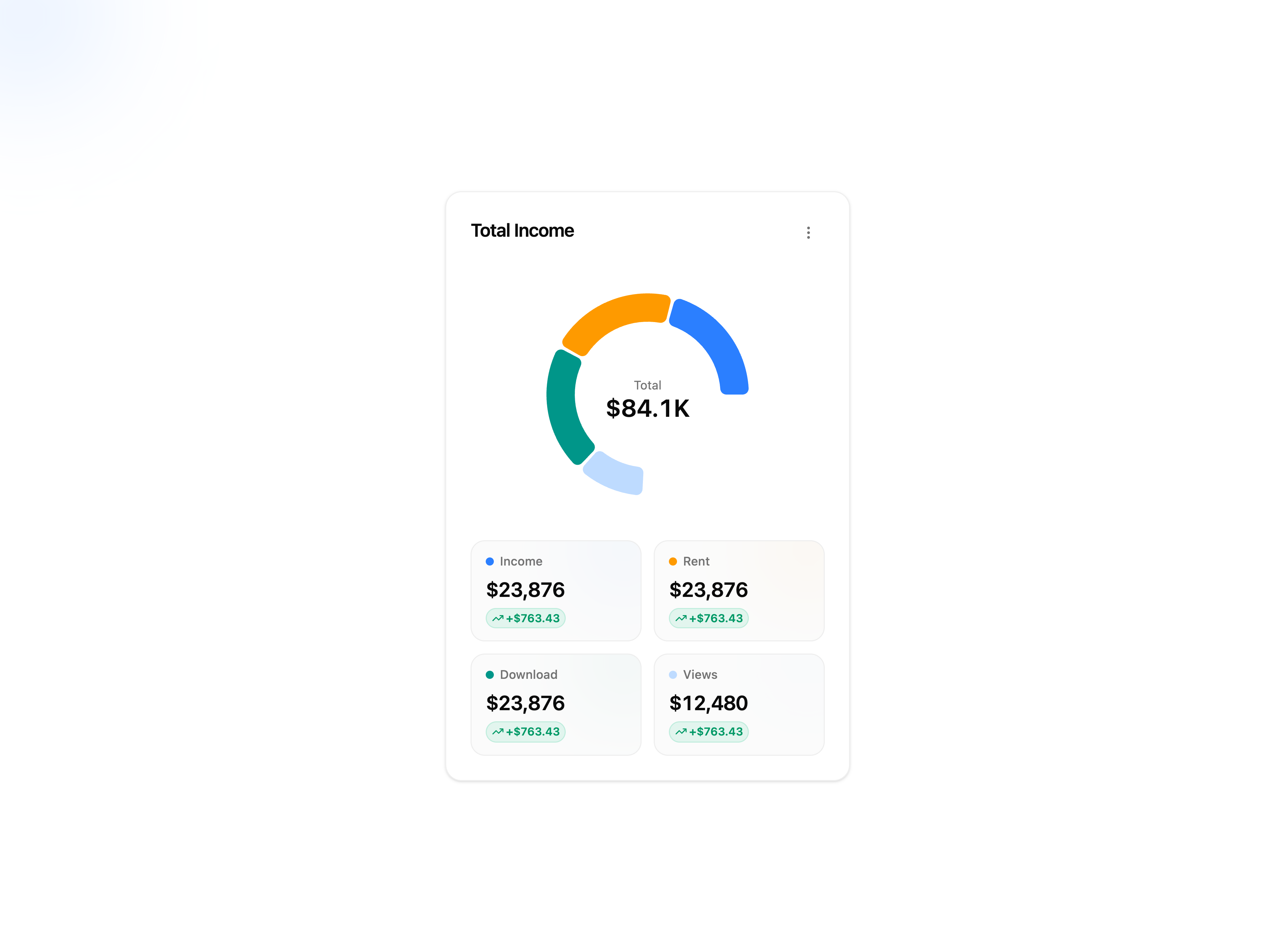
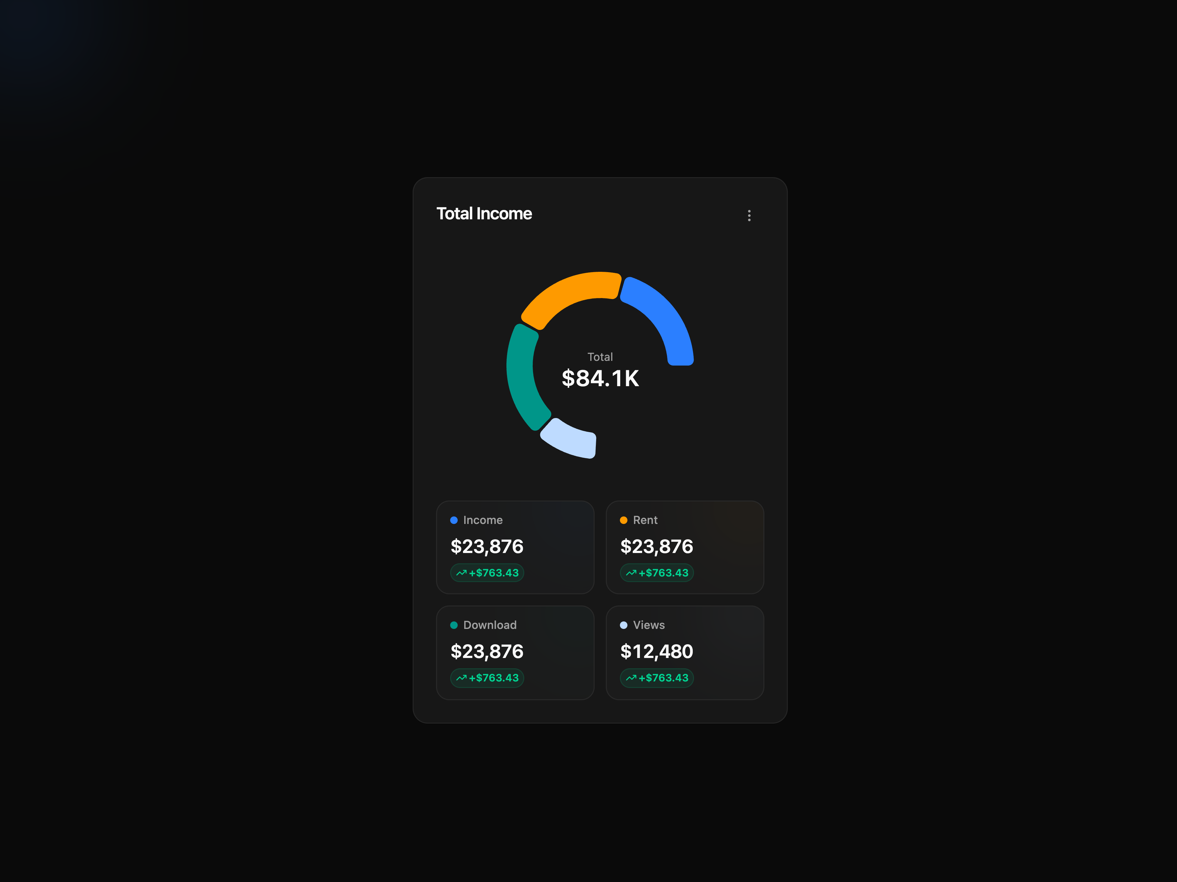
  • Income Donut ChartIncome Donut Chart

    Income Donut Chart

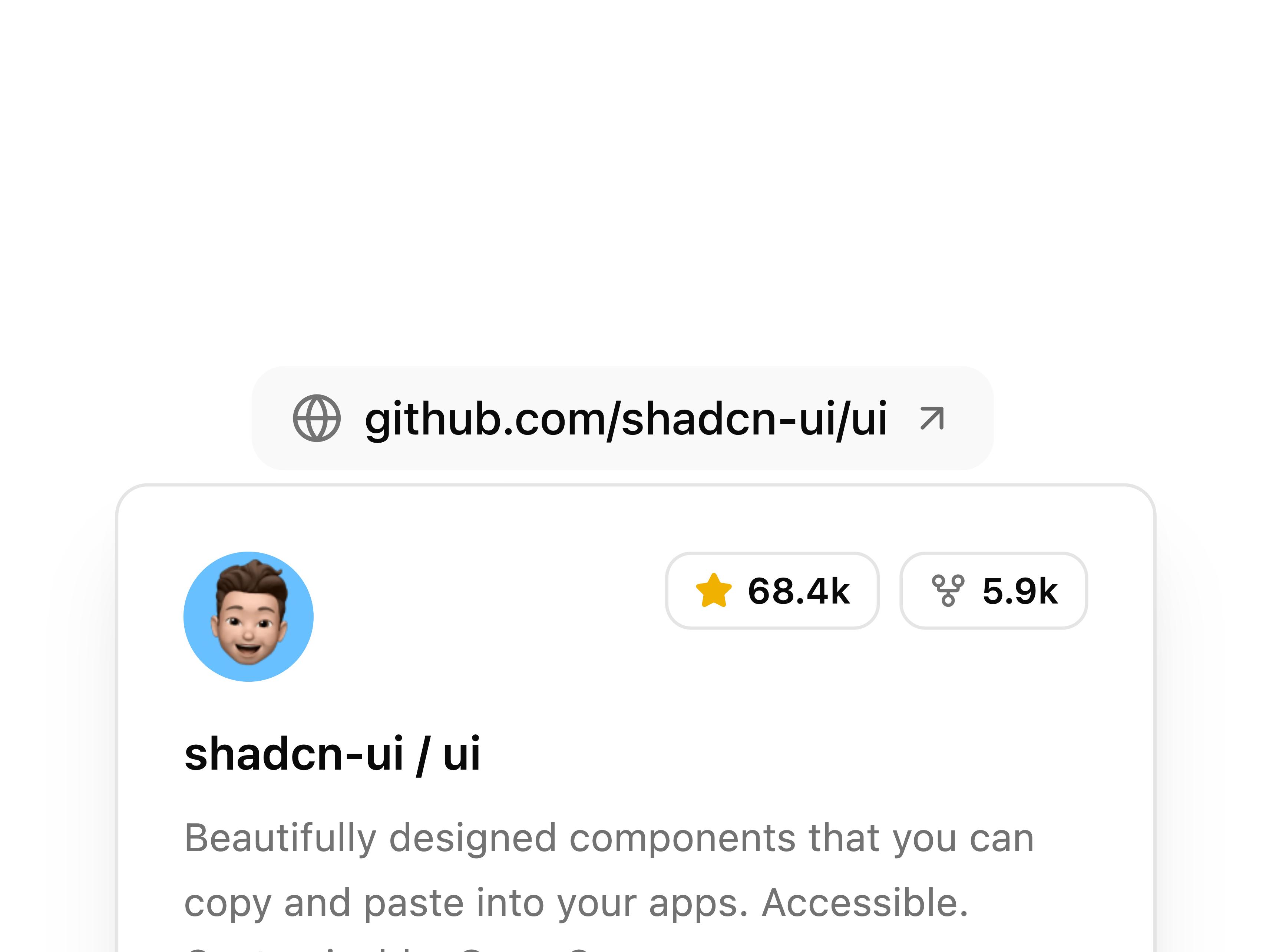
  • Hover Card Link PreviewHover Card Link Preview

    Hover Card Link Preview

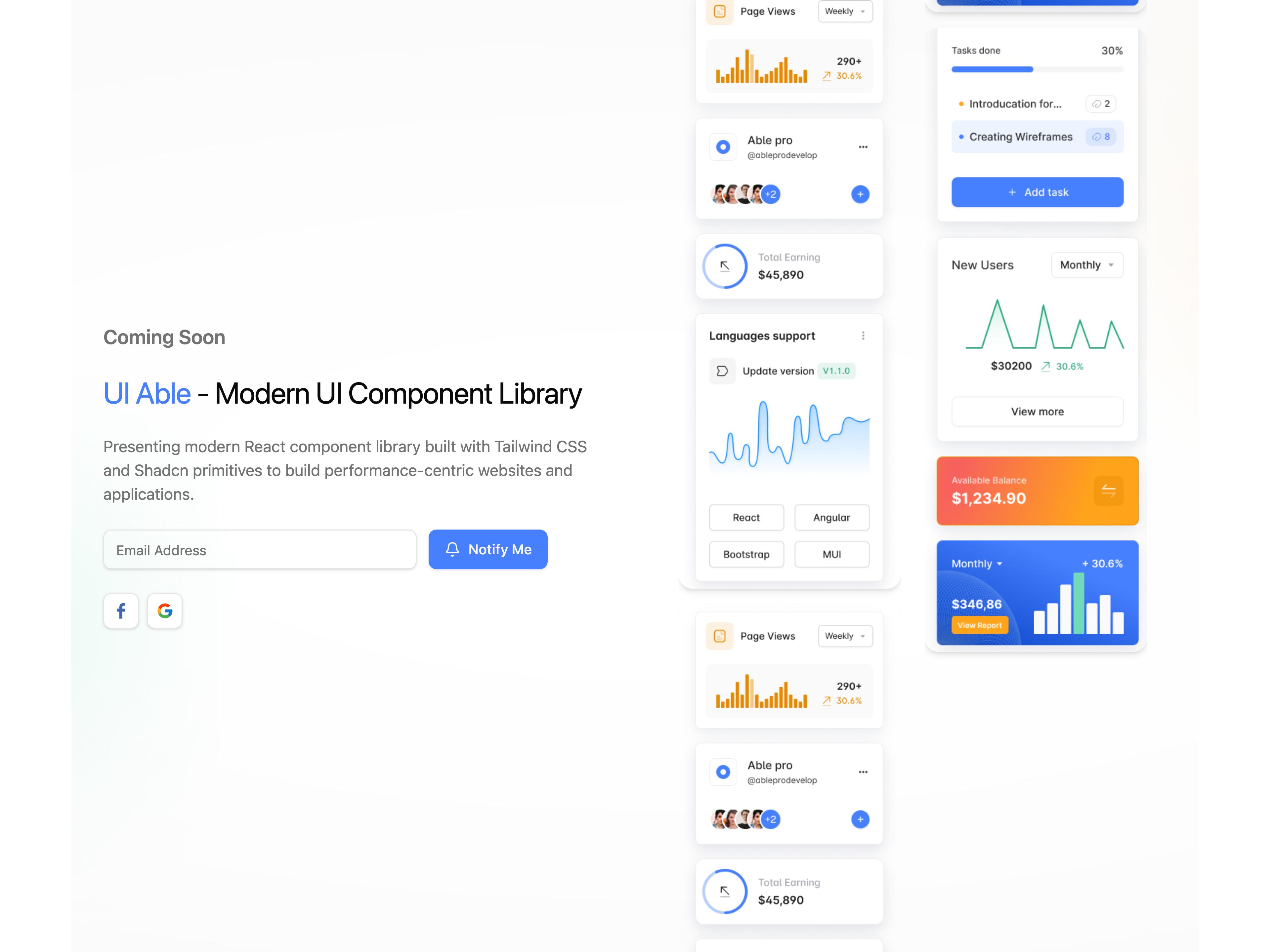
  • Coming Soon Hero BlockComing Soon Hero Block

    Coming Soon Hero Block

  • Forgot Password 3

    Forgot Password 3

  • Disabled ToggleDisabled Toggle

    Disabled Toggle

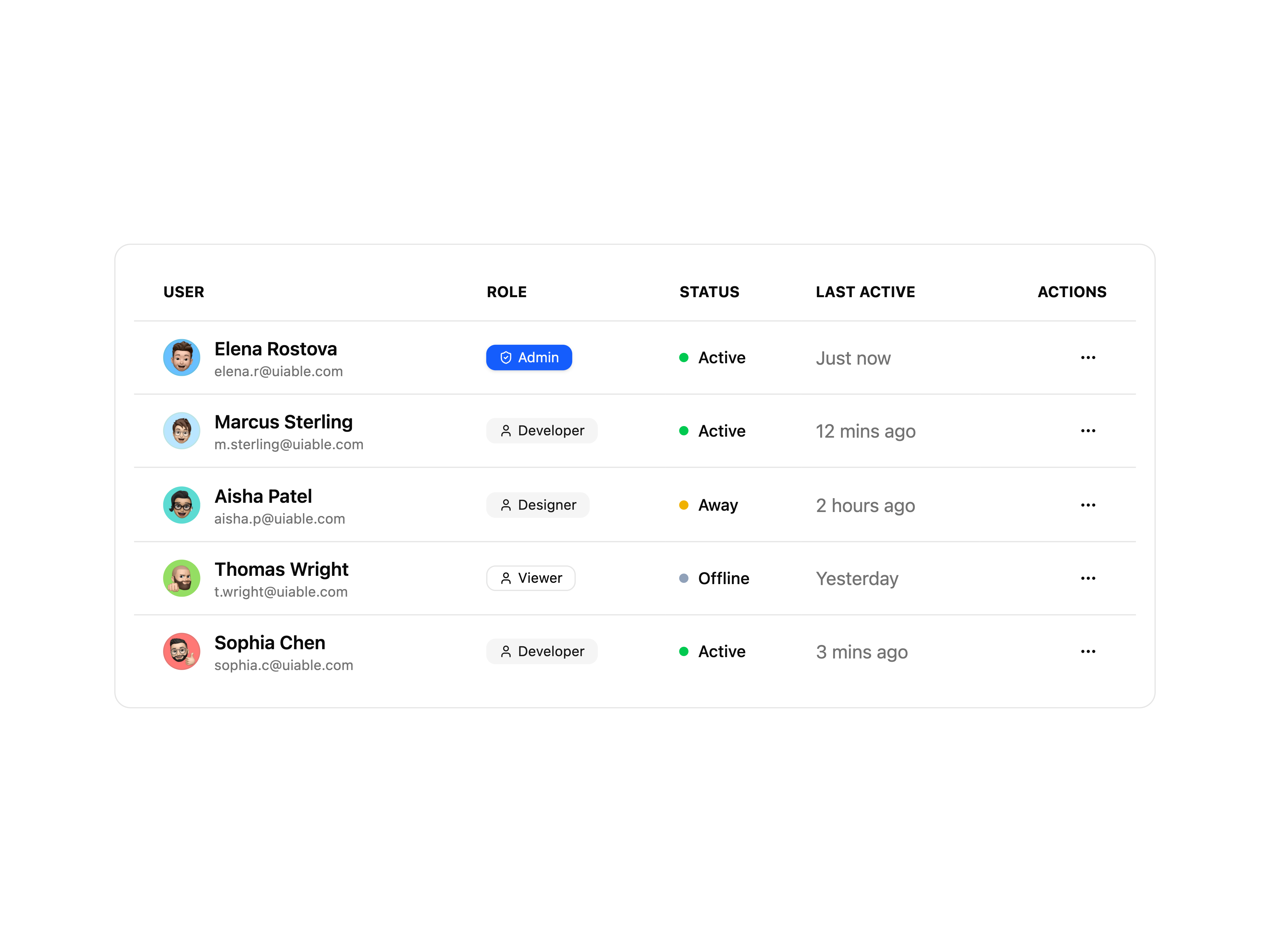
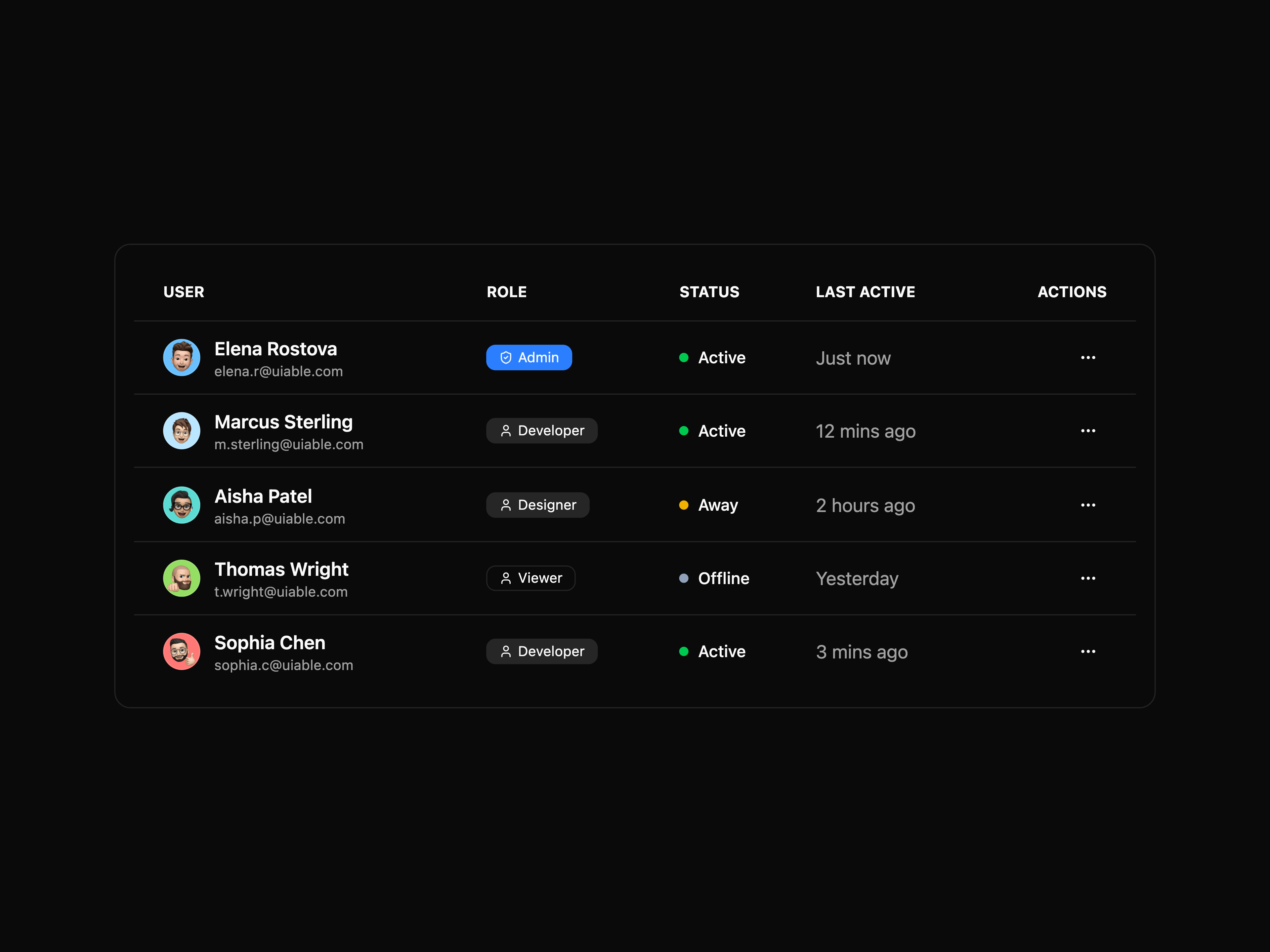
  • Table UsersTable Users

    Table Users

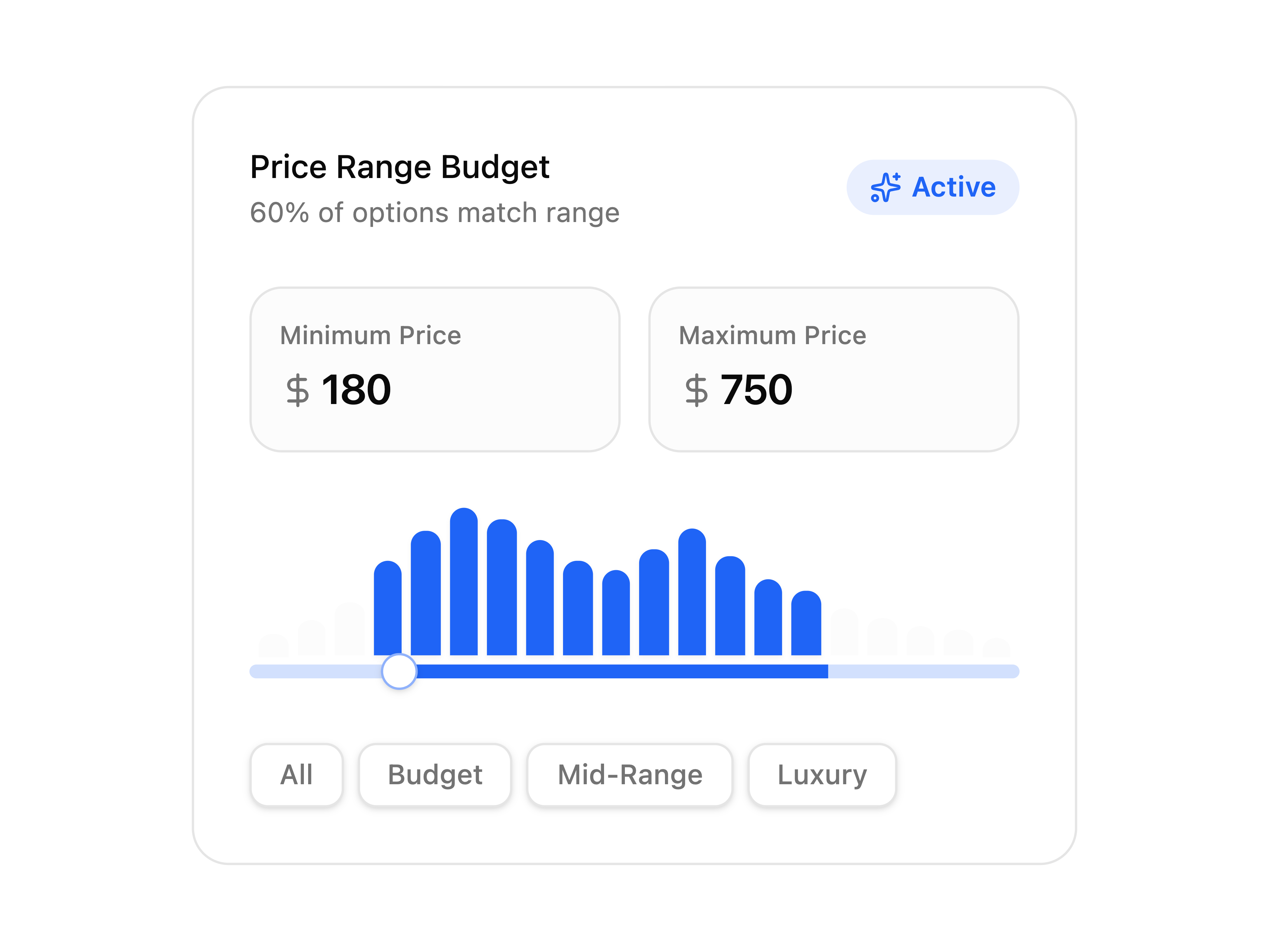
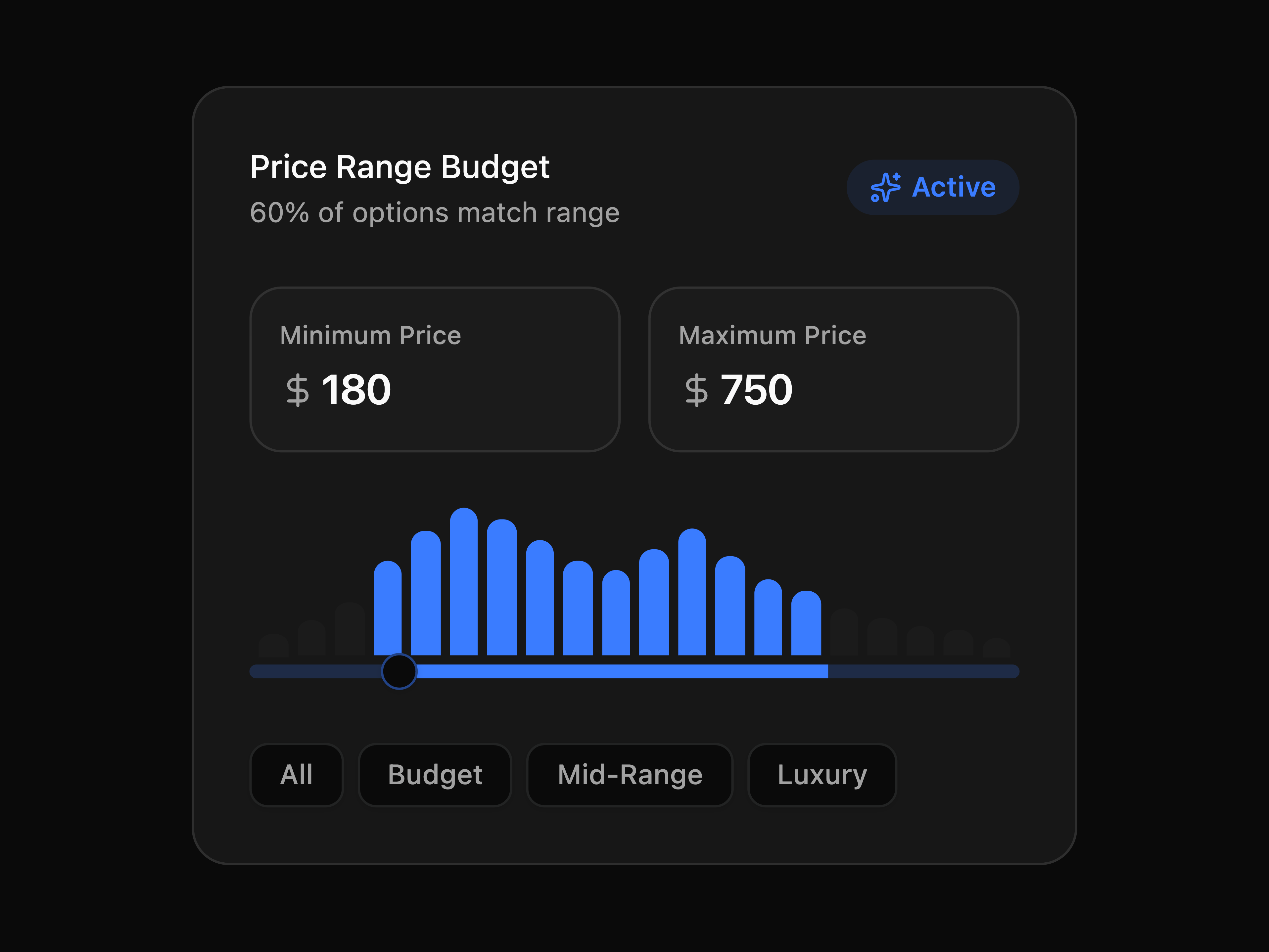
  • Slider Price RangeSlider Price Range

    Slider Price Range

  • Radio Group BoxRadio Group Box

    Radio Group Box

  • Radio Group SizesRadio Group Sizes

    Radio Group Sizes

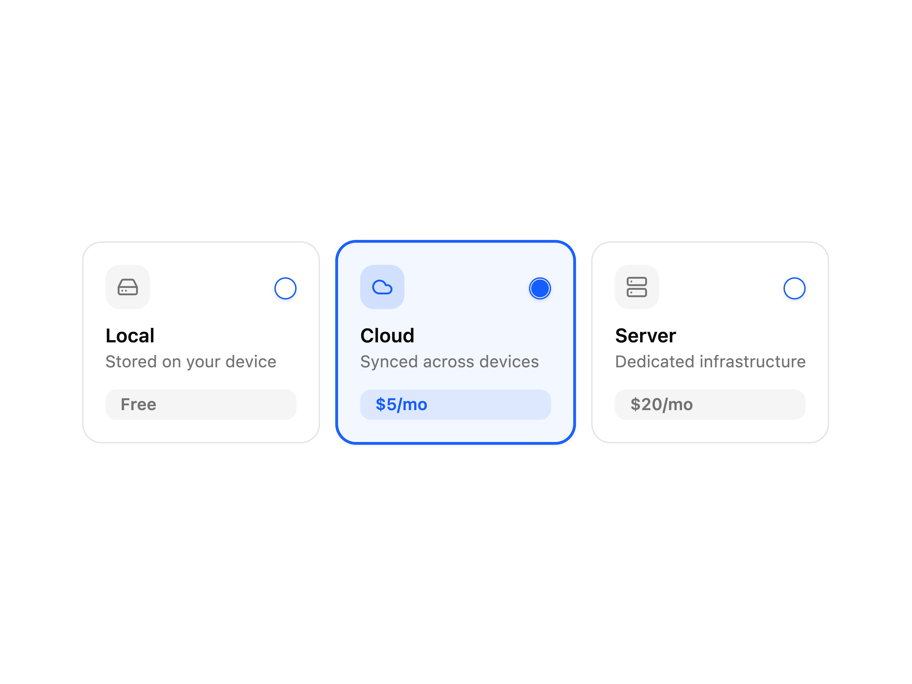
  • Empty CardEmpty Card

    Empty Card

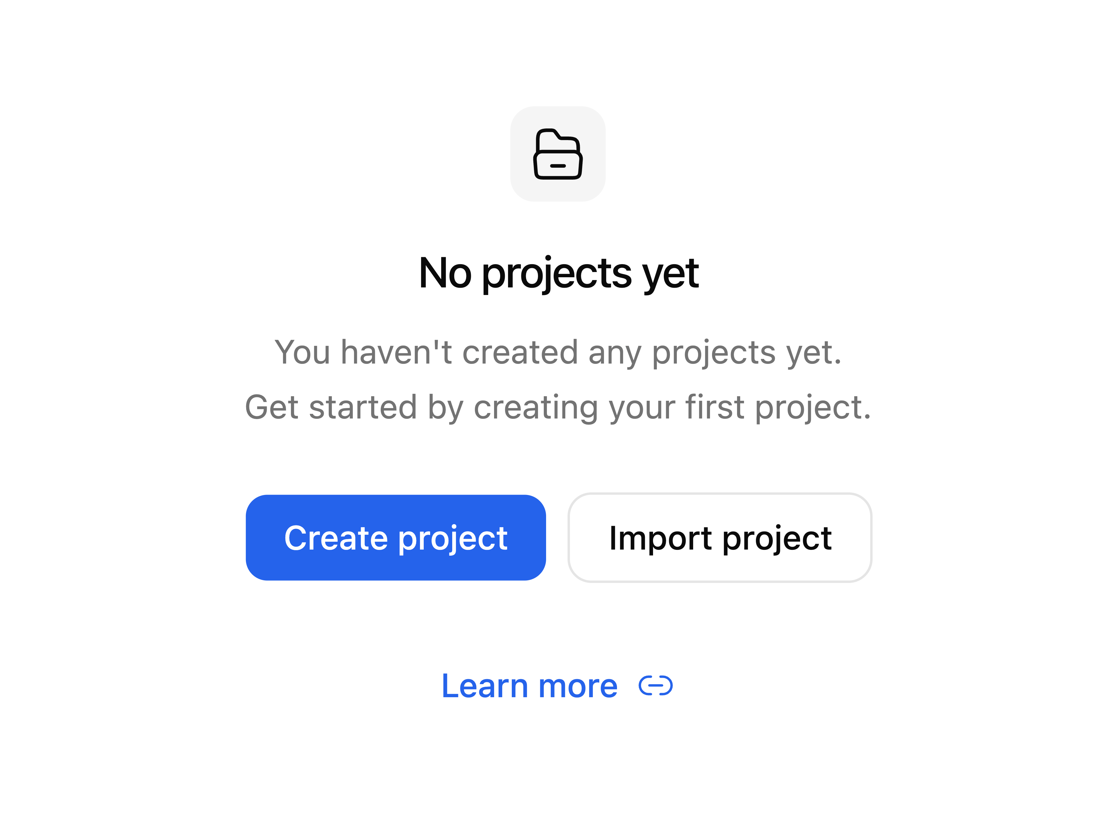
  • Empty No Search ResultEmpty No Search Result

    Empty No Search Result

  • Dialog Scrollable Content

    Dialog Scrollable Content

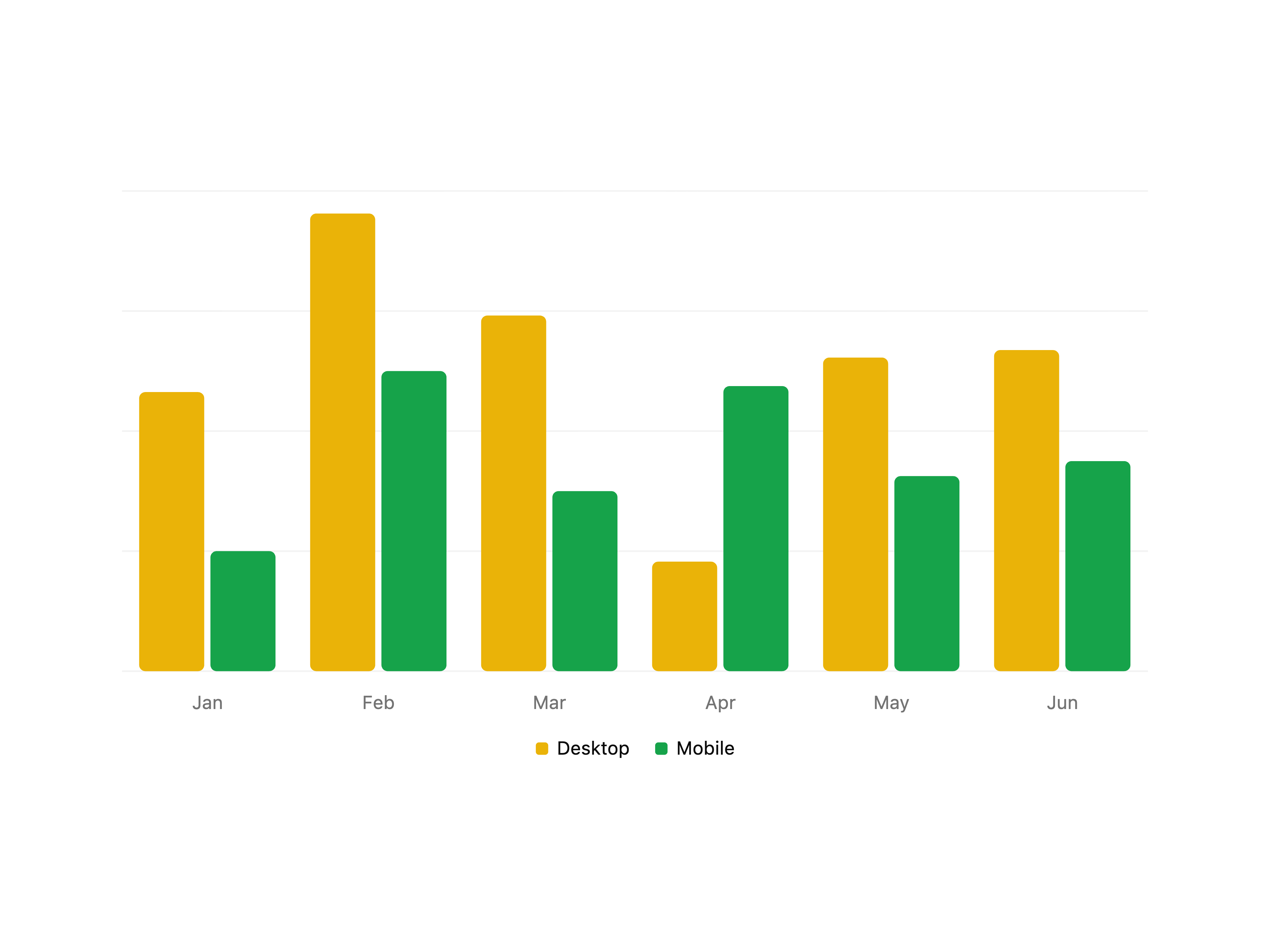
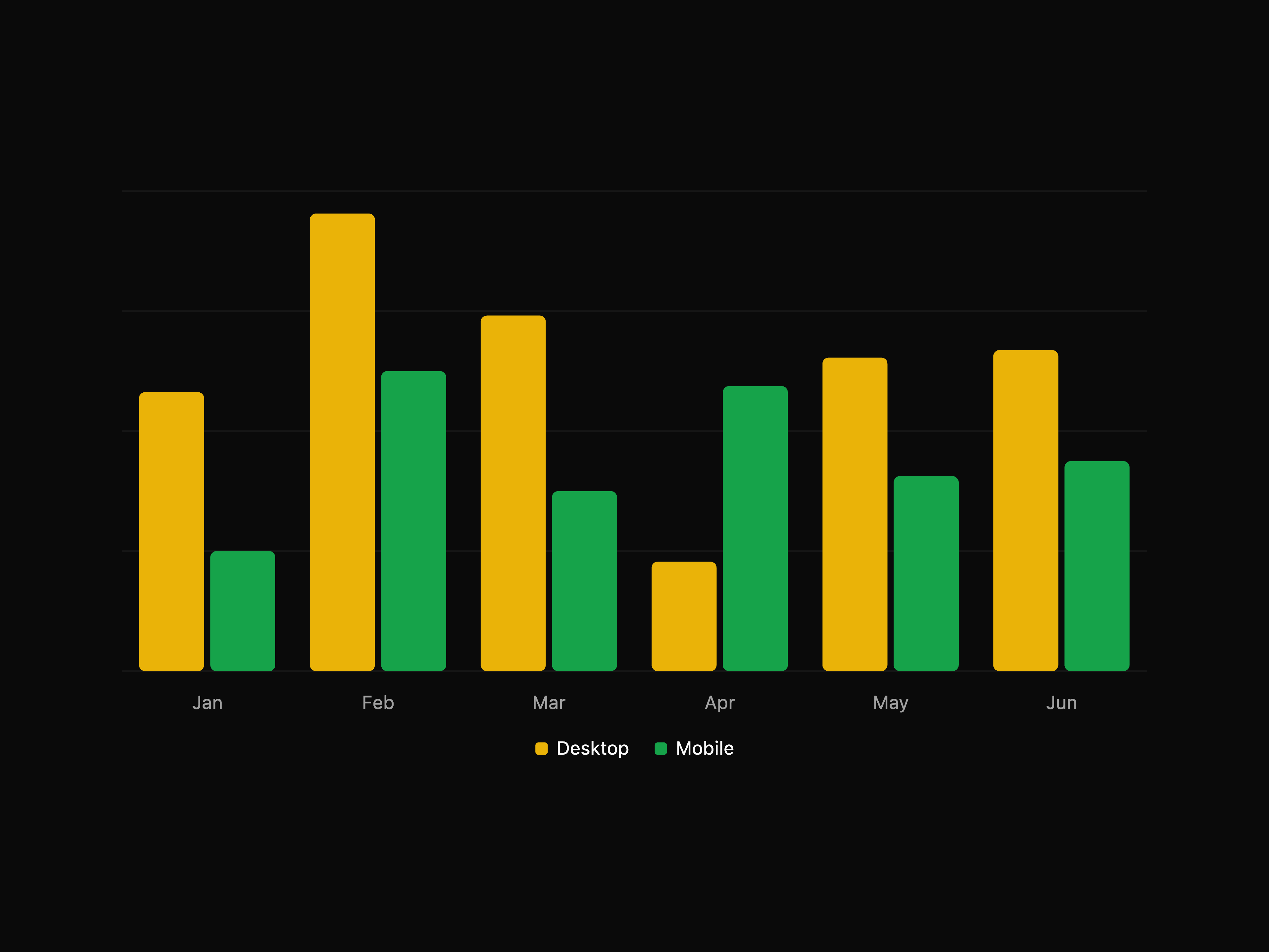
  • Bar Chart with LegendBar Chart with Legend

    Bar Chart with Legend

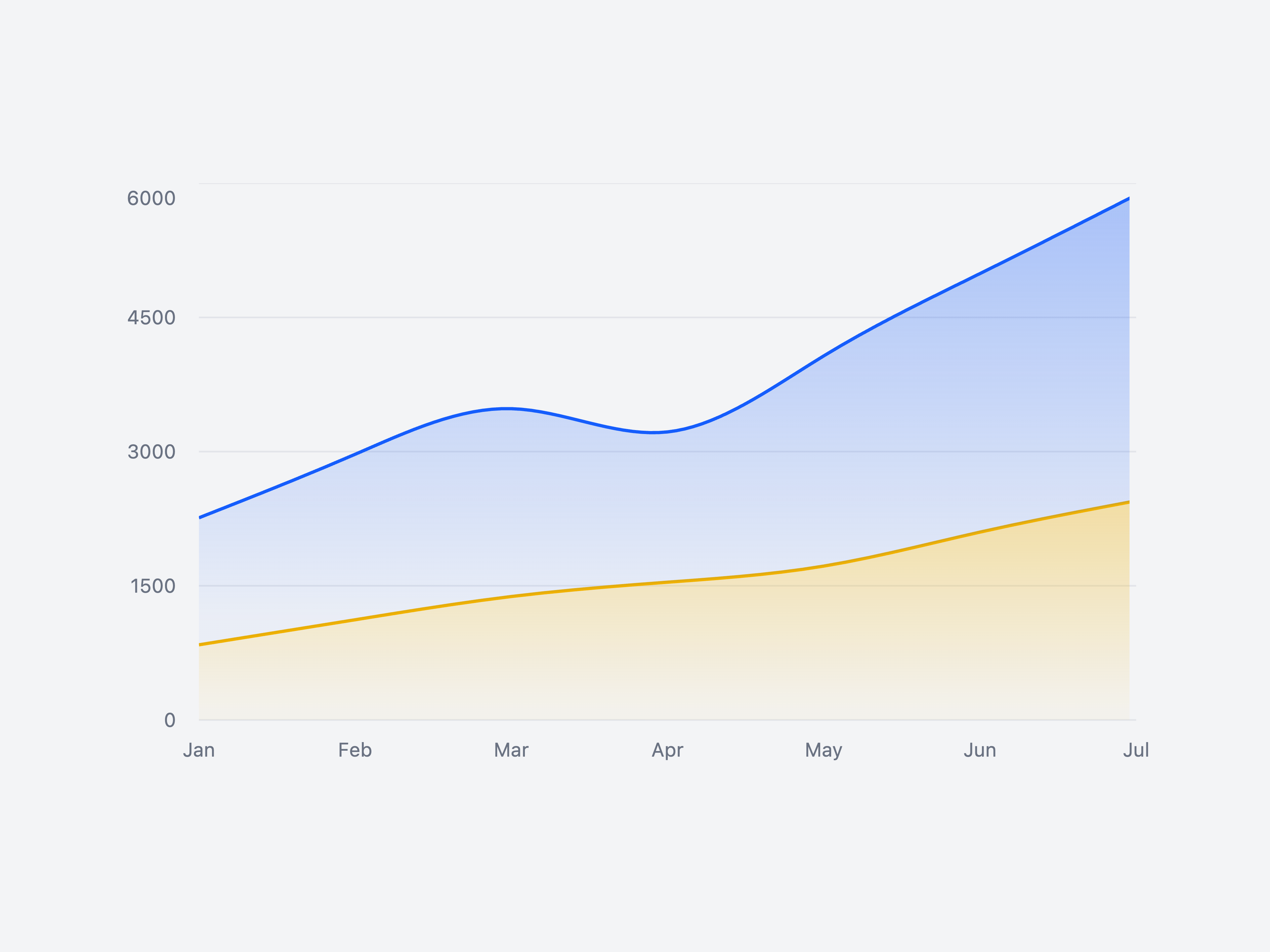
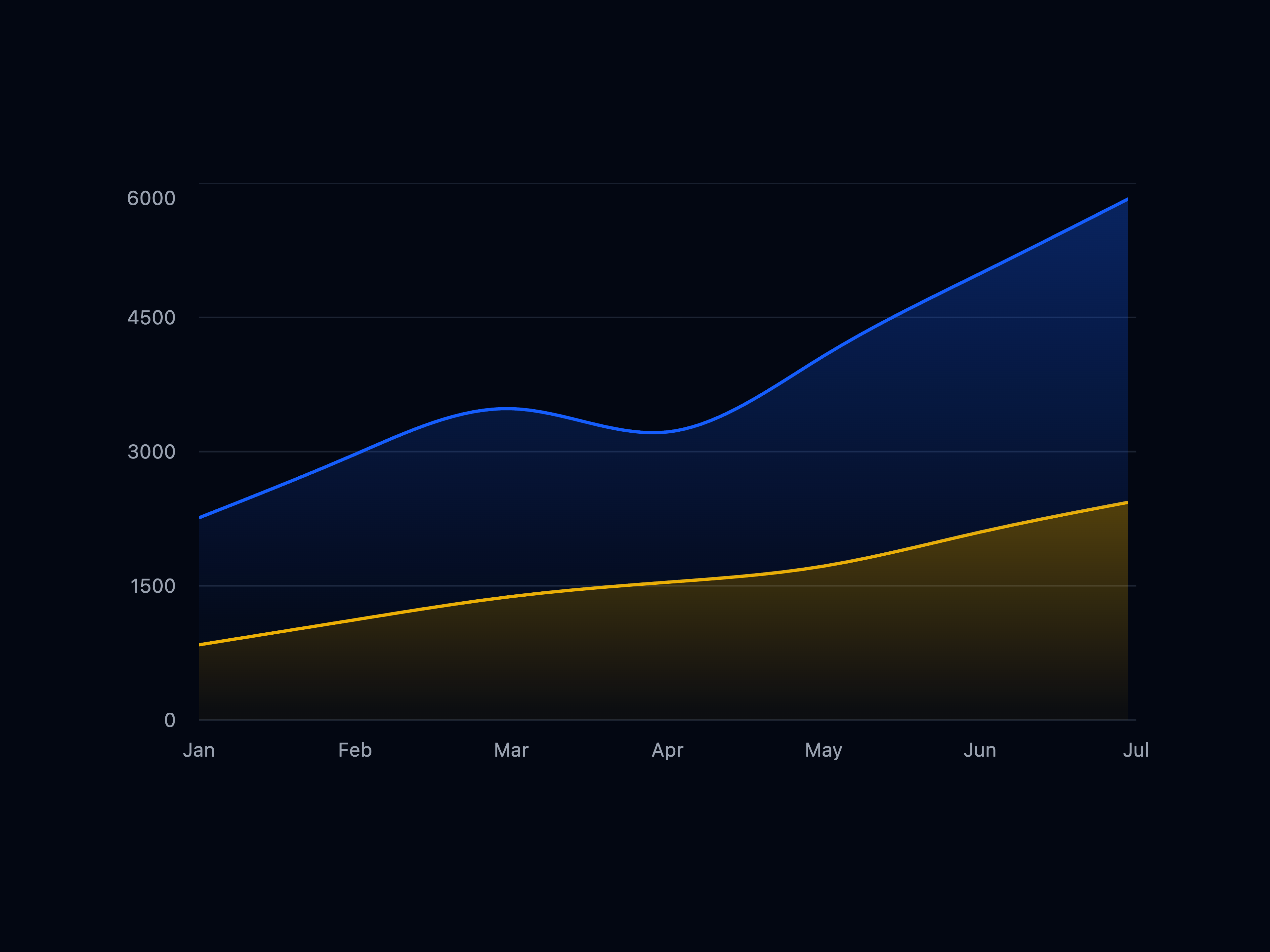
  • Chart AreaChart Area

    Chart Area

  • Chart PieChart Pie

    Chart Pie

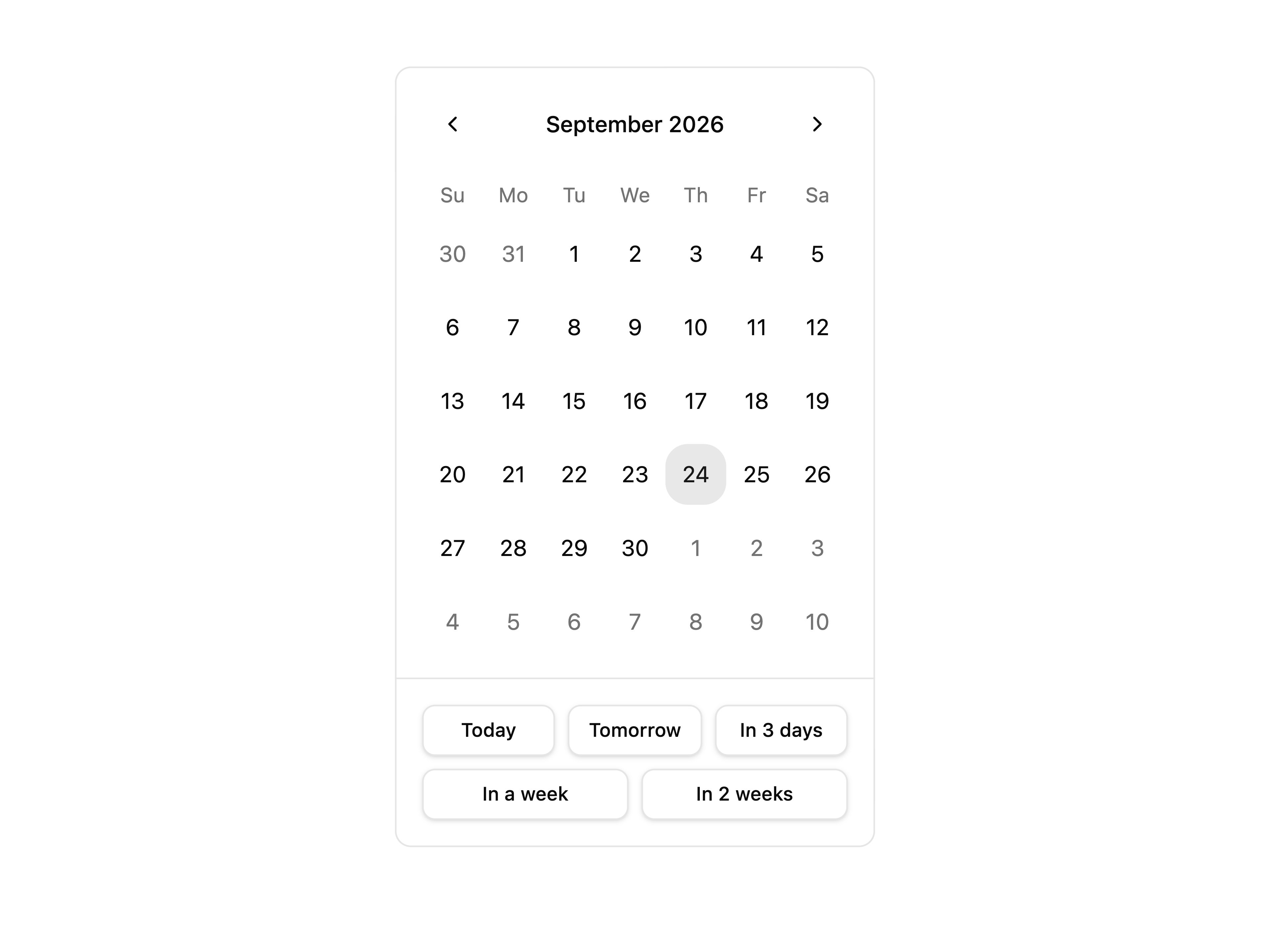
  • Calendar PresetsCalendar Presets

    Calendar Presets

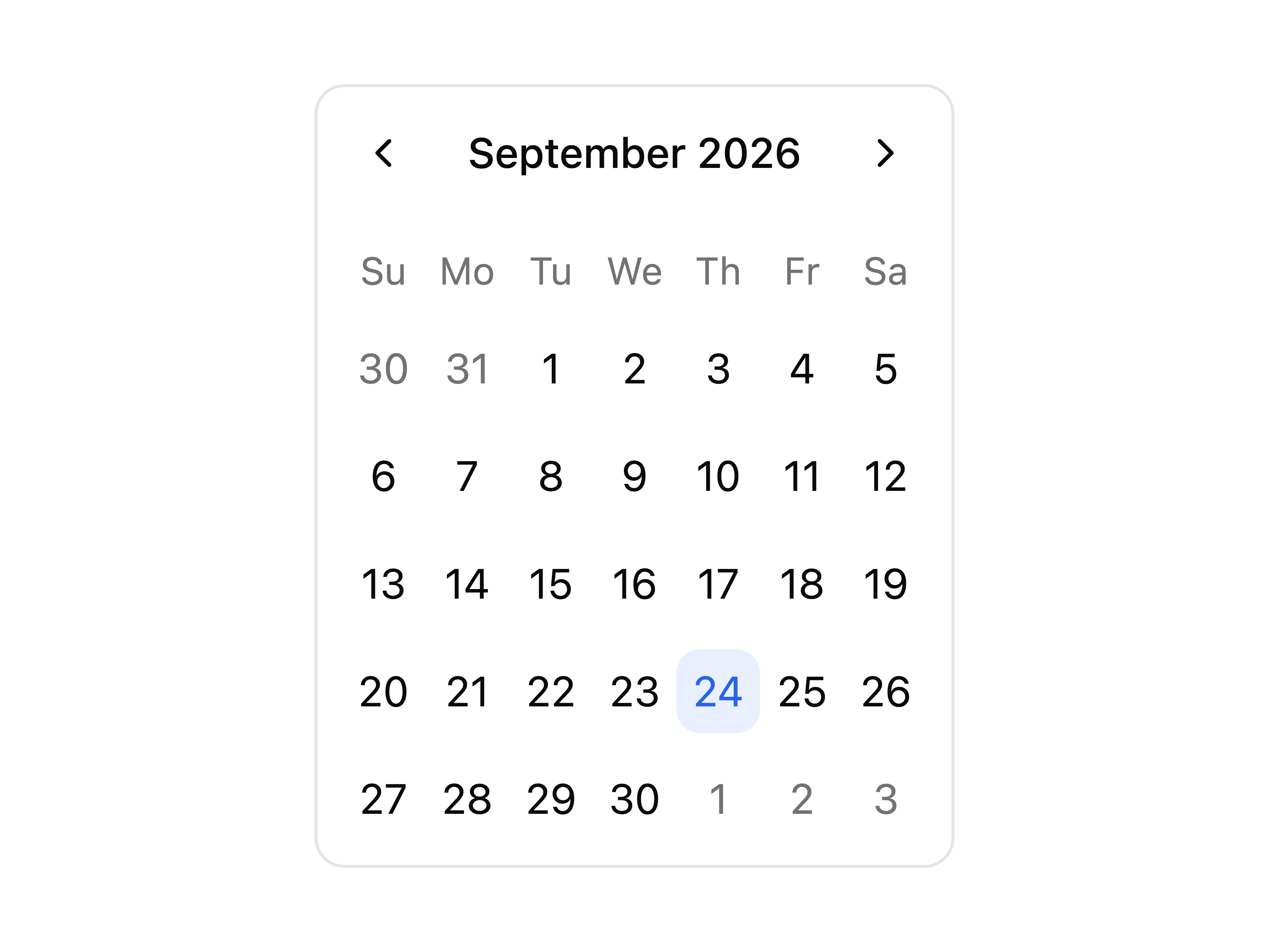
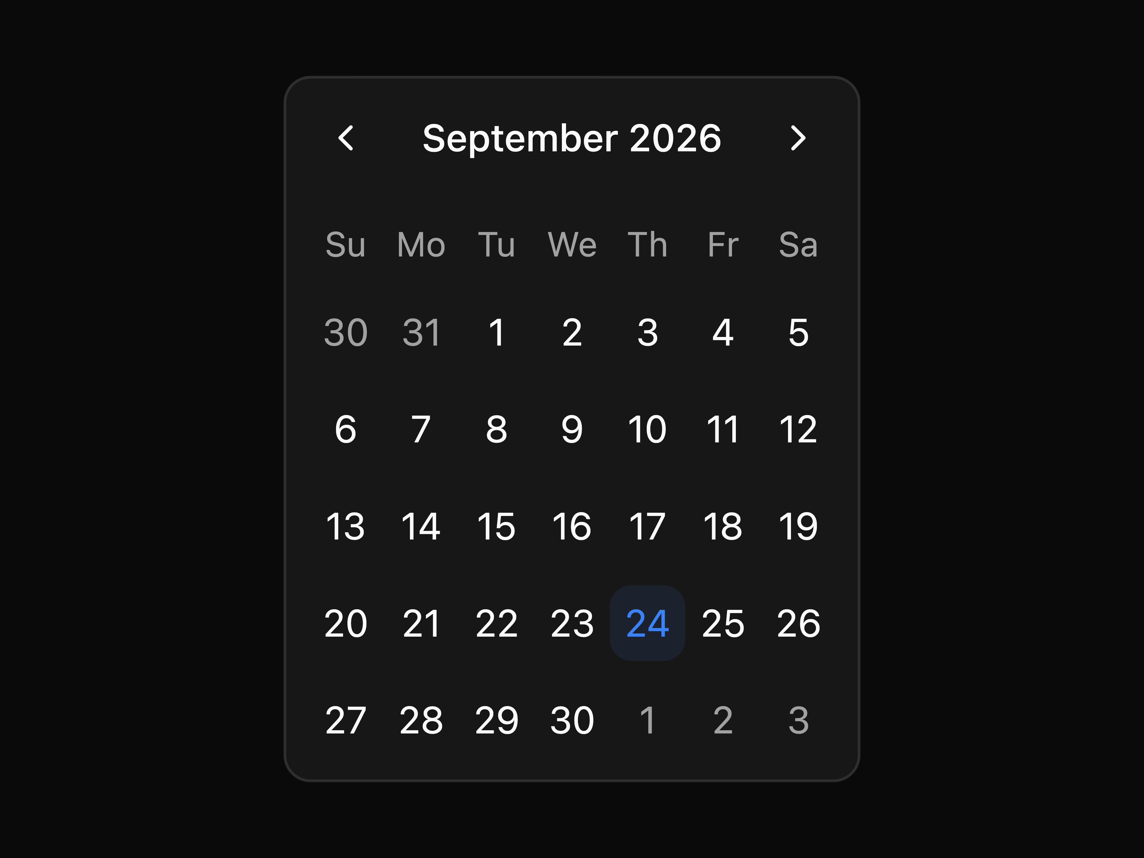
  • Calendar BasicCalendar Basic

    Calendar Basic

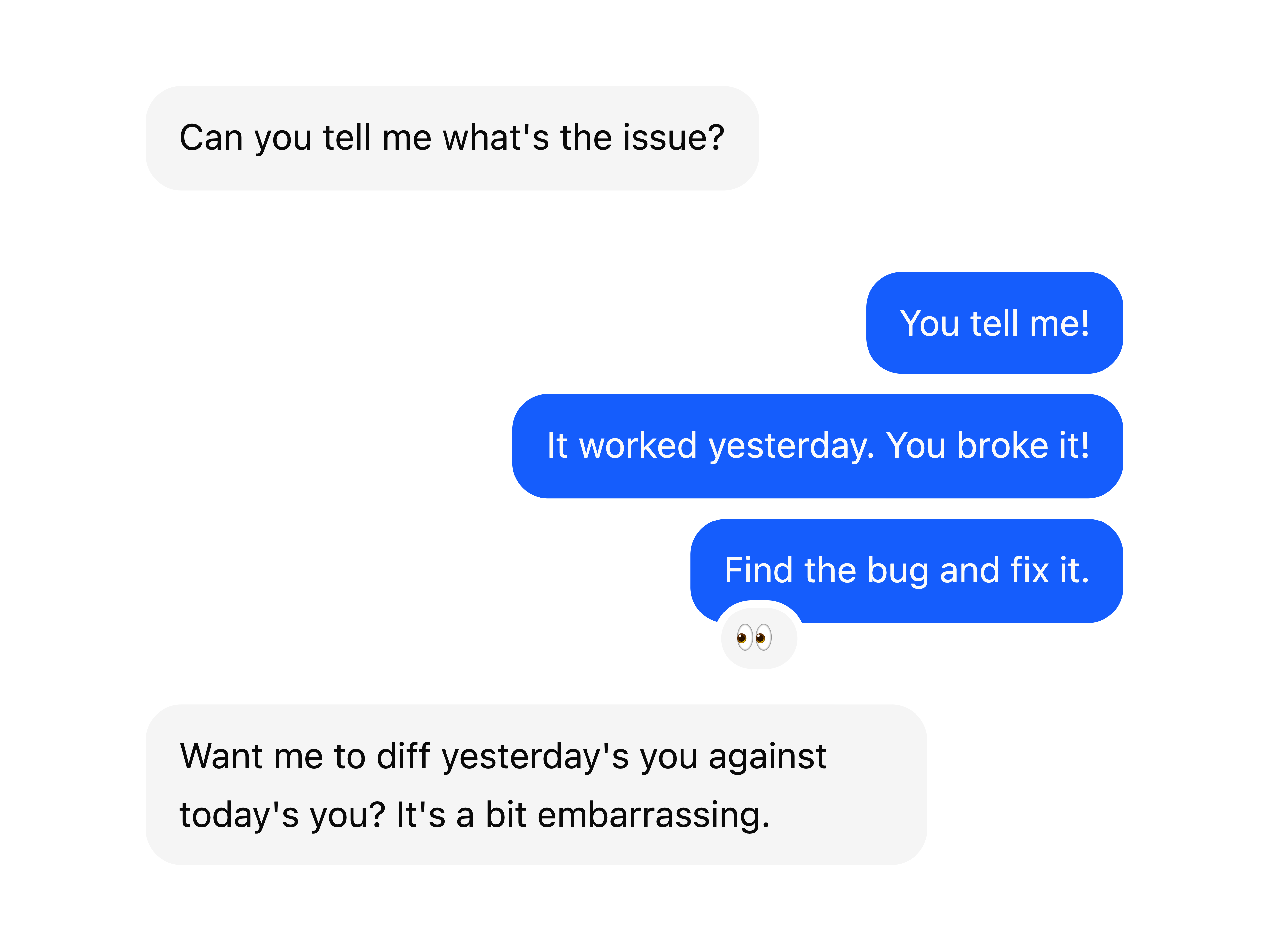
  • Chat Bubble GroupChat Bubble Group

    Chat Bubble Group

  • Avatar Counter IndicatorAvatar Counter Indicator

    Avatar Counter Indicator

  • About uiable

    uiable publishes a shadcn registry at uiable.com, with 354 components installable through the shadcn CLI.

    Components
    354
    GitHub stars
    142
    Last commit
    Oct 1, 2026
    Repository
    codedthemes/uiable

    Also in the uiable registry

    Copy a prompt for your agent, copy the install command, or open the docs that ship it.

    • Accordion Basic

      accordion-basic

      Accordion Basic variant for component.

      1 file
    • Accordion Borders

      accordion-borders

      Accordion Borders variant for component.

      1 file
    • Accordion Card

      accordion-card

      Accordion Card variant for component.

      1 file
    • Accordion Disabled

      accordion-disabled

      Accordion Disabled variant for component.

      1 file
    • Accordion Flush

      accordion-flush

      Accordion Flush variant for component.

      1 file
    • accordion-icons

    • Alert Basic

      alert-basic

      Alert Basic variant for component.

      lucide-react1 file
    • Alert Border Left Danger

      alert-border-left-danger

      Alert Border Left Danger variant for component.

      1 file
    • Alert Border Left Dark

      alert-border-left-dark

      Alert Border Left Dark variant for component.

      1 file
    • Alert Colors

      alert-colors

      Alert Colors variant for component.

      lucide-react1 file
    • Alert Destructive

      alert-destructive

      Alert Destructive variant for component.

      lucide-react1 file
    • Alert Dialog Destructive

      alert-dialog-destructive

      Alert Dialog Destructive variant for component.

      iconsax-reactjs1 file
    • Alert Dialog Media

      alert-dialog-media

      Alert Dialog Media variant for component.

      iconsax-reactjs1 file
    • Alert Dialog Small Media

      alert-dialog-small-media

      Alert Dialog Small Media variant for component.

      iconsax-reactjs1 file
    • alert-dialog-subscription

    • alert-dialog-warning

    • Alert Dismissible Danger

      alert-dismissible-danger

      Alert Dismissible Danger variant for component.

      lucide-react1 file
    • Alert Dismissible Dark

      alert-dismissible-dark

      Alert Dismissible Dark variant for component.

      lucide-react1 file
    • Alert Dismissible Info

      alert-dismissible-info

      Alert Dismissible Info variant for component.

      lucide-react1 file
    • Alert Dismissible Primary

      alert-dismissible-primary

      Alert Dismissible Primary variant for component.

      lucide-react1 file
    • Alert Dismissible Secondary

      alert-dismissible-secondary

      Alert Dismissible Secondary variant for component.

      lucide-react1 file
    • Alert Dismissible Success

      alert-dismissible-success

      Alert Dismissible Success variant for component.

      lucide-react1 file
    • Alert Dismissible Warning

      alert-dismissible-warning

      Alert Dismissible Warning variant for component.

      lucide-react1 file
    • Alert Icon Danger

      alert-icon-danger

      Alert Icon Danger variant for component.

      lucide-react1 file
    • Alert Icon Dark

      alert-icon-dark

      Alert Icon Dark variant for component.

      lucide-react1 file
    • Alert Icon Info

      alert-icon-info

      Alert Icon Info variant for component.

      lucide-react1 file
    • Alert Icon Primary

      alert-icon-primary

      Alert Icon Primary variant for component.

      lucide-react1 file
    • Alert Icon Secondary

      alert-icon-secondary

      Alert Icon Secondary variant for component.

      lucide-react1 file
    • Alert Icon Success

      alert-icon-success

      Alert Icon Success variant for component.

      lucide-react1 file
    • Alert Icon Warning

      alert-icon-warning

      Alert Icon Warning variant for component.

      lucide-react1 file
    • Alert Light Dark

      alert-light-dark

      Alert Light Dark variant for component.

      1 file
    • Alert Light Info

      alert-light-info

      Alert Light Info variant for component.

      1 file
    • Alert Light Primary

      alert-light-primary

      Alert Light Primary variant for component.

      1 file
    • Alert Light Secondary

      alert-light-secondary

      Alert Light Secondary variant for component.

      1 file
    • Alert Light Success

      alert-light-success

      Alert Light Success variant for component.

      1 file
    • Alert Light Warning

      alert-light-warning

      Alert Light Warning variant for component.

      1 file
    • alert-outlined-dark

    • alert-outlined-info

    • alert-outlined-secondary

    • alert-outlined-success

    • alert-outlined-warning

    • Alert Solid Danger

      alert-solid-danger

      Alert Solid Danger variant for component.

      1 file
    • Alert Solid Dark

      alert-solid-dark

      Alert Solid Dark variant for component.

      1 file
    • Alert Solid Primary

      alert-solid-primary

      Alert Solid Primary variant for component.

      1 file
    • Alert Solid Secondary

      alert-solid-secondary

      Alert Solid Secondary variant for component.

      1 file
    • Alert Solid Success

      alert-solid-success

      Alert Solid Success variant for component.

      1 file
    • Alert Solid Warning

      alert-solid-warning

      Alert Solid Warning variant for component.

      1 file
    • animated-beam

    • aspect-ratio-cinematic

    • Aspect Ratio Portrait

      aspect-ratio-portrait

      Aspect Ratio Portrait variant for component.

      next1 file
    • Aspect Ratio Square

      aspect-ratio-square

      Aspect Ratio Square variant for component.

      next1 file
    • Aspect Ratio Standard

      aspect-ratio-standard

      Aspect Ratio Standard variant for component.

      1 file
    • Attachment Group

      attachment-group

      Attachment Group variant for component.

      lucide-react1 file
    • Attachment Sizes

      attachment-sizes

      Attachment Sizes variant for component.

      lucide-react1 file
    • Attachment Triggers

      attachment-triggers

      Attachment Triggers variant for component.

      lucide-react1 file
    • Avatar Badge

      avatar-badge

      Avatar Badge variant for component.

      1 file
    • Avatar Badge Icon

      avatar-badge-icon

      Avatar Badge Icon variant for component.

      lucide-react1 file
    • Avatar Basic

      avatar-basic

      Avatar Basic variant for component.

      1 file
    • Avatar Border Radius

      avatar-border-radius

      Avatar Border Radius variant for component.

      1 file
    • Avatar Dropdown

      avatar-dropdown

      Avatar Dropdown variant for component.

      1 file
    • Avatar Fallback

      avatar-fallback

      Avatar Fallback variant for component.

      1 file
    • Avatar Group

      avatar-group

      Avatar Group variant for component.

      1 file
    • Avatar Group Count

      avatar-group-count

      Avatar Group Count variant for component.

      1 file
    • Avatar Group Count Icon

      avatar-group-count-icon

      Avatar Group Count Icon variant for component.

      lucide-react1 file
    • avatar-group-tooltip

    • Avatar Placeholder Icon

      avatar-placeholder-icon

      Avatar Placeholder Icon variant for component.

      lucide-react1 file
    • Avatar Size

      avatar-size

      Avatar Size variant for component.

      1 file
    • Badge Avatar

      badge-avatar

      Badge Avatar variant for component.

      1 file
    • Badge Colors

      badge-colors

      Badge Colors variant for component.

      1 file
    • Badge Gradient

      badge-gradient

      Badge Gradient variant for component.

      1 file
    • Badge Icon

      badge-icon

      Badge Icon variant for component.

      lucide-react1 file
    • Badge Light Danger

      badge-light-danger

      Badge Light Danger variant for component.

      1 file
    • Badge Light Dark

      badge-light-dark

      Badge Light Dark variant for component.

      1 file
    • Badge Light Info

      badge-light-info

      Badge Light Info variant for component.

      1 file
    • Badge Light Primary

      badge-light-primary

      Badge Light Primary variant for component.

      1 file
    • Badge Light Secondary

      badge-light-secondary

      Badge Light Secondary variant for component.

      1 file
    • Badge Light Success

      badge-light-success

      Badge Light Success variant for component.

      1 file
    • Badge Light Warning

      badge-light-warning

      Badge Light Warning variant for component.

      1 file
    • Badge Link

      badge-link

      Badge Link variant for component.

      lucide-react1 file
    • Badge Outline Danger

      badge-outline-danger

      Badge Outline Danger variant for component.

      1 file
    • Badge Outline Dark

      badge-outline-dark

      Badge Outline Dark variant for component.

      1 file
    • Badge Outline Info

      badge-outline-info

      Badge Outline Info variant for component.

      1 file
    • Badge Outline Primary

      badge-outline-primary

      Badge Outline Primary variant for component.

      1 file
    • Badge Outline Secondary

      badge-outline-secondary

      Badge Outline Secondary variant for component.

      1 file
    • Badge Outline Success

      badge-outline-success

      Badge Outline Success variant for component.

      1 file
    • Badge Outline Warning

      badge-outline-warning

      Badge Outline Warning variant for component.

      1 file
    • Badge Pill Danger

      badge-pill-danger

      Badge Pill Danger variant for component.

      1 file
    • Badge Pill Dark

      badge-pill-dark

      Badge Pill Dark variant for component.

      1 file
    • Badge Pill Info

      badge-pill-info

      Badge Pill Info variant for component.

      1 file
    • Badge Pill Secondary

      badge-pill-secondary

      Badge Pill Secondary variant for component.

      1 file
    • Badge Pill Success

      badge-pill-success

      Badge Pill Success variant for component.

      1 file
    • Badge Pill Warning

      badge-pill-warning

      Badge Pill Warning variant for component.

      1 file
    • Badge Sizes

      badge-sizes

      Badge Sizes variant for component.

      1 file
    • Badge Solid Dark

      badge-solid-dark

      Badge Solid Dark variant for component.

      1 file
    • Badge Solid Info

      badge-solid-info

      Badge Solid Info variant for component.

      1 file
    • Badge Solid Primary

      badge-solid-primary

      Badge Solid Primary variant for component.

      1 file
    • Badge Solid Secondary

      badge-solid-secondary

      Badge Solid Secondary variant for component.

      1 file
    • Badge Solid Success

      badge-solid-success

      Badge Solid Success variant for component.

      1 file
    • Badge Solid Warning

      badge-solid-warning

      Badge Solid Warning variant for component.

      1 file
    • Badge Spinner

      badge-spinner

      Badge Spinner variant for component.

      spinner1 file
    • Badge Status

      badge-status

      Badge Status variant for component.

      1 file
    • block-about

    • block-banner

    • block-bento-4

    • block-bento-7

    • block-blocks-showcase

    • block-charts-7

    • block-check-mail-2

    • block-code-verification-4

    • block-code-verification-5

    • block-coming-soon-2

    • Component 1

      block-component-1

      Component 1 variant for block.

      @tabler/icons-react, next1 file
    • Component 2

      block-component-2

      Component 2 variant for block.

      input-group1 file
    • block-ComponentLayout

      logo
    • Contact

      block-contact

      Contact variant for block.

      sonner1 file
    • block-contact-10

      field
    • Contact 11

      block-contact-11

      Contact 11 variant for block.

      framer-motion1 file
    • block-contact-21

    • block-contact-3

    • block-contact-5

      field
    • block-contact-6

    • block-contact-7

      field
    • block-contact-8

    • block-content-10

    • block-content-11

    • block-cta

    • Cta 1

      block-cta-1

      Cta 1 variant for block.

      1 file
    • block-cta-12

    • block-cta-14

    • Cta 2

      block-cta-2

      Cta 2 variant for block.

      1 file
    • block-cta-3

    • block-cta-6

    • block-cta-9

    • block-dashboard-1

      logo, notification-dropdown, search-bar, user-profile
    • block-dashboard-2

      logo, notification-dropdown, search-bar, user-profile
    • block-dashboard-3

      logo, notification-dropdown, search-bar, user-profile
    • block-DocLayout

      logo, notification-dropdown, search-bar, user-profile
    • block-e-commerce-10

    • block-e-commerce-19

      item
    • block-e-commerce-2

    • block-e-commerce-21

      item
    • block-e-commerce-3

    • block-e-commerce-5

    • block-e-commerce-7

    • block-e-commerce-8

    • block-e-commerce-9

    • block-error404-1

    • block-error404-2

    • block-error500-1

    • block-error500-2

    • Faq

      block-faq

      Faq variant for block.

      next1 file
    • Faq 1

      block-faq-1

      Faq 1 variant for block.

      1 file
    • block-faq-9

    • Feature 1

      block-feature-1

      Feature 1 variant for block.

      1 file
    • block-feature-18

    • block-feature-24

    • block-feature-39

    • block-feature-4

    • block-feature-42

    • block-feature-45

    • block-feature-6

    • block-feature-9

    • Footer

      block-footer

      Footer variant for block.

      @tabler/icons-react, next1 file
    • block-footer-19

    • block-gallery-1

    • Gallery 10

      block-gallery-10

      Gallery 10 variant for block.

      embla-carousel-autoplay, lucide-react1 file
    • block-gallery-11

    • Gallery 2

      block-gallery-2

      Gallery 2 variant for block.

      1 file
    • Gallery 3

      block-gallery-3

      Gallery 3 variant for block.

      1 file
    • Gallery 4

      block-gallery-4

      Gallery 4 variant for block.

      embla-carousel-autoplay1 file
    • block-hero-15

    • block-hero-16

    • block-hero-19

    • block-hero-22

    • block-hero-24

    • Hero 3

      block-hero-3

      Hero 3 variant for block.

      embla-carousel-autoplay, framer-motion1 file
    • block-hero-5

    • block-hero-8

      field
    • block-hero-9

    • block-join-waitlist-1

    • Block List

      block-list

      Layout Block List variant for component.

      next1 file
    • block-login-1

      logo
    • Navbar

      block-navbar

      Navbar variant for block.

      @tabler/icons-react, next1 file
    • block-navbar-10

    • block-navbar-2

      notification-dropdown, search-bar, user-profile
    • block-navbar-6

      logo, mobile-nav
    • block-navbar-8

    • Portfolio 4

      block-portfolio-4

      Portfolio 4 variant for block.

      lucide-react1 file
    • Portfolio 5

      block-portfolio-5

      Portfolio 5 variant for block.

      1 file
    • block-pricing-10

    • block-pricing-12

    • block-pricing-19

    • Pricing 2

      block-pricing-2

      Pricing 2 variant for block.

      lucide-react1 file
    • Pricing 3

      block-pricing-3

      Pricing 3 variant for block.

      lucide-react1 file
    • block-pricing-9

    • Process 1

      block-process-1

      Process 1 variant for block.

      lucide-react1 file
    • Process 3

      block-process-3

      Process 3 variant for block.

      lucide-react1 file
    • block-process-4

    • Process 6

      block-process-6

      Process 6 variant for block.

      lucide-react1 file
    • block-process-7

    • block-reset-password-1

      field
    • Block Sidebar

      block-sidebar

      Layout Block Sidebar variant for component.

      component-search1 file
    • block-sign-up-6

    • block-small-hero-5

    • block-statistics-11

    • block-statistics-4

    • block-team-6

    • block-templates-showcase

    • Testimonial 1

      block-testimonial-1

      Testimonial 1 variant for block.

      lucide-react1 file
    • block-testimonial-16

    • block-testimonial-17

    • block-testimonial-18

    • block-testimonial-20

    • block-testimonial-21

    • block-testimonial-22

    • block-testimonial-24

    • block-testimonial-25

    • block-testimonial-5

    • block-testimonial-6

    • block-testimonial-8

    • block-testimonial-9

    • block-testimonials

    • block-under-construction-1

    • block-under-construction-2

    • block-widgets-11

    • block-widgets-17

    • block-widgets-18

    • block-widgets-19

    • block-widgets-22

    • breadcrumb-background

    • Breadcrumb Basic

      breadcrumb-basic

      Breadcrumb Basic variant for component.

      1 file
    • Breadcrumb Collapsed

      breadcrumb-collapsed

      Breadcrumb Collapsed variant for component.

      1 file
    • Breadcrumb Dropdown

      breadcrumb-dropdown

      Breadcrumb Dropdown variant for component.

      lucide-react, next1 file
    • Breadcrumb Ellipsis

      breadcrumb-ellipsis

      Breadcrumb Ellipsis variant for component.

      next1 file
    • breadcrumb-outline

    • Breadcrumb Separator

      breadcrumb-separator

      Breadcrumb Separator variant for component.

      lucide-react, next1 file
    • Breadcrumb Stepper

      breadcrumb-stepper

      Breadcrumb Stepper variant for component.

      next1 file
    • Bubble

      Bubble component.

      @base-ui/react, class-variance-authority1 file
    • Bubble Alignment

      bubble-alignment

      Bubble Alignment variant for component.

      1 file
    • Bubble Link

      bubble-link

      Bubble Link variant for component.

      sonner1 file
    • Bubble Popover

      bubble-popover

      Bubble Popover variant for component.

      lucide-react1 file
    • Bubble Reactions

      bubble-reactions

      Bubble Reactions variant for component.

      sonner1 file
    • Bubble Tooltip

      bubble-tooltip

      Bubble Tooltip variant for component.

      lucide-react1 file
    • Bubble Variants

      bubble-variants

      Bubble Variants variant for component.

      1 file
    • button-ai

    • Button Animated Border

      button-animated-border

      Button Animated Border variant for component.

      1 file
    • button-contextual-feedback

    • Button Default

      button-default

      Button Default variant for component.

      1 file
    • Button Destructive

      button-destructive

      Button Destructive variant for component.

      1 file
    • Button Ghost

      button-ghost

      Button Ghost variant for component.

      1 file
    • Button Group

      button-group

      Button Group component.

      @base-ui/react, class-variance-authority1 file
    • Button Group Icon

      button-group-icon

      Button Group Icon variant for component.

      lucide-react1 file
    • Button Group Input Group

      button-group-input-group

      Button Group Input Group variant for component.

      lucide-react1 file
    • Button Group Nested

      button-group-nested

      Button Group Nested variant for component.

      lucide-react1 file
    • Button Group Orientation

      button-group-orientation

      Button Group Orientation variant for component.

      lucide-react1 file
    • Button Group Qty Select

      button-group-qty-select

      Button Group Qty Select variant for component.

      lucide-react1 file
    • Button Group Select

      button-group-select

      Button Group Select variant for component.

      lucide-react1 file
    • Button Group Separator

      button-group-separator

      Button Group Separator variant for component.

      1 file
    • Button Group Size

      button-group-size

      Button Group Size variant for component.

      lucide-react1 file
    • Button Group Social

      button-group-social

      Button Group Social variant for component.

      framer-motion, lucide-react1 file
    • Button Group Split

      button-group-split

      Button Group Split variant for component.

      @tabler/icons-react1 file
    • Button Group Toolbar

      button-group-toolbar

      Button Group Toolbar variant for component.

      iconsax-reactjs1 file
    • Button Icon

      button-icon

      Button Icon variant for component.

      lucide-react1 file
    • Button Icon Danger

      button-icon-danger

      Button Icon Danger variant for component.

      lucide-react1 file
    • Button Icon Dark

      button-icon-dark

      Button Icon Dark variant for component.

      lucide-react1 file
    • Button Icon Info

      button-icon-info

      Button Icon Info variant for component.

      lucide-react1 file
    • Button Icon Primary

      button-icon-primary

      Button Icon Primary variant for component.

      lucide-react1 file
    • Button Icon Secondary

      button-icon-secondary

      Button Icon Secondary variant for component.

      lucide-react1 file
    • Button Icon Success

      button-icon-success

      Button Icon Success variant for component.

      lucide-react1 file
    • Button Icon Warning

      button-icon-warning

      Button Icon Warning variant for component.

      lucide-react1 file
    • Button Light Danger

      button-light-danger

      Button Light Danger variant for component.

      1 file
    • Button Light Dark

      button-light-dark

      Button Light Dark variant for component.

      1 file
    • Button Light Info

      button-light-info

      Button Light Info variant for component.

      1 file
    • Button Light Primary

      button-light-primary

      Button Light Primary variant for component.

      1 file
    • Button Light Secondary

      button-light-secondary

      Button Light Secondary variant for component.

      1 file
    • Button Light Success

      button-light-success

      Button Light Success variant for component.

      1 file
    • Button Light Warning

      button-light-warning

      Button Light Warning variant for component.

      1 file

    From the uiable readme

    UIAble A modern UI library built with Tailwind CSS and Shadcn architecture.

    UIAble is an open-source collection of reusable UI components designed for developers who want clean, practical, and fully customizable building blocks for modern frontend projects, without lock-in, without unnecessary abstraction, and without rebuilding the same UI patterns from scratch every time.


    Why UIAble?

    Most UI libraries built on Shadcn end up looking and feeling nearly identical. Same structure. Same visual defaults. Same tradeoffs.

    UIAble was built to be different, not by adding more features but by being more intentional about what a component library should actually do in a real project.

    The common frustrations with existing libraries:

    • Too opinionated about things that should be left to you
    • Components that look great in demos but break under real product requirements
    • Hard to customize after initial setup
    • Dependency-heavy structures that become difficult to escape
    • Logic hidden behind abstraction layers you can't inspect or modify

    UIAble addresses all of these directly.


    What Makes It Different

    You get the actual code

    No black-box packages. Components are copied directly into your codebase. You see them, you edit them, you own them.

    Built for real product UI

    The focus is on components that handle real requirements, including form validation, edge case inputs, accessible dialogs, scalable tables, and proper keyboard navigation, rather than components optimized for screenshots.

    Tailwind-first, not Tailwind-locked

    UIAble uses Tailwind CSS in a clean, sensible way. No class soup. No structural gymnastics. Just readable component code that happens to use Tailwind well.

    No lock-in

    If you stop using UIAble tomorrow, your code still works. Because it's already yours.

    Open source from day one

    The entire component library is transparent and open for contribution. No gated tiers. No "pro" version. Just components.


    Tech Stack

    LayerTechnology
    StylingTailwind CSS v4
    Architectureshadcn/ui
    PrimitivesBase UI
    LanguageTypeScript
    FrameworkReact (Next.js compatible)

    Components

    Inputs

    Button Button Group Checkbox Combobox Command Date Picker Input Input Group Input OTP Item Native Select Questionnaire Radio Radio Group Select Slider Switch Textarea Toggle Toggle Group Calendar

    Data Display

    Coupon Attachment Avatar Badge Bubble Card Carousel Chart Data Table Empty Field Hover Card Kbd Label Marker Message Message Scroller List Group Scroll Area Separator Table Tooltip Typography Aspect Ratio Skeleton Timeline Tree View

    Feedback

    Alert Alert Dialog Dialog Drawer Progress Sheet Sonner Spinner

    Navigation

    Breadcrumb Dropdown Menu Menubar Navigation Menu Pagination Tabs Sidebar

    Surfaces

    Accordion Collapsible

    Utils

    Context Menu Popover Resizable


    Blocks

    Pre-built page sections ready to drop into your project.

    Bento

    Bento 4 Bento 5

    Charts

    Charts 7 Charts 11

    Check Mail

    Check Mail 2

    Code Verification

    Coming Soon

    Coming Soon 1 Coming Soon 2

    Contact

    Contact 1 Contact 3 Contact 5 Contact 6 Contact 7 Contact 8 Contact 10 Contact 11 Contact 19 Contact 20 Contact 21

    Content

    Content 1 Content 2 Content 4 Content 9 Content 10 Content 11 Content 15 Content 16

    Call To Action

    Call To Action 1 Call To Action 2 Call To Action 3 Call To Action 6 Call To Action 9 Call To Action 12 Call To Action 14

    E-commerce

    E-commerce 2 E-commerce 3 E-commerce 5 E-commerce 7 E-commerce 8 E-commerce 9 E-commerce 10 E-commerce 19 E-commerce 21

    Error 404

    Error 404 1 Error 404 2

    Error 500

    Error 500 1 Error 500 2

    FAQ

    FAQ 1 FAQ 4 FAQ 6 FAQ 8 FAQ 9 FAQ 10

    Feature

    Feature 1 Feature 2 Feature 3 Feature 4 Feature 6 Feature 8 Feature 9 Feature 18 Feature 24 Feature 27 Feature 30 Feature 39 Feature 42 Feature 45

    Footer

    Footer 2 Footer 3 Footer 7 Footer 10 Footer 19 Footer 20

    Forgot Password

    Gallery

    Gallery 1 Gallery 2 Gallery 3 Gallery 4 Gallery 10 Gallery 11

    Hero

    Hero 2 Hero 3 Hero 4 Hero 5 Hero 6 Hero 8 Hero 9 Hero 15 Hero 24

    Join Waitlist

    Join Waitlist 1

    Landing

    About Blocks Showcase Component 1 Component 2 Components Contact FAQ Feature Footer Hero Navbar Testimonials

    Login

    Login 1 Login 2

    Navbar

    Navbar 2 Navbar 6

    Portfolio

    Portfolio 2 Portfolio 4 Portfolio 5 Portfolio 8 Portfolio 9 Portfolio 10

    Pricing

    Pricing 2 Pricing 3 Pricing 9 Pricing 10 Pricing 12 Pricing 18 Pricing 19

    Process

    Process 1 Process 3 Process 4 Process 6 Process 7 Process 9

    Reset Password

    Reset Password 1

    Sign Up

    Small Hero

    Small Hero 5 Small Hero 6

    Statistics

    Statistics 1 Statistics 4 Statistics 5 Statistics 11

    Team

    Team 1 Team 3 Team 6 Team 7

    Testimonial

    Testimonial 1 Testimonial 5 Testimonial 6 Testimonial 8 Testimonial 9 Testimonial 16 Testimonial 17 Testimonial 18 Testimonial 20 Testimonial 21 Testimonial 22 Testimonial 24 Testimonial 25

    Under Construction

    Under Construction 1 Under Construction 2

    Widgets

    Widgets 11 Widgets 17 Widgets 18 Widgets 19 Widgets 22

    Components are added based on practical frontend needs, not trend-driven requests. If you need something that isn't here, open a discussion or a PR.


    License

    MIT © UIAble

    You can use, modify, and distribute UIAble freely in personal and commercial projects. No attribution required, though it's always appreciated.

    See the full LICENSE file for details.


    Acknowledgements

    UIAble stands on the shoulders of great open-source work:

    • shadcn/ui — for the copy-paste component model
    • Tailwind CSS — for the utility-first foundation
    • Base UI — for unstyled accessible primitives
    • Lucide — for the icon set

    UIAble is intentionally not trying to feel like a product. It's trying to feel like something you quietly copy into your project — and forget about, because it just works.

    Read the rest on GitHub →

    What uiable builds on

    The packages and primitives its components pull in, counted across the registry.

    logo10field9input-group5notification-dropdown5search-bar5user-profile5item2component-search1mobile-nav1spinner1text-marquee1

    Hooks and utilities

    • accordion
    • alert
    • alert-dialog
    • aspect-ratio
    • avatar
    • badge
    • breadcrumb
    • button
    • calendar
    • card
    • carousel
    • chart
    • checkbox
    • collapsible
    • combobox
    • command
    • context-menu
    • dialog
    • drawer
    • dropdown-menu
    • hover-card
    • input
    • input-otp
    • label
    • menubar
    • navigation-menu
    • pagination
    • popover
    • progress
    • radio-group
    • resizable
    • scroll-area
    • select
    • separator
    • sheet
    • sidebar
    • skeleton
    • slider
    • sonner
    • switch
    • table
    • tabs
    • textarea
    • toggle
    • toggle-group
    • tooltip

    What uiable shipped recently

    Every appearance and removal our crawl has seen in the registry index.

    • accordion-customaddedSep 19, 2026
    • animated-beamaddedSep 19, 2026
    • aspect-ratio-widescreenremovedSep 19, 2026
    • avatar-group-tooltipaddedSep 19, 2026
    • badge-closableaddedSep 19, 2026
    • block-aboutaddedSep 19, 2026
    • block-banneraddedSep 19, 2026
    • alert-dialog-subscriptionaddedSep 8, 2026
    • aspect-ratio-widescreenaddedSep 8, 2026
    • accordion-iconsaddedSep 1, 2026
    • accordion-active-bgaddedAug 25, 2026
    • alert-dialog-warningaddedAug 25, 2026
    • alert-outlined-dangeraddedAug 25, 2026
    • alert-outlined-darkaddedAug 25, 2026
    • alert-outlined-infoaddedAug 25, 2026
    • alert-outlined-primaryaddedAug 25, 2026
    • alert-outlined-secondaryaddedAug 25, 2026
    • alert-outlined-successaddedAug 25, 2026
    • alert-outlined-warningaddedAug 25, 2026
    • aspect-ratio-cinematicaddedAug 25, 2026

    Registries like uiable

    Magic UI

    Magic UI

    by Dillion Verma

    64

    components

    coss

    coss

    by coss

    74

    components

    Motion Primitives

    Motion Primitives

    by Julien Thibeaut

    39

    components

    cult ui

    cult ui

    by cult/ui

    50

    components

    ReUI

    ReUI

    by Sean Hello

    262

    components

    Kokonut UI

    Kokonut UI

    by Kokonut UI

    60

    components

    Browse every shadcn registry we track →

    1. Components
    2. /
    3. uiable
    4. /
    5. uiable

    Related libraries

    Cnippet

    Cnippet

    by Cnippet

    347

    components

    ReUI

    ReUI

    by Sean Hello

    262

    components

    ShadcnSpace

    ShadcnSpace

    by ShadcnSpace

    186

    components

    shadcn/ui

    shadcn/ui

    by shadcn

    87

    components

    FirstReply

    FirstReply

    by Jason Mohab-Ali

    27

    components

    HextaUI

    HextaUI

    by Preet Suthar

    119

    components

    About uiable

    uiable is a component library on 21st.dev by uiable with 168 public React components. Every component ships with a live interactive preview and full TSX source — copy the code, install it through the shadcn CLI, or pull it into Cursor or Claude Code over MCP.

    All 168 uiable components

    • Accordion Active Background
    • Accordion Custom
    • Accordion Multiple
    • Advisory Services Feature List
    • Alert Action
    • Alert Dialog Basic
    • Alert Dialog Lock
    • Alert Dialog Small
    • Alert Light Danger
    • Alert Solid Info
    • Animated Footer
    • Animated Gradient Button

    Browse all component libraries →

  • Animated SaaS Footer
  • Animated SaaS Footer
  • App Download Hero
  • App Feature Grid
  • App Mobile Hero
  • Attachment States
  • Attachment Vertical
  • Avatar Counter Indicator
  • Badge Solid Danger
  • Bar Chart with Legend
  • Bar Chart with Tooltip
  • Bars Scale Spinner
  • Brand Marquee Hero
  • Bubble Collapsible
  • Button Animated
  • Button Group Dropdown
  • Button Group Input
  • Button Group Popover
  • Button Spinner
  • Calendar Basic
  • Calendar Presets
  • Calendar Right Navigation
  • Card Skeleton
  • Card Tabs
  • Chart Area
  • Chart Pie
  • Chart Tooltip
  • Chat Bubble Group
  • Checkbox Group
  • Checkbox Indeterminate
  • Checkbox Table
  • Checkbox Todo List
  • Closable Badge
  • Coming Soon Hero Block
  • Component Search
  • Contact Form Card
  • Contact Form Section
  • Contact Form with Particles
  • Contact Hero
  • Content Showcase Block
  • Context Menu Destructive
  • Copy Link Button
  • Danger Border Spinner
  • Date Picker Disabled
  • Dialog Scrollable Content
  • Disabled Input Field
  • Disabled Toggle
  • Drawer Sides
  • Empty Background
  • Empty Card
  • Empty No Search Result
  • Event Details Content Section
  • FAQ Accordion Hero
  • FAQ Accordion Section
  • FAQ Cards Grid
  • FAQ Split Accent
  • Feature Grid Section
  • Feature Grid with Icons
  • Feature Highlights Grid
  • Field Checkbox
  • Field Radio
  • Field Responsive
  • Financial Bento Grid
  • Financial Platform Feature Grid
  • Footer with Social Icons
  • Footwear Feature Grid
  • Forgot Password 3
  • Furniture Hero Section
  • Hover Card Image Preview
  • Hover Card Link Preview
  • Icon Breadcrumb
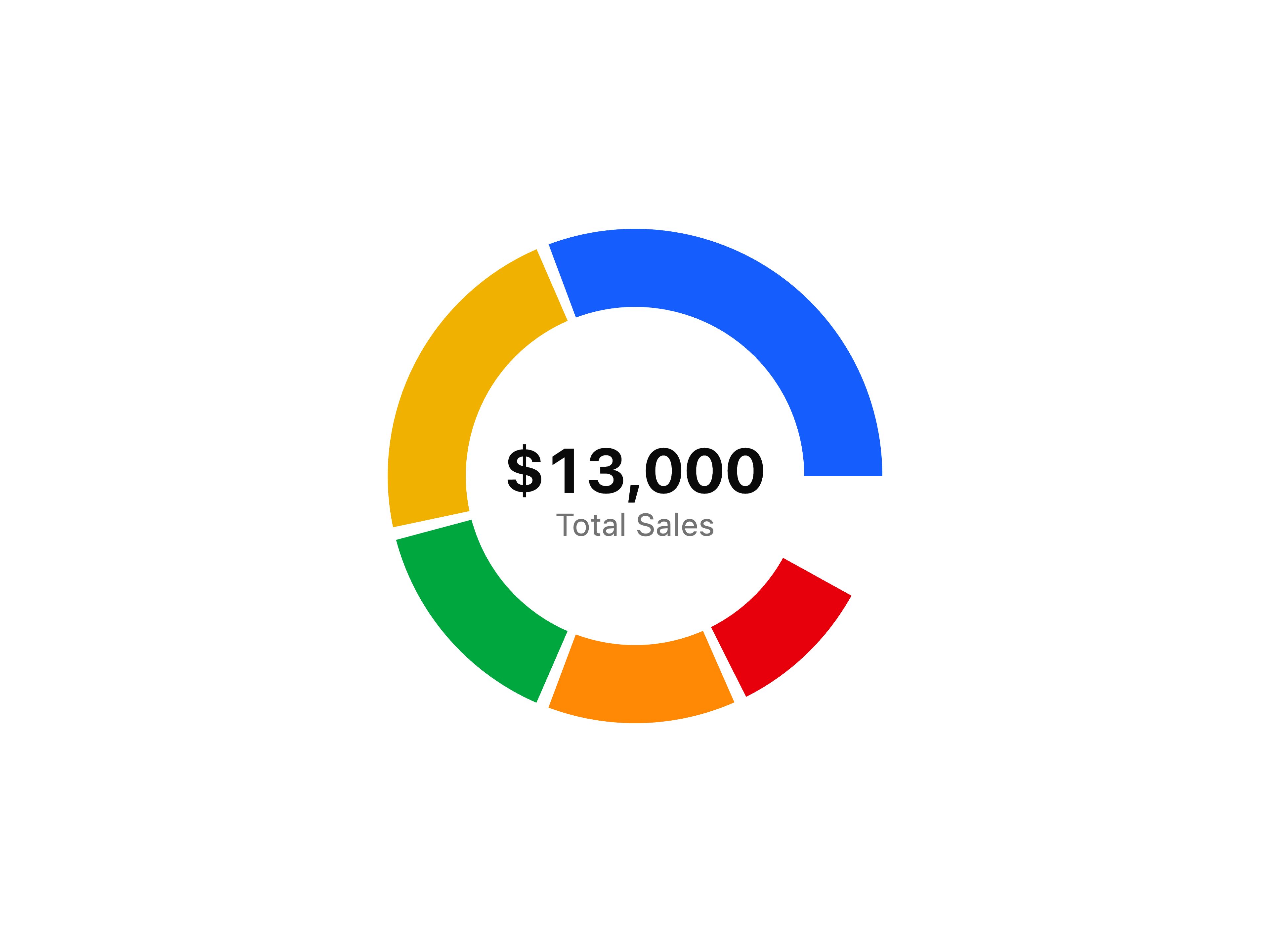
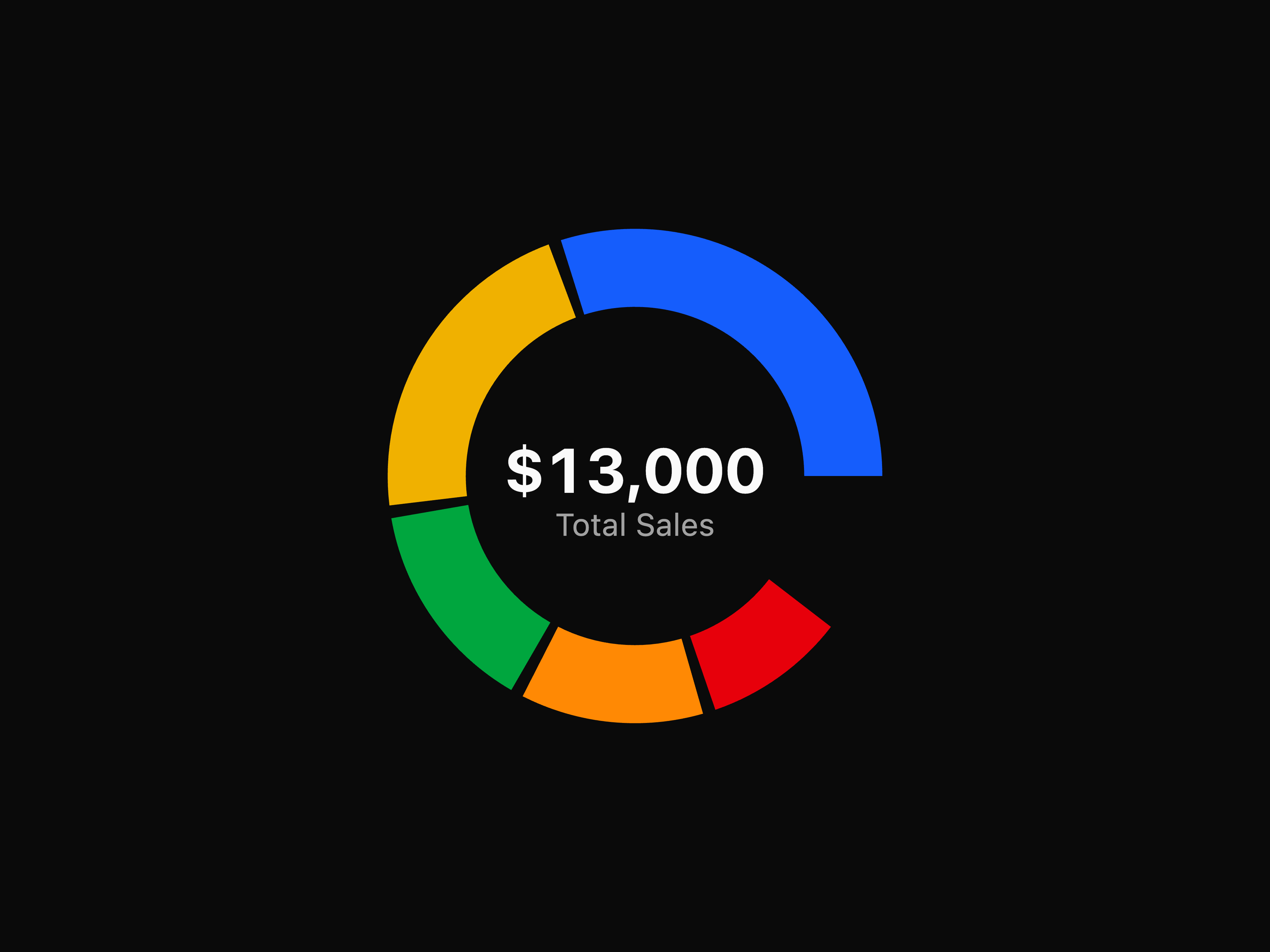
  • Income Donut Chart
  • Info Growing Spinner
  • Inline Code Typography
  • Input Badge
  • Input Form
  • Input Group Dropdown
  • Input Group Icon
  • Input Group Inline Start
  • Input Group Spinner
  • Input OTP Alphanumeric
  • Input OTP Controlled
  • Input OTP Form
  • Input OTP Separator
  • Item Icon Alert
  • Item Image
  • Kbd Button
  • Kbd Function Keys
  • Kbd Input Group
  • Label Disabled
  • Link Breadcrumb
  • Liquid Glass Card
  • List Group Badge
  • List Group Custom Content
  • List Group Links
  • Login Form with Social Providers
  • Marker Links
  • Marker Separator
  • Marker Status
  • Marketing Hero Section
  • Menubar Compact
  • Message Attachment
  • Message Header Footer
  • Message Scroller
  • Milestone Timeline Feature
  • Outline Button
  • Outlined Danger Alert
  • Outlined Primary Alert
  • Page Header Breadcrumb
  • Pill Badge
  • Portfolio Bento Grid
  • Portfolio Feature Showcase
  • Portfolio Showcase Grid
  • Position Sonner
  • Pricing Plans with Billing Toggle
  • Problem Cards Scroll Section
  • Process Steps Grid
  • Process Steps Section
  • Professional Team Grid
  • Progress Height
  • Questionnaire
  • Radio Group Box
  • Radio Group List
  • Radio Group Sizes
  • Required Field Label
  • SaaS Footer with Newsletter
  • SaaS Launch Content Block
  • Search Bar
  • Select Multi
  • Sidebar 1
  • Sidebar with Search and Profile
  • Slider Price Range
  • Slider Range
  • Small Typography
  • Split Feature Section
  • Spotlight Feature Grid
  • Statistics Section
  • Statistics Stats Section
  • Striped Progress Bar
  • Success Border Spinner
  • Switch Color Options
  • Table Skeleton
  • Table Status
  • Table Users
  • Tabs Line
  • Team Carousel Section
  • Team Grid Cards
  • Text Highlight
  • Text Skeleton
  • Toggle Group Animated Toolbar
  • Toolkit Hero Section
  • Tooltip Status
  • Tree View
  • Warning Border Spinner
  • Wedding Portfolio Carousel
  • Welcome Banner