
About
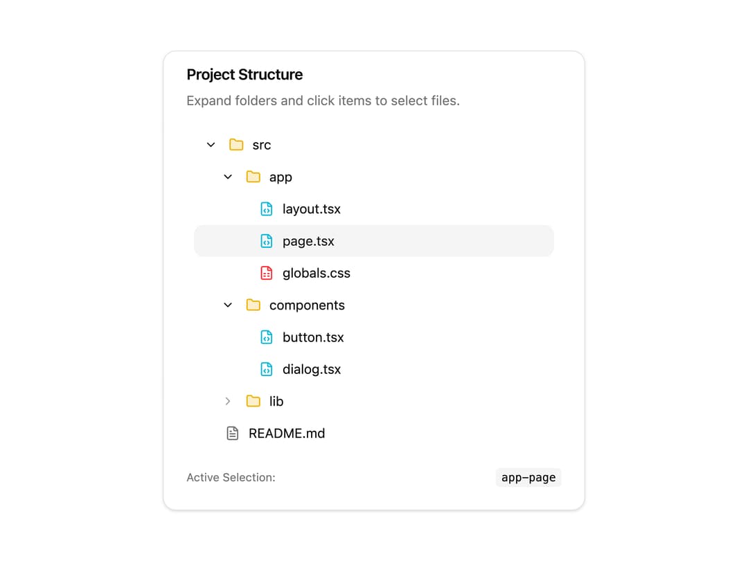
A collapsible hierarchical tree list for showing nested directory structures, org charts, or permission trees, with single/multi select, keyboard navigation, and expand/collapse.
Built with React and Tailwind. Copy the prompt and paste it into Claude Code, Cursor or Lovable: your agent adds Tree View to your project and fits it to your theme.
Code
How Tree View is used: the demo's code. The component's own source comes with a free account.
Usage.tsx
"use client";

import { useState } from "react";

// shadcn
import {
  Card,
  CardContent,
  CardDescription,
  CardHeader,
  CardTitle,
} from "@/components/ui/card";
import {
  TreeView,
  TreeItem,
  TreeItemRow,
  TreeItemToggle,
  TreeItemIcon,
  TreeItemLabel,
  TreeItemContent,
} from "@/components/ui/tree-view";

// assets
import { FileCode, FileSpreadsheet, FileText, Folder } from "lucide-react";

//  ------------------------------ | TREE VIEW - BASIC | ------------------------------  //

export default function TreeViewBasic() {
  const [selected, setSelected] = useState<string | string[]>("app-page");

  return (
    <Card className="w-full max-w-md">
      <CardHeader className="py-3">
        <CardTitle className="text-base">Project Structure</CardTitle>
        <CardDescription>
          Expand folders and click items to select files.
        </CardDescription>
      </CardHeader>
      <CardContent>
        <TreeView
          value={selected}
          onValueChange={setSelected}
          defaultExpandedValues={["src", "app", "components"]}
          className="rounded-lg bg-background/50 p-2"
        >
          {/* src folder */}
          <TreeItem value="src" hasChildren level={0}>
            <TreeItemRow>
              <TreeItemToggle />
              <TreeItemIcon>
                <Folder className="fill-yellow-500/20 text-yellow-500" />
              </TreeItemIcon>
              <TreeItemLabel>src</TreeItemLabel>
            </TreeItemRow>

            <TreeItemContent>
              {/* app folder */}
              <TreeItem value="app" hasChildren level={1}>
                <TreeItemRow>
                  <TreeItemToggle />
                  <TreeItemIcon>
                    <Folder className="fill-yellow-500/20 text-yellow-500" />
                  </TreeItemIcon>
                  <TreeItemLabel>app</TreeItemLabel>
                </TreeItemRow>

                <TreeItemContent>
                  <TreeItem value="app-layout" level={2}>
                    <TreeItemRow>
                      <TreeItemToggle />
                      <TreeItemIcon>
                        <FileCode className="text-cyan-500" />
                      </TreeItemIcon>
                      <TreeItemLabel>layout.tsx</TreeItemLabel>
                    </TreeItemRow>
                  </TreeItem>

                  <TreeItem value="app-page" level={2}>
                    <TreeItemRow>
                      <TreeItemToggle />
                      <TreeItemIcon>
                        <FileCode className="text-cyan-500" />
                      </TreeItemIcon>
                      <TreeItemLabel>page.tsx</TreeItemLabel>
                    </TreeItemRow>
                  </TreeItem>

                  <TreeItem value="app-globals" level={2}>
                    <TreeItemRow>
                      <TreeItemToggle />
                      <TreeItemIcon>
                        <FileSpreadsheet className="text-red-500" />
                      </TreeItemIcon>
                      <TreeItemLabel>globals.css</TreeItemLabel>
                    </TreeItemRow>
                  </TreeItem>
                </TreeItemContent>
              </TreeItem>

              {/* components folder */}
              <TreeItem value="components" hasChildren level={1}>
                <TreeItemRow>
                  <TreeItemToggle />
                  <TreeItemIcon>
                    <Folder className="fill-yellow-500/20 text-yellow-500" />
                  </TreeItemIcon>
                  <TreeItemLabel>components</TreeItemLabel>
                </TreeItemRow>

                <TreeItemContent>
                  <TreeItem value="comp-button" level={2}>
                    <TreeItemRow>
                      <TreeItemToggle />
                      <TreeItemIcon>
                        <FileCode className="text-cyan-500" />
                      </TreeItemIcon>
                      <TreeItemLabel>button.tsx</TreeItemLabel>
                    </TreeItemRow>
                  </TreeItem>

                  <TreeItem value="comp-dialog" level={2}>
                    <TreeItemRow>
                      <TreeItemToggle />
                      <TreeItemIcon>
                        <FileCode className="text-cyan-500" />
                      </TreeItemIcon>
                      <TreeItemLabel>dialog.tsx</TreeItemLabel>
                    </TreeItemRow>
                  </TreeItem>
                </TreeItemContent>
              </TreeItem>

              {/* lib folder */}
              <TreeItem value="lib" hasChildren level={1}>
                <TreeItemRow>
                  <TreeItemToggle />
                  <TreeItemIcon>
                    <Folder className="fill-yellow-500/20 text-yellow-500" />
                  </TreeItemIcon>
                  <TreeItemLabel>lib</TreeItemLabel>
                </TreeItemRow>

                <TreeItemContent>
                  <TreeItem value="lib-utils" level={2}>
                    <TreeItemRow>
                      <TreeItemToggle />
                      <TreeItemIcon>
                        <FileCode className="text-cyan-500" />
                      </TreeItemIcon>
                      <TreeItemLabel>utils.ts</TreeItemLabel>
                    </TreeItemRow>
                  </TreeItem>
                </TreeItemContent>
              </TreeItem>
            </TreeItemContent>
          </TreeItem>

          {/* README at root */}
          <TreeItem value="readme" level={0}>
            <TreeItemRow>
              <TreeItemToggle />
              <TreeItemIcon>
                <FileText className="text-muted-foreground" />
              </TreeItemIcon>
              <TreeItemLabel>README.md</TreeItemLabel>
            </TreeItemRow>
          </TreeItem>
        </TreeView>

        <div className="mt-3 flex items-center justify-between text-xs text-muted-foreground">
          <span>Active Selection:</span>
          <code className="rounded bg-muted px-1.5 py-0.5 font-mono font-medium text-foreground">
            {selected || "none"}
          </code>
        </div>
      </CardContent>
    </Card>
  );
}
Dependencies
More by uiable
View all

Feature Highlights Grid
341
Card Tabs
101
Financial Bento Grid
71
Chart Tooltip
67
Portfolio Showcase Grid
58
Marketing Hero Section
58
Sidebar with Search and Profile
50
Position Sonner
48