About
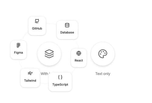
Animated skill badges that orbit a center element. On desktop the ring follows the cursor on hover; on mobile the ring is always visible. From Unlumen UI.
Built with React and Tailwind. Copy the prompt and paste it into Claude Code, Cursor or Lovable: your agent adds Unlumen Orbiting Skills to your project and fits it to your theme.
Code
How Unlumen Orbiting Skills is used: the demo's code. The component's own source comes with a free account.
Usage.tsx
"use client";

import type { ReactNode } from "react";

import {
  Braces,
  Database,
  Figma,
  Github,
  Globe,
  Layers,
  Palette,
  Wind,
} from "lucide-react";

import {
  OrbitingSkills,
  type OrbitSkillItem,
  type OrbitingSkillsProps,
} from "@/components/ui/unlumen-orbiting-skills";

const ICON_SKILLS: OrbitSkillItem[] = [
  { label: "React", icon: <Globe className="size-4" /> },
  { label: "TypeScript", icon: <Braces className="size-4" /> },
  { label: "Tailwind", icon: <Wind className="size-4" /> },
  { label: "Figma", icon: <Figma className="size-4" /> },
  { label: "GitHub", icon: <Github className="size-4" /> },
  { label: "Database", icon: <Database className="size-4" /> },
];

const TEXT_SKILLS: OrbitSkillItem[] = [
  { label: "Design" },
  { label: "Motion" },
  { label: "UX" },
  { label: "CSS" },
  { label: "a11y" },
  { label: "Perf" },
];

type OrbitingSkillsDemoProps = Pick<
  OrbitingSkillsProps,
  "radius" | "duration" | "showPath" | "followCursor"
>;

function Avatar({ children }: { children: ReactNode }) {
  return (
    <div className="flex size-20 items-center justify-center rounded-full border border-border bg-background shadow-md">
      {children}
    </div>
  );
}

export const OrbitingSkillsDemo = ({
  radius = 96,
  duration = 18,
  showPath = true,
  followCursor = true,
}: OrbitingSkillsDemoProps) => {
  return (
    <div className="flex min-h-[400px] flex-wrap items-center justify-center gap-24 p-16">
      {/* ── With Lucide icons ── */}
      <div className="flex flex-col items-center gap-4">
        <OrbitingSkills
          items={ICON_SKILLS}
          radius={radius}
          duration={duration}
          showPath={showPath}
          followCursor={followCursor}
        >
          <Avatar>
            <Layers className="size-8 text-foreground/70" />
          </Avatar>
        </OrbitingSkills>
        <p className="text-xs text-muted-foreground">With icons</p>
      </div>

      {/* ── Text only ── */}
      <div className="flex flex-col items-center gap-4">
        <OrbitingSkills
          items={TEXT_SKILLS}
          radius={radius}
          duration={duration}
          showPath={showPath}
          followCursor={followCursor}
        >
          <Avatar>
            <Palette className="size-8 text-foreground/70" />
          </Avatar>
        </OrbitingSkills>
        <p className="text-xs text-muted-foreground">Text only</p>
      </div>
    </div>
  );
};

export default function DefaultDemo() { return <OrbitingSkillsDemo />; }
Dependencies
More by unlumen
View all
Motion Navigation Menu
271
Side By Side Slide
228
Scroll Reveal Image
222
Count Up
145
Pixel Liquid Background
106
Glow Button
97
Animated Sidebar
95
Horizontal Depth Fade
78