
About
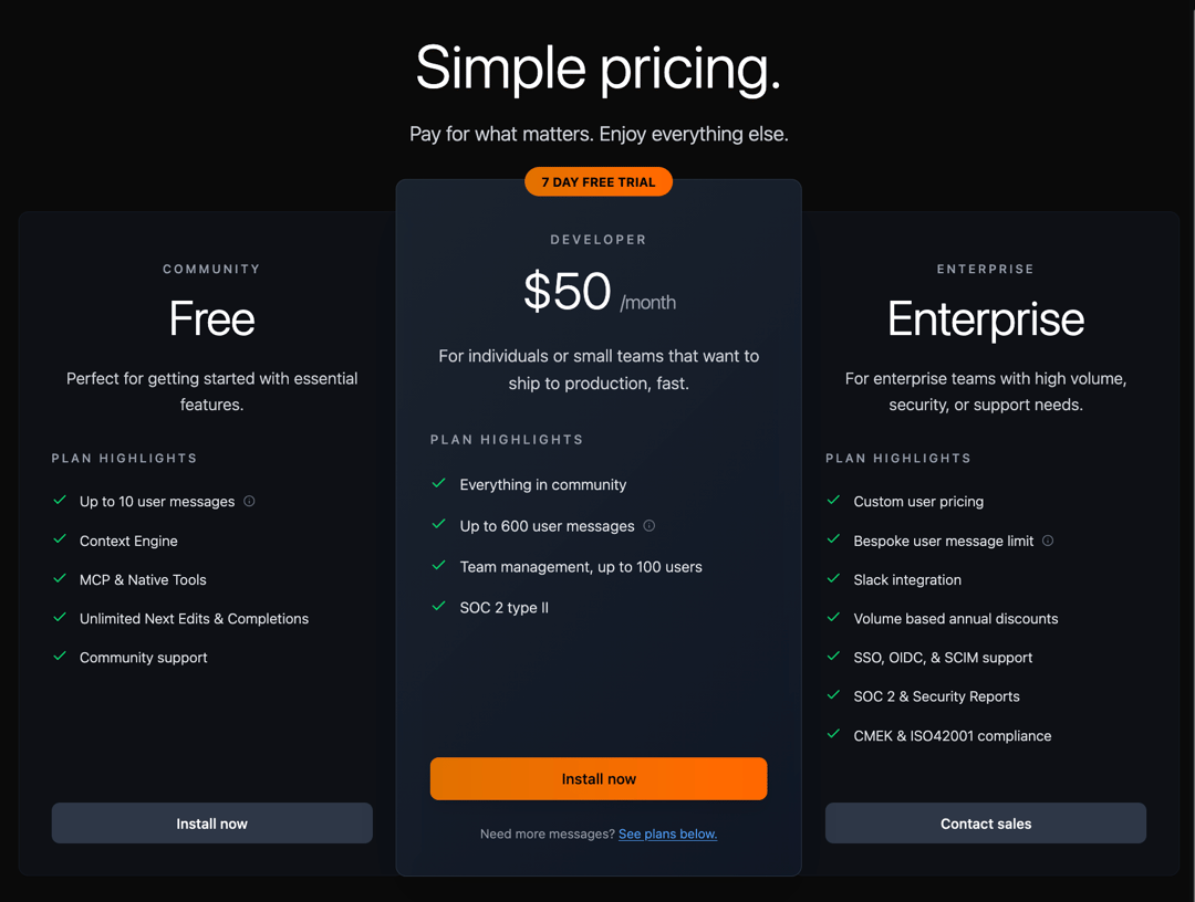
A comprehensive, responsive pricing section component that replicates modern SaaS pricing layouts. Features three-tier pricing cards with customizable badges, feature lists with checkmarks, gradient backgrounds, and call-to-action buttons. Includes support for free trials, enterprise contact, and highlighted plans with special styling.
Built with React and Tailwind. Copy the prompt and paste it into Claude Code, Cursor or Lovable: your agent adds Pricing Section to your project and fits it to your theme.
Code
How Pricing Section is used: the demo's code. The component's own source comes with a free account.
Usage.tsx
import React from 'react'
import PricingComponent from '@/components/ui/pricing-section'

const Demo = () => {
  const pricingTiers = [
    {
      name: "Free",
      subtitle: "COMMUNITY",
      description: "Perfect for getting started with essential features.",
      features: [
        { text: "Up to 10 user messages", included: true, hasInfo: true },
        { text: "Context Engine", included: true },
        { text: "MCP & Native Tools", included: true },
        { text: "Unlimited Next Edits & Completions", included: true },
        { text: "Community support", included: true }
      ],
      buttonText: "Install now"
    },
    {
      name: "$50",
      subtitle: "DEVELOPER",
      price: "$50",
      period: "/month",
      description: "For individuals or small teams that want to ship to production, fast.",
      badge: {
        text: "7 DAY FREE TRIAL"
      },
      features: [
        { text: "Everything in community", included: true },
        { text: "Up to 600 user messages", included: true, hasInfo: true },
        { text: "Team management, up to 100 users", included: true },
        { text: "SOC 2 type II", included: true }
      ],
      buttonText: "Install now",
      highlighted: true,
      footerText: "Need more messages?",
      footerLink: "See plans below."
    },
    {
      name: "Enterprise",
      subtitle: "ENTERPRISE",
      description: "For enterprise teams with high volume, security, or support needs.",
      features: [
        { text: "Custom user pricing", included: true },
        { text: "Bespoke user message limit", included: true, hasInfo: true },
        { text: "Slack integration", included: true },
        { text: "Volume based annual discounts", included: true },
        { text: "SSO, OIDC, & SCIM support", included: true },
        { text: "SOC 2 & Security Reports", included: true },
        { text: "CMEK & ISO42001 compliance", included: true }
      ],
      buttonText: "Contact sales"
    }
  ]

  return (
    <div className="w-full">
      <PricingComponent
        tiers={pricingTiers}
      />
    </div>
  )
}

export default Demo
Dependencies
More by Vaibhav Kumar Singh
View all
Stagger Testimonials
2K
Event Manager
1.6K
Expanding Cards
1.4K
FAQ tabs
1.2K
Shuffle Grid
1K
Flip Links
1K
Category List
820
Color Change Card
758
More in Pricing
View all
Pricing Section
575

Pricing Section
173

Pricing Card
362

Pricing Cards
85
Single Pricing Card
792
Glowing Pricing Tiers
39
pricing section
157
Colorful-Pricing
84


