
About
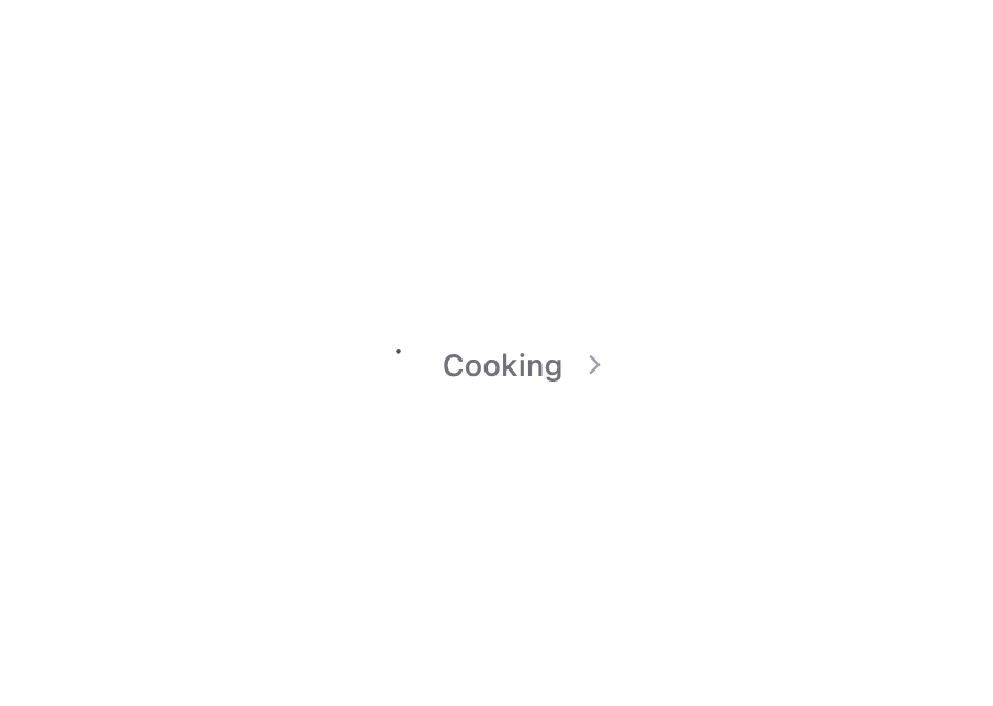
An animated loading breadcrumb component with a spinning SVG loader icon, shimmer text effect, and chevron. Perfect for indicating loading states in a visually appealing way.
Built with React and Tailwind. Copy the prompt and paste it into Claude Code, Cursor or Lovable: your agent adds Animated Loading SVG + Text Shimmer to your project and fits it to your theme.
Code
How Animated Loading SVG + Text Shimmer is used: the demo's code. The component's own source comes with a free account.
Usage.tsx
import { LoadingBreadcrumb } from '@/components/ui/animated-loading-svg-text-shimmer';
import { useTheme } from 'next-themes';
import { Button } from '@/components/ui/button';
import { Moon, Sun } from 'lucide-react';

export default function App() {
  const { theme, setTheme } = useTheme();

  return (
    <div className="flex min-h-screen items-center justify-center font-sans p-8">
      {/* Theme Toggle */}
      <div className="fixed top-4 right-4">
        <Button
          variant="outline"
          size="icon"
          onClick={() => setTheme(theme === 'dark' ? 'light' : 'dark')}
        >
          <Sun className="h-[1.2rem] w-[1.2rem] rotate-0 scale-100 transition-all dark:-rotate-90 dark:scale-0" />
          <Moon className="absolute h-[1.2rem] w-[1.2rem] rotate-90 scale-0 transition-all dark:rotate-0 dark:scale-100" />
          <span className="sr-only">Toggle theme</span>
        </Button>
      </div>

      <LoadingBreadcrumb />
    </div>
  );
}
Dependencies
More by Zachary BENSALEM
View all

Prompt Input dynamic grow
361
Toggle Switch Glass
75
Copy Button - Variants
58
Sign In Minimalist
2
SegmentedControl
Dropdown Menu - Apps SDK UI
More in Text
View all

Vertical Cut Reveal Characters
103

Rainbow Text Effect
47
Motion Blur Text
36
Text Loop
306
Text Reveal
27
Apple Hello Effect
608

Animated Text
8
Lightning Text
122

