
About
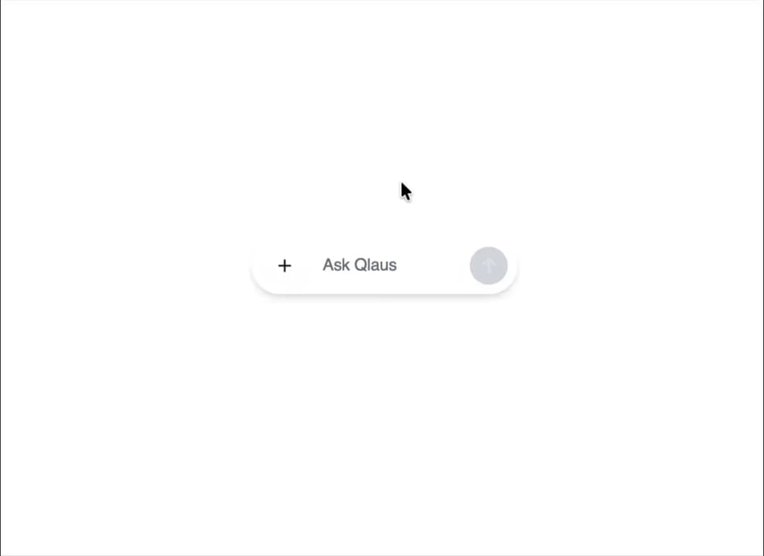
A prompt input that grow on click, with subtle glow, and a onFocus on click ripple effect. shrink when not anymore inFocus
Built with React and Tailwind. Copy the prompt and paste it into Claude Code, Cursor or Lovable: your agent adds Prompt Input dynamic grow to your project and fits it to your theme.
Code
How Prompt Input dynamic grow is used: the demo's code. The component's own source comes with a free account.
Usage.tsx
import { defineProperties } from "figma:react";
import React, { createContext, useContext, useEffect, useState, useRef, useCallback, memo, useMemo } from "react";
import { Plus } from "lucide-react";

// ===== TYPES =====

type MenuOption = "Auto" | "Max" | "Search" | "Plan";

interface RippleEffect {
  x: number;
  y: number;
  id: number;
}

interface Position {
  x: number;
  y: number;
}

interface ChatInputProps {
  /**
   * Placeholder text for the input field
   */
  placeholder?: string;
  /**
   * Function called when the form is submitted
   */
  onSubmit?: (value: string) => void;
  /**
   * Whether the input is disabled
   */
  disabled?: boolean;
  /**
   * Intensity of the glow effect (0.1 to 1.0)
   */
  glowIntensity?: number;
  /**
   * Whether the input expands on focus
   */
  expandOnFocus?: boolean;
  /**
   * Duration of animations in ms
   */
  animationDuration?: number;
  /**
   * Text color
   */
  textColor?: string;
  /**
   * Background opacity (0.1 to 1.0)
   */
  backgroundOpacity?: number;
  /**
   * Whether to show visual effects
   */
  showEffects?: boolean;
  /**
   * Available menu options
   */
  menuOptions?: MenuOption[];
}

interface InputAreaProps {
  value: string;
  setValue: React.Dispatch<React.SetStateAction<string>>;
  placeholder: string;
  handleKeyDown: (e: React.KeyboardEvent) => void;
  disabled: boolean;
  isSubmitDisabled: boolean;
  textColor: string;
}

interface GlowEffectsProps {
  glowIntensity: number;
  mousePosition: Position;
  animationDuration: number;
  enabled: boolean;
}

interface RippleEffectsProps {
  ripples: RippleEffect[];
  enabled: boolean;
}

interface MenuButtonProps {
  toggleMenu: () => void;
  menuRef: React.RefObject<HTMLDivElement>;
  isMenuOpen: boolean;
  onSelectOption: (option: MenuOption) => void;
  textColor: string;
  menuOptions: MenuOption[];
}

interface SelectedOptionsProps {
  options: MenuOption[];
  onRemove: (option: MenuOption) => void;
  textColor: string;
}

interface SendButtonProps {
  isDisabled: boolean;
  textColor: string;
}

interface OptionsMenuProps {
  isOpen: boolean;
  onSelect: (option: MenuOption) => void;
  textColor: string;
  menuOptions: MenuOption[];
}

interface OptionTagProps {
  option: MenuOption;
  onRemove: (option: MenuOption) => void;
  textColor: string;
}

// ===== CONTEXT =====

interface ChatInputContextProps {
  mousePosition: Position;
  ripples: RippleEffect[];
  addRipple: (x: number, y: number) => void;
  animationDuration: number;
  glowIntensity: number;
  textColor: string;
  showEffects: boolean;
}

const ChatInputContext = createContext<ChatInputContextProps | undefined>(undefined);

function useChatInputContext() {
  const context = useContext(ChatInputContext);
  if (context === undefined) {
    throw new Error("useChatInputContext must be used within a ChatInputProvider");
  }
  return context;
}

// ===== COMPONENTS =====

// Send button component
const SendButton = memo(({
  isDisabled,
  textColor
}: SendButtonProps) => {
  const backgroundColor = isDisabled
    ? `${textColor}/40`
    : `${textColor}/60`;

  const hoverBackgroundColor = `${textColor}/70`;

  return (
    <button
      type="submit"
      aria-label="Send message"
      disabled={isDisabled}
      className={`ml-auto self-center h-8 w-8 flex items-center justify-center rounded-full border-0 p-0 transition-all z-20 ${
        isDisabled
          ? 'opacity-40 cursor-not-allowed bg-gray-400 text-white/60'
          : 'opacity-90 bg-[#0A1217] text-white hover:opacity-100 cursor-pointer hover:shadow-lg'
      }`}
    >
      <svg
        width="32"
        height="32"
        viewBox="0 0 32 32"
        fill="none"
        xmlns="http://www.w3.org/2000/svg"
        className={`block ${isDisabled ? "opacity-50" : "opacity-100"}`}
      >
        <path
          d="M16 22L16 10M16 10L11 15M16 10L21 15"
          stroke="currentColor"
          strokeWidth="1.7"
          strokeLinecap="round"
          strokeLinejoin="round"
        />
      </svg>
    </button>
  );
});

// Options menu component
const OptionsMenu = memo(({
  isOpen,
  onSelect,
  textColor,
  menuOptions
}: OptionsMenuProps) => {
  if (!isOpen) return null;

  return (
    <div className="absolute top-full left-0 mt-1 bg-white rounded-lg shadow-lg overflow-hidden z-30 min-w-[120px]">
      <ul className="py-1">
        {menuOptions.map((option) => (
          <li
            key={option}
            className={`px-4 py-2 hover:bg-gray-100 cursor-pointer text-[${textColor}] text-sm font-medium`}
            onClick={() => onSelect(option)}
            style={{ fontFamily: '"Inter", sans-serif' }}
          >
            {option}
          </li>
        ))}
      </ul>
    </div>
  );
});

// Option tag component
const OptionTag = memo(({
  option,
  onRemove,
  textColor
}: OptionTagProps) => (
  <div
    className={`flex items-center gap-1 bg-[${textColor}]/10 px-2 py-1 rounded-md text-xs text-[${textColor}]`}
    style={{ fontFamily: '"Inter", sans-serif' }}
  >
    <span>{option}</span>
    <button
      type="button"
      onClick={() => onRemove(option)}
      className={`h-4 w-4 flex items-center justify-center rounded-full hover:bg-[${textColor}]/20 text-[${textColor}]/70`}
    >
      <svg
        width="10"
        height="10"
        viewBox="0 0 24 24"
        fill="none"
        xmlns="http://www.w3.org/2000/svg"
      >
        <path
          d="M18 6L6 18M6 6l12 12"
          stroke="currentColor"
          strokeWidth="2"
          strokeLinecap="round"
          strokeLinejoin="round"
        />
      </svg>
    </button>
  </div>
));

// Visual effects component
const GlowEffects = memo(({
  glowIntensity,
  mousePosition,
  animationDuration,
  enabled
}: GlowEffectsProps) => {
  if (!enabled) return null;

  const transitionStyle = `transition-opacity duration-${animationDuration}`;

  return (
    <>
      {/* Enhanced liquid glass background */}
      <div className="absolute inset-0 bg-gradient-to-r from-white/8 via-white/12 to-white/8 backdrop-blur-2xl rounded-3xl"></div>

      {/* Outside border glow effect */}
      <div
        className={`absolute inset-0 rounded-3xl opacity-0 group-hover:opacity-100 group-focus-within:opacity-100 ${transitionStyle} pointer-events-none`}
        style={{
          boxShadow: `
            0 0 0 1px rgba(147, 51, 234, ${0.2 * glowIntensity}),
            0 0 8px rgba(147, 51, 234, ${0.3 * glowIntensity}),
            0 0 16px rgba(236, 72, 153, ${0.2 * glowIntensity}),
            0 0 24px rgba(59, 130, 246, ${0.15 * glowIntensity})
          `,
          filter: 'blur(0.5px)',
        }}
      ></div>

      {/* Enhanced outside glow on hover */}
      <div
        className={`absolute inset-0 rounded-3xl opacity-0 group-hover:opacity-100 ${transitionStyle} pointer-events-none`}
        style={{
          boxShadow: `
            0 0 12px rgba(147, 51, 234, ${0.4 * glowIntensity}),
            0 0 20px rgba(236, 72, 153, ${0.25 * glowIntensity}),
            0 0 32px rgba(59, 130, 246, ${0.2 * glowIntensity})
          `,
          filter: 'blur(1px)',
        }}
      ></div>

      {/* Cursor following gradient */}
      <div
        className={`absolute inset-0 rounded-3xl opacity-0 group-hover:opacity-20 transition-opacity duration-300 pointer-events-none blur-sm`}
        style={{
          background: `radial-gradient(circle 120px at ${mousePosition.x}% ${mousePosition.y}%, rgba(147,51,234,0.08) 0%, rgba(236,72,153,0.05) 30%, rgba(59,130,246,0.04) 60%, transparent 100%)`,
        }}
      ></div>

      {/* Subtle trail animation overlay */}
      <div className={`absolute inset-0 rounded-3xl opacity-0 group-hover:opacity-30 transition-opacity duration-300 overflow-hidden blur-sm`}>
        <div
          className="absolute inset-0 bg-gradient-to-r from-transparent via-purple-400/8 to-transparent transform -translate-x-full group-hover:translate-x-full"
          style={{
            transitionProperty: 'transform',
            transitionDuration: `${animationDuration * 2}ms`,
            transitionTimingFunction: 'ease-out'
          }}
        ></div>
      </div>

      {/* Subtle shimmer overlay */}
      <div className={`absolute inset-0 rounded-3xl opacity-0 group-hover:opacity-25 ${transitionStyle} bg-gradient-to-r from-transparent via-white/4 to-transparent animate-pulse blur-sm`}></div>

      {/* Minimal gradient background on hover */}
      <div className={`absolute inset-0 rounded-3xl opacity-0 group-hover:opacity-15 group-focus-within:opacity-10 transition-opacity duration-300 bg-gradient-to-r from-purple-400/5 via-pink-400/5 to-blue-400/5 blur-sm`}></div>
    </>
  );
});

// Ripple effects component
const RippleEffects = memo(({ ripples, enabled }: RippleEffectsProps) => {
  if (!enabled || ripples.length === 0) return null;

  return (
    <>
      {ripples.map((ripple) => (
        <div
          key={ripple.id}
          className="absolute pointer-events-none blur-sm"
          style={{
            left: ripple.x - 25,
            top: ripple.y - 25,
            width: 50,
            height: 50,
          }}
        >
          <div className="w-full h-full rounded-full bg-gradient-to-r from-purple-400/15 via-pink-400/10 to-blue-400/15 animate-ping"></div>
        </div>
      ))}
    </>
  );
});

// Input area component
const InputArea = memo(({
  value,
  setValue,
  placeholder,
  handleKeyDown,
  disabled,
  isSubmitDisabled,
  textColor
}: InputAreaProps) => {
  const textareaRef = useRef<HTMLTextAreaElement | null>(null);

  // Auto-resize textarea
  useEffect(() => {
    if (textareaRef.current) {
      textareaRef.current.style.height = "auto";
      const scrollHeight = textareaRef.current.scrollHeight;
      const lineHeight = 22;
      const maxHeight = lineHeight * 4 + 16;
      textareaRef.current.style.height =
        Math.min(scrollHeight, maxHeight) + "px";
    }
  }, [value]);

  return (
    <div className="flex-1 relative h-full flex items-center">
      <textarea
        ref={textareaRef}
        value={value}
        onChange={(e) => setValue(e.target.value)}
        onKeyDown={handleKeyDown}
        placeholder={placeholder}
        aria-label="Message Input"
        rows={1}
        className={`w-full min-h-8 max-h-24 bg-transparent text-sm font-normal text-left self-center text-[${textColor}] placeholder-[#6B7280] border-0 outline-none px-3 pr-10 py-1 z-20 relative resize-none overflow-y-auto`}
        style={{
          fontFamily: '"Inter", sans-serif',
          letterSpacing: "-0.14px",
          lineHeight: "22px",
        }}
        disabled={disabled}
      />
      <SendButton isDisabled={isSubmitDisabled} textColor={textColor} />
    </div>
  );
});

// Menu Button component
const MenuButton = memo(({
  toggleMenu,
  menuRef,
  isMenuOpen,
  onSelectOption,
  textColor,
  menuOptions
}: MenuButtonProps) => (
  <div className="relative" ref={menuRef}>
    <button
      type="button"
      onClick={toggleMenu}
      aria-label="Menu options"
      className={`h-8 w-8 flex items-center justify-center rounded-full bg-[${textColor}]/10 hover:bg-[${textColor}]/20 text-[${textColor}] transition-all ml-1 mr-1`}
    >
      <Plus size={16} />
    </button>
    <OptionsMenu
      isOpen={isMenuOpen}
      onSelect={onSelectOption}
      textColor={textColor}
      menuOptions={menuOptions}
    />
  </div>
));

// Selected options component
const SelectedOptions = memo(({
  options,
  onRemove,
  textColor
}: SelectedOptionsProps) => {
  if (options.length === 0) return null;

  return (
    <div className="flex flex-wrap gap-2 mt-2 pl-3 pr-3 z-20 relative">
      {options.map((option) => (
        <OptionTag
          key={option}
          option={option}
          onRemove={onRemove}
          textColor={textColor}
        />
      ))}
    </div>
  );
});

export default function ChatGPTInput({
  placeholder = "Ask Qlaus",
  onSubmit = (value: string) => console.log("Submitted:", value),
  disabled = false,
  glowIntensity = 0.4,
  expandOnFocus = true,
  animationDuration = 500,
  textColor = "#0A1217",
  backgroundOpacity = 0.15,
  showEffects = true,
  menuOptions = ["Auto", "Max", "Search", "Plan"] as MenuOption[]
}: ChatInputProps) {
  // State
  const [value, setValue] = useState("");
  const [isMenuOpen, setIsMenuOpen] = useState(false);
  const [selectedOptions, setSelectedOptions] = useState<MenuOption[]>([]);
  const [ripples, setRipples] = useState<RippleEffect[]>([]);
  const [mousePosition, setMousePosition] = useState<Position>({ x: 50, y: 50 });

  // Refs
  const containerRef = useRef<HTMLDivElement | null>(null);
  const menuRef = useRef<HTMLDivElement | null>(null);
  const throttleRef = useRef<number | null>(null);

  // Close menu when clicking outside
  useEffect(() => {
    const handleClickOutside = (event: MouseEvent) => {
      if (menuRef.current && !menuRef.current.contains(event.target as Node)) {
        setIsMenuOpen(false);
      }
    };

    document.addEventListener("mousedown", handleClickOutside);
    return () => {
      document.removeEventListener("mousedown", handleClickOutside);
    };
  }, []);

  // Handle submit
  const handleSubmit = useCallback(
    (e: React.FormEvent) => {
      e.preventDefault();
      if (value.trim() && onSubmit && !disabled) {
        onSubmit(value.trim());
        setValue("");
      }
    },
    [value, onSubmit, disabled]
  );

  // Handle key down
  const handleKeyDown = useCallback(
    (e: React.KeyboardEvent) => {
      if (e.key === "Enter" && !e.shiftKey) {
        e.preventDefault();
        handleSubmit(e as any);
      }
    },
    [handleSubmit]
  );

  // Throttled mouse move handler
  const handleMouseMove = useCallback((e: React.MouseEvent) => {
    if (!showEffects) return;

    if (containerRef.current && !throttleRef.current) {
      throttleRef.current = window.setTimeout(() => {
        const rect = containerRef.current?.getBoundingClientRect();
        if (rect) {
          const x = ((e.clientX - rect.left) / rect.width) * 100;
          const y = ((e.clientY - rect.top) / rect.height) * 100;
          setMousePosition({ x, y });
        }
        throttleRef.current = null;
      }, 50); // throttle to 50ms
    }
  }, [showEffects]);

  // Add ripple effect
  const addRipple = useCallback((x: number, y: number) => {
    if (!showEffects) return;

    // Limit number of ripples for performance
    if (ripples.length < 5) {
      const newRipple: RippleEffect = {
        x,
        y,
        id: Date.now(),
      };

      setRipples(prev => [...prev, newRipple]);

      // Remove ripple after animation
      setTimeout(() => {
        setRipples(prev => prev.filter(ripple => ripple.id !== newRipple.id));
      }, 600);
    }
  }, [ripples, showEffects]);

  // Handle click for ripple effect
  const handleClick = useCallback((e: React.MouseEvent) => {
    if (containerRef.current) {
      const rect = containerRef.current.getBoundingClientRect();
      const x = e.clientX - rect.left;
      const y = e.clientY - rect.top;

      addRipple(x, y);
    }
  }, [addRipple]);

  // Toggle menu
  const toggleMenu = useCallback(() => {
    setIsMenuOpen(prev => !prev);
  }, []);

  // Select option
  const selectOption = useCallback((option: MenuOption) => {
    setSelectedOptions(prev => {
      if (!prev.includes(option)) {
        return [...prev, option];
      }
      return prev;
    });
    setIsMenuOpen(false);
  }, []);

  // Remove option
  const removeOption = useCallback((option: MenuOption) => {
    setSelectedOptions(prev => prev.filter(opt => opt !== option));
  }, []);

  // Create context value
  const contextValue = useMemo(() => ({
    mousePosition,
    ripples,
    addRipple,
    animationDuration,
    glowIntensity,
    textColor,
    showEffects
  }), [mousePosition, ripples, addRipple, animationDuration, glowIntensity, textColor, showEffects]);

  // Check if submit is disabled
  const isSubmitDisabled = disabled || !value.trim();

  // Calculate width classes
  const hasModeSelected = selectedOptions.length > 0;
  const shouldExpandOnFocus = expandOnFocus && !hasModeSelected;
  const baseWidthClass = hasModeSelected ? "w-96" : "w-56";
  const focusWidthClass = shouldExpandOnFocus ? "focus-within:w-96" : "";

  // Background opacity class
  const bgOpacityValue = Math.floor(backgroundOpacity * 100);
  const backgroundClass = `bg-white/${bgOpacityValue}`;

  return (
    <ChatInputContext.Provider value={contextValue}>
      <form
        onSubmit={handleSubmit}
        className={`sticky bottom-4 left-1/2 -translate-x-1/2 z-50 mx-auto min-h-12 ${baseWidthClass} transition-all duration-${animationDuration} ease-out ${focusWidthClass} translate-y-0 opacity-100`}
        style={{
          transition: `transform ${animationDuration}ms, opacity 200ms, left 200ms, width ${animationDuration}ms`,
        }}
      >
        <div
          ref={containerRef}
          onMouseMove={handleMouseMove}
          onClick={handleClick}
          className={`relative flex flex-col w-full min-h-full ${backgroundClass} backdrop-blur-xl shadow-lg rounded-3xl p-2 overflow-visible group transition-all duration-${animationDuration} hover:${backgroundClass.replace(/\/\d+$/, `/${bgOpacityValue + 5}`)}`}
          style={{
            boxShadow:
              "0 4px 6px -1px rgba(0, 0, 0, 0.1), 0 2px 4px -1px rgba(0, 0, 0, 0.06)",
            transition: `all ${animationDuration}ms ease, box-shadow ${animationDuration}ms ease`,
          }}
        >
          {/* Visual effects */}
          <GlowEffects
            glowIntensity={glowIntensity}
            mousePosition={mousePosition}
            animationDuration={animationDuration}
            enabled={showEffects}
          />

          {/* Ripple effects */}
          <RippleEffects ripples={ripples} enabled={showEffects} />

          {/* Input row with plus button */}
          <div className="flex items-center relative z-20">
            <MenuButton
              toggleMenu={toggleMenu}
              menuRef={menuRef}
              isMenuOpen={isMenuOpen}
              onSelectOption={selectOption}
              textColor={textColor}
              menuOptions={menuOptions}
            />

            <InputArea
              value={value}
              setValue={setValue}
              placeholder={placeholder}
              handleKeyDown={handleKeyDown}
              disabled={disabled}
              isSubmitDisabled={isSubmitDisabled}
              textColor={textColor}
            />
          </div>

          {/* Selected options row */}
          <SelectedOptions
            options={selectedOptions}
            onRemove={removeOption}
            textColor={textColor}
          />
        </div>
      </form>
    </ChatInputContext.Provider>
  );
}
Dependencies
More by Zachary BENSALEM
View all

Animated Loading SVG + Text Shimmer
371
Toggle Switch Glass
75
Copy Button - Variants
58
Sign In Minimalist
2
SegmentedControl
Dropdown Menu - Apps SDK UI