
About
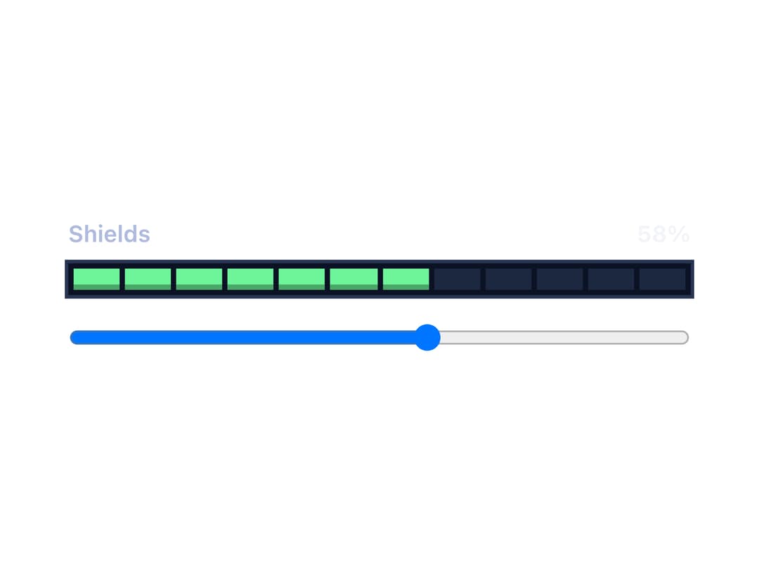
A segmented pixel-block bar that shows a level (like fuel, shields or cargo) between a min and max value, changing color at configurable warning and danger thresholds. Ported to React from the sb-meter Datastar/Rocket web component by zweiundeins (Starbase).
Built with React and Tailwind. Copy the prompt and paste it into Claude Code, Cursor or Lovable: your agent adds Meter to your project and fits it to your theme.
Code
How Meter is used: the demo's code. The component's own source comes with a free account.
Usage.tsx
"use client";
import * as React from "react";
import Meter from "@/components/ui/meter";

export default function MeterLiveDemo() {
  const [shields, setShields] = React.useState(58);
  return (
    <div style={{ display: "grid", gap: 16, inlineSize: "min(100%, 22rem)" }}>
      <Meter label="Shields" unit="%" value={shields} />
      <input
        type="range"
        min={0}
        max={100}
        value={shields}
        onChange={(e) => setShields(Number(e.target.value))}
        aria-label="Power to shields"
        style={{ inlineSize: "100%" }}
      />
    </div>
  );
}
More by zweiundeins
View all
Theme Switch
11
Busy
7
Odometer
Radio Group
Gauge
Checkbox Group
QR Code
Alert