
About
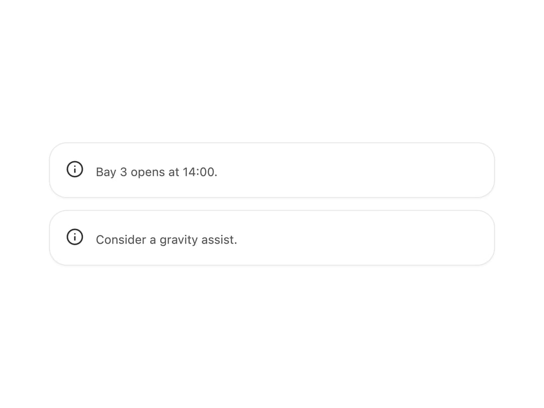
A status alert box with four tones (info, success, warning, danger), an optional bold heading, an icon slot, and an optional dismiss button — ported from the Starbase web component by zweiundeins.
Built with React and Tailwind. Copy the prompt and paste it into Claude Code, Cursor or Lovable: your agent adds Alert to your project and fits it to your theme.
Code
How Alert is used: the demo's code. The component's own source comes with a free account.
Usage.tsx
import Alert from "@/components/ui/alert";

export default function IconAlertDemo() {
  return (
    <div className="grid gap-3 w-full max-w-md">
      <Alert heading="Docking window">Bay 3 opens at 14:00.</Alert>
      <Alert
        variant="warning"
        heading="Low fuel"
        icon={<span aria-hidden="true">⛽</span>}
      >
        Consider a gravity assist.
      </Alert>
    </div>
  );
}
More by zweiundeins
View all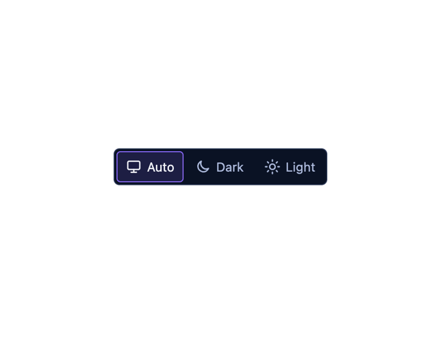
Theme Switch
11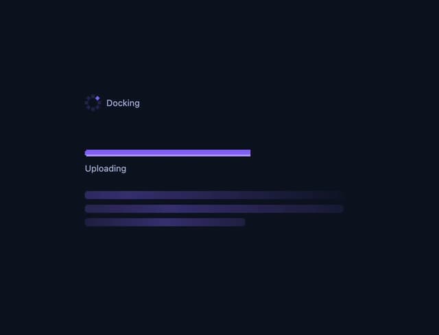
Busy
7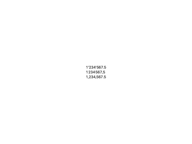
Odometer
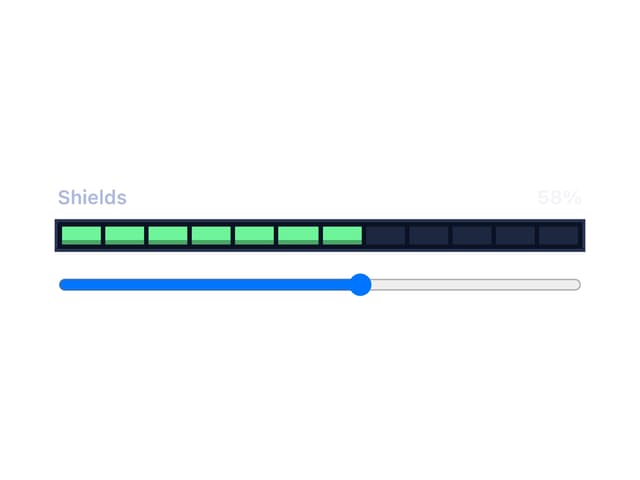
Meter
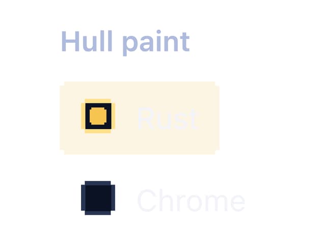
Radio Group
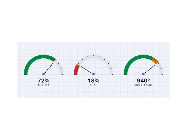
Gauge
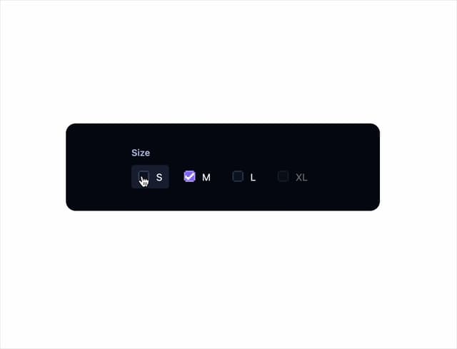
Checkbox Group
QR Code