
About
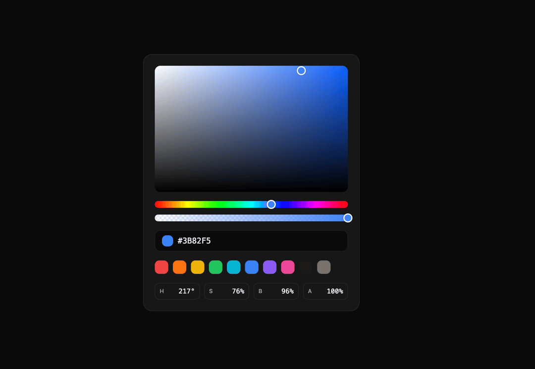
A polished color picker built from Cromia headless primitives, with area selection, hue and alpha sliders, editable channels, and preset swatches.
Built with React and Tailwind. Copy the prompt and paste it into Claude Code, Cursor or Lovable: your agent adds Cromia Color Picker to your project and fits it to your theme.
Code
How Cromia Color Picker is used: the demo's code. The component's own source comes with a free account.
Usage.tsx
import CromiaColorPicker from "@/components/ui/cromia-color-picker"

const settings = {
  hue: 217,
  saturation: 76,
  brightness: 96,
  alpha: 100,
}

export default function CromiaColorPickerDemo(
  props: Partial<typeof settings>,
) {
  const values = { ...settings, ...props }

  return (
    <div className="flex min-h-[560px] w-full items-center justify-center p-8">
      <CromiaColorPicker
        hue={values.hue}
        saturation={values.saturation}
        brightness={values.brightness}
        alpha={values.alpha}
      />
    </div>
  )
}
More by arikchakma
View all
Cromia Compact
18
Cromia Channels
14
Cromia Swatches
10
Unit Field
2
More in Forms
View all

Premium Auth
500

Login 1
52

Book A Demo 3
83
Authentication Card
47
Book A Demo 1
69

Contact Card
1K

Login Card
32

Login 2
7
