
About
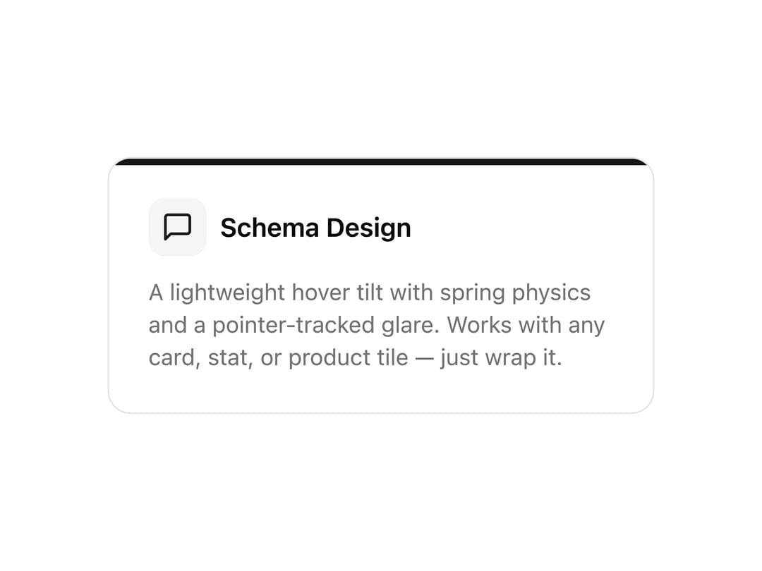
A lightweight 3D tilt container with spring physics and a pointer-tracked glare. Wrap any card, stat, or product tile for an interactive hover tilt; disable on touch.
Built with React and Tailwind. Copy the prompt and paste it into Claude Code, Cursor or Lovable: your agent adds Tilt Card to your project and fits it to your theme.
Code
How Tilt Card is used: the demo's code. The component's own source comes with a free account.
Usage.tsx
import TiltCard from '@/components/ui/tilt-card'

export default function TiltCardDemo() {
  return (
    <div className="w-full max-w-sm mx-auto p-6 bg-background">
      <TiltCard>
        <div className="relative p-6 bg-card rounded-xl border border-border overflow-hidden">
          <div className="absolute top-0 left-0 right-0 h-1 bg-primary" />
          <div className="flex items-center gap-2 mb-3">
            <div className="p-2 bg-muted rounded-lg">
              <svg className="w-5 h-5 text-primary" fill="none" stroke="currentColor" viewBox="0 0 24 24">
                <path strokeLinecap="round" strokeLinejoin="round" strokeWidth={2} d="M21 15a2 2 0 01-2 2H7l-4 4V5a2 2 0 012-2h14a2 2 0 012 2z" />
              </svg>
            </div>
            <h3 className="font-semibold text-foreground">Schema Design</h3>
          </div>
          <p className="text-sm text-muted-foreground">
            A lightweight hover tilt with spring physics and a pointer-tracked glare. Works with any card, stat, or
            product tile — just wrap it.
          </p>
        </div>
      </TiltCard>
    </div>
  )
}
Dependencies
More by Abubakri Faaruq
View all
3D Flip Card
More in Cards
View all
Stats cards with links
33

Course Design Cards
1.1K

Card
70
Statistics Card 2
264
Statistics Card 10
263

Card
17

Card Studio
9
The Item one
3
