
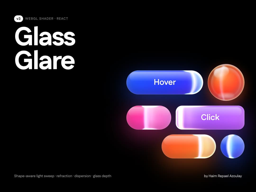
An animated glass glare that wears the shape it lives on. The light front is born on the leading edge (pill cap, rounded corner, circle), hugs the rim all the way as it leaves, relaxes to a straight line mid-run and lands on the trailing edge the same way. v3: edge ribbons and a crest on the rim, refraction around the rim, chromatic dispersion on the front, fresnel glass depth, a faint ambient wash and an eased sweep (soft start, fast middle, gentle landing). Pause between sweeps, both directions, freeze at any progress for stills. Pass the container's border-radius as `radius` (Infinity = pill) and drop it over any button, card or chip. Retina-crisp WebGL on a transparent canvas, zero dependencies.
Built with React and Tailwind. Copy the prompt and paste it into Claude Code, Cursor or Lovable: your agent adds Glass Glare to your project and fits it to your theme.
Code
How Glass Glare is used: the demo's code. The component's own source comes with a free account.
Usage.tsx
// Copyright (c) 2026 haim repael azoulay. All rights reserved.
import AmbientGlareShader from "@/components/ui/ambient-glare-shader"

// Glass Glare v3 controls (same set as the Figma shader)
const settings = {
  playback: true,
  duration: 2, // sweep duration (s)
  pause: 1.2, // pause between sweeps (s)
  loop: true,
  direction: "rtl",
  freezeAt: -1, // -1 = animate, 0–1 = freeze at progress
  glowWidth: 48, // px
  intensity: 1.15,
  softness: 0.7,
  edgeWear: 1.6, // edge-wear depth (how long the corners keep bending the front)
  bow: 0, // residual curve mid-run
  refraction: 0.6,
  dispersion: 0.5,
  depth: 0.7, // glass depth
  ribbonWidth: 3, // edge ribbon width (px)
  ribbonStrength: 1,
  ambient: 0.045, // ambient wash
  coolColor: { r: 0.15, g: 0.25, b: 1, a: 1 },
  crestColor: { r: 1, g: 0.2, b: 0.76, a: 1 },
  frontColor: { r: 1, g: 0.32, b: 0.02, a: 1 },
}

export default function GlassGlareDemo(props: Partial<typeof settings>) {
  const s = { ...settings, ...props }
  return (
    <div className="flex min-h-[420px] w-full flex-col items-center justify-center gap-10 bg-background p-12">
      {/* pill: radius = Infinity makes the glare born on the round cap */}
      <div className="relative h-14 w-[440px] overflow-hidden rounded-full border border-white/10 bg-[#141926]">
        <AmbientGlareShader className="absolute inset-0" radius={Infinity} {...(s as any)} />
        <span className="relative z-10 flex h-full items-center justify-center text-sm font-medium text-white/80">
          Glass Glare
        </span>
      </div>
      {/* rounded card: pass the same radius as the border-radius */}
      <div className="relative h-40 w-[440px] overflow-hidden rounded-[18px] border border-white/10 bg-[#141926]">
        <AmbientGlareShader className="absolute inset-0" radius={18} {...(s as any)} direction={s.direction === "rtl" ? "ltr" : "rtl"} />
        <div className="relative z-10 flex h-full flex-col justify-end p-5 text-white/80">
          <div className="text-base font-semibold">Any silhouette</div>
          <div className="text-xs text-white/50">The front wears the corner it is born on</div>
        </div>
      </div>
    </div>
  )
}
More by Haim Repael Azoulay
View all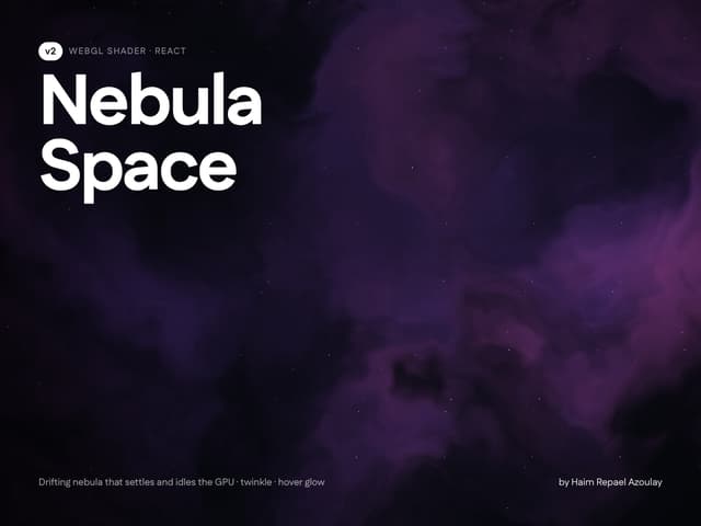
Nebula Space Background
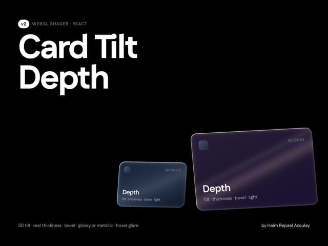
Card Tilt Depth
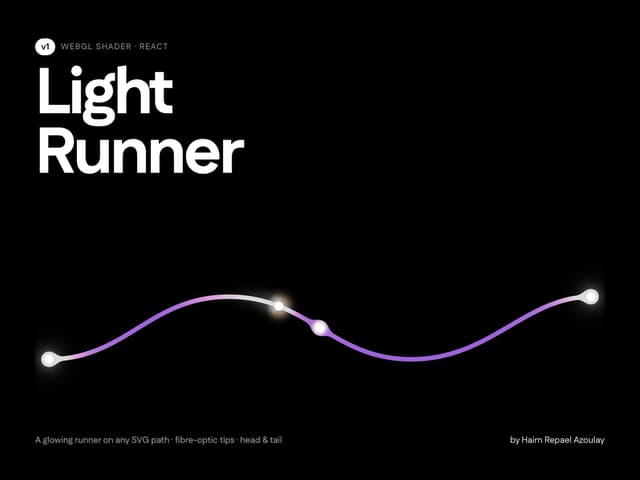
Light Runner Path
More in Shaders
View all
Glass Fold
212

Neural Noise
717
Wave
685
LightSpeed
207
animated pattern cloud
616

Background Shader
304
Shader Background
2K

Line Shader Homlu UI
48


