
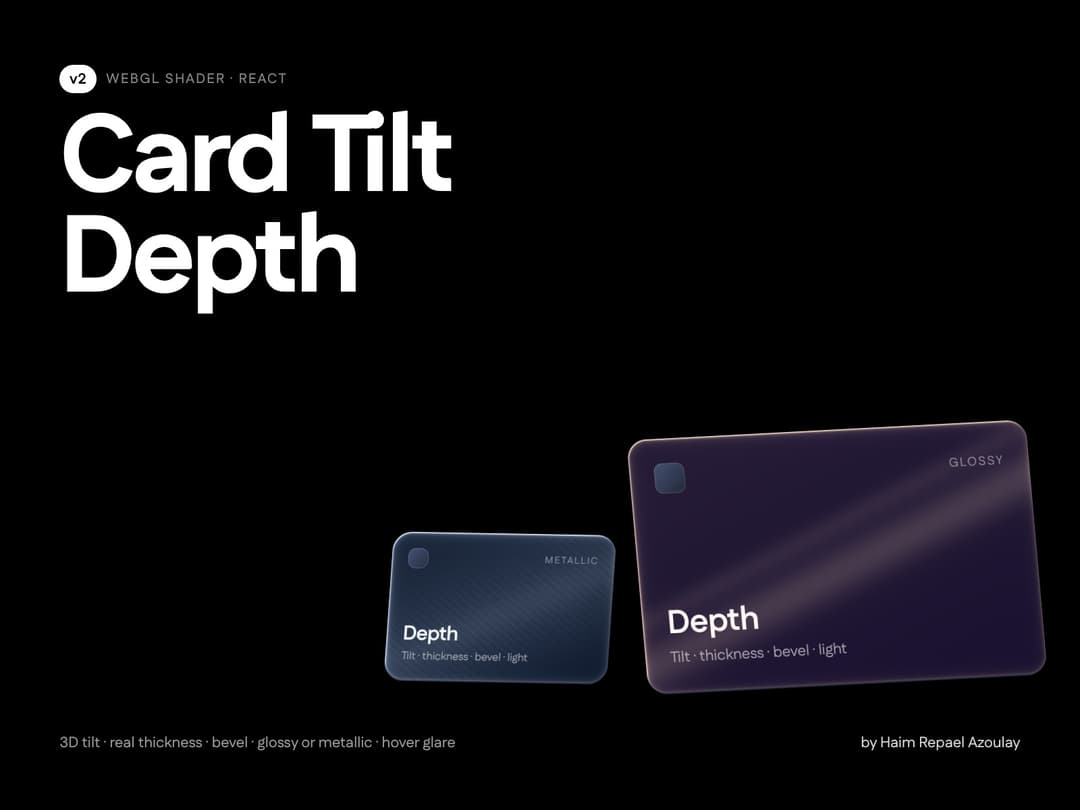
Wrap any card. Card Tilt Depth adds real depth: perspective tilt that follows the pointer and eases back to a resting pose, an extruded body with adjustable thickness, a bevelled rim, a soft shadow that travels opposite the lean, and a WebGL material layer - glossy (tight clear highlight) or metallic (broad brushed sheen) - lit from one light you place by angle. Hover interactions you can switch on and off: a one-shot glare sweep when the pointer enters (speed, width, intensity, single/double, color) and a lift toward the viewer (5-100 px). Corner-radius aware, children stay interactive, the face can be an image or SVG. Retina-crisp, zero dependencies.
Built with React and Tailwind. Copy the prompt and paste it into Claude Code, Cursor or Lovable: your agent adds Card Tilt Depth to your project and fits it to your theme.
Code
How Card Tilt Depth is used: the demo's code. The component's own source comes with a free account.
Usage.tsx
// Copyright (c) 2026 haim repael azoulay. All rights reserved.
import CardTiltDepth from "@/components/ui/card-tilt-depth"

const settings = {
  // body
  thickness: 6, // px, 0 = flat
  bevel: 3, // px bevel on the face rim
  // light & material
  lightAngle: -35, // degrees clockwise from the top
  lightAmount: 0.8, // 0–2
  lightColor: { r: 0.85, g: 0.9, b: 1, a: 1 },
  material: "glossy",
  materialStrength: 0.5, // 0–1
  // tilt
  tilt: 10, // max degrees
  tiltSensitivity: 1, // 0.2–2
  restTiltX: 3.5,
  restTiltY: -4.5,
  perspective: 900,
  hoverScale: 1.02,
  smoothing: 0.18,
  // shadow
  shadowDistance: 24,
  shadowBlur: 36,
  shadowOpacity: 0.55,
  // interactions
  interactions: true,
  hoverGlare: true, // glare runs once when the pointer enters
  glareSpeed: 900, // 200–2000 ms
  glareWidth: 0.16,
  glareIntensity: 0.9,
  glarePasses: "double",
  glareColor: { r: 1, g: 1, b: 1, a: 1 },
  hoverLift: true, // bring the card closer on hover
  liftDistance: 24, // 5–100 px
}

export default function CardTiltDepthDemo(props: Partial<typeof settings>) {
  const s = { ...settings, ...props }
  return (
    <div className="flex min-h-[460px] w-full flex-wrap items-center justify-center gap-12 bg-background p-12">
      {/* 320x200 card (8:5). Pass faceSrc="/my-art.svg" with the same ratio to replace the face. */}
      <CardTiltDepth className="h-[200px] w-[320px]" radius={20} {...(s as any)}>
        <div className="flex h-full w-full flex-col justify-between p-6 text-white">
          <span className="text-xs uppercase tracking-widest text-white/50">Card</span>
          <div>
            <div className="text-2xl font-semibold">Depth</div>
            <div className="text-sm text-white/60">Move your pointer across me</div>
          </div>
        </div>
      </CardTiltDepth>
      {/* round badge: radius >= half the size, metallic material */}
      <CardTiltDepth className="h-48 w-48" radius={999} {...(s as any)} tilt={14} restTiltX={0} restTiltY={0} thickness={4} material="metallic">
        <div className="flex h-full w-full items-center justify-center text-sm text-white/70">metallic</div>
      </CardTiltDepth>
    </div>
  )
}
More by Haim Repael Azoulay
View all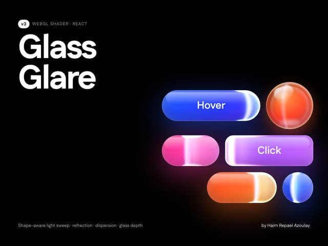
Glass Glare
33
Nebula Space Background
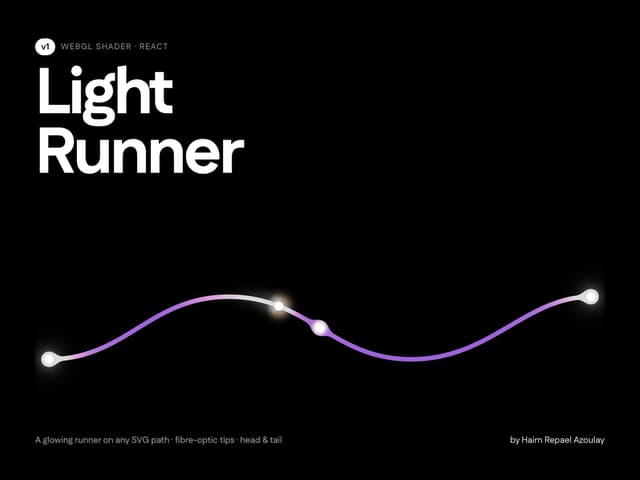
Light Runner Path
More in Shaders
View all
Glass Fold
212

Neural Noise
717
Wave
685
LightSpeed
207
animated pattern cloud
616

Background Shader
304
Shader Background
2K

Line Shader Homlu UI
48


