
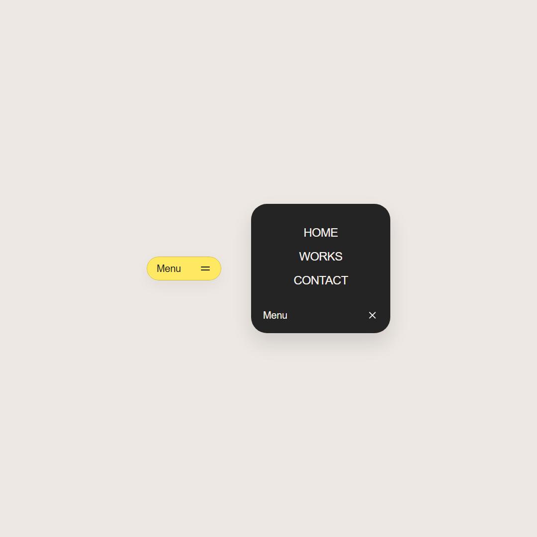
About
A premium, interactive floating navigation pill that dynamically expands into a dark-themed menu with smooth organic transitions, a morphing toggle button, and staggered letter-roll hover effects.
Built with React and Tailwind. Copy the prompt and paste it into Claude Code, Cursor or Lovable: your agent adds Liquid Morph Floating Menu to your project and fits it to your theme.
Code
How Liquid Morph Floating Menu is used: the demo's code. The component's own source comes with a free account.
Usage.tsx
"use client";

import FloatingMenu from "../components/ui/liquid-morph-floating-menu";

function SkeletonLoader() {
  return (
    <div className="w-full max-w-6xl mx-auto p-6 sm:p-10 flex flex-col gap-10 bg-transparent select-none pointer-events-none">
      {/* Header */}
      <div className="flex justify-between items-center w-full border-b border-[#242424]/10 pb-6 shrink-0">
        {/* Logo */}
        <div className="h-6 w-28 bg-[#242424]/10 rounded-lg animate-pulse" />
        {/* Nav Items */}
        <div className="hidden sm:flex gap-8">
          <div className="h-4 w-16 bg-[#242424]/10 rounded-md animate-pulse" />
          <div className="h-4 w-16 bg-[#242424]/10 rounded-md animate-pulse" />
          <div className="h-4 w-16 bg-[#242424]/10 rounded-md animate-pulse" />
        </div>
        {/* CTA */}
        <div className="h-9 w-24 bg-[#242424]/10 rounded-full animate-pulse" />
      </div>

      {/* Hero Section */}
      <div className="flex flex-col gap-4 py-12 items-center text-center max-w-2xl mx-auto w-full">
        <div className="h-10 w-4/5 bg-[#242424]/15 rounded-xl animate-pulse" />
        <div className="h-10 w-2/3 bg-[#242424]/15 rounded-xl animate-pulse" />
        <div className="h-4 w-full bg-[#242424]/10 rounded-md mt-4 animate-pulse" />
        <div className="h-4 w-5/6 bg-[#242424]/10 rounded-md animate-pulse" />
        <div className="flex gap-4 mt-6">
          <div className="h-11 w-32 bg-[#242424]/15 rounded-full animate-pulse" />
          <div className="h-11 w-32 bg-[#242424]/10 rounded-full animate-pulse" />
        </div>
      </div>

      {/* Grid Content - Section 1 */}
      <div className="flex flex-col gap-4">
        <div className="h-6 w-40 bg-[#242424]/15 rounded-lg animate-pulse mb-2" />
        <div className="grid grid-cols-1 md:grid-cols-3 gap-6 w-full">
          {[1, 2, 3].map((i) => (
            <div key={i} className="bg-white/60 backdrop-blur-sm p-5 rounded-2xl border border-white/40 flex flex-col gap-4">
              <div className="aspect-video w-full bg-[#242424]/10 rounded-xl animate-pulse" />
              <div className="h-3 w-1/4 bg-[#242424]/10 rounded-md animate-pulse" />
              <div className="h-5 w-3/4 bg-[#242424]/15 rounded-md animate-pulse" />
              <div className="flex flex-col gap-2">
                <div className="h-3 w-full bg-[#242424]/10 rounded-md animate-pulse" />
                <div className="h-3 w-5/6 bg-[#242424]/10 rounded-md animate-pulse" />
              </div>
            </div>
          ))}
        </div>
      </div>

      {/* Feature Block - Section 2 */}
      <div className="flex flex-col md:flex-row gap-8 items-center py-8 border-t border-[#242424]/10">
        <div className="w-full md:w-1/2 flex flex-col gap-4">
          <div className="h-8 w-2/3 bg-[#242424]/15 rounded-xl animate-pulse" />
          <div className="h-4 w-full bg-[#242424]/10 rounded-md animate-pulse" />
          <div className="h-4 w-11/12 bg-[#242424]/10 rounded-md animate-pulse" />
          <div className="h-4 w-4/5 bg-[#242424]/10 rounded-md animate-pulse" />
          <div className="h-9 w-28 bg-[#242424]/15 rounded-full animate-pulse mt-2" />
        </div>
        <div className="w-full md:w-1/2 aspect-video bg-[#242424]/10 rounded-2xl animate-pulse" />
      </div>

      {/* Grid Content - Section 3 */}
      <div className="flex flex-col gap-4 py-8 border-t border-[#242424]/10">
        <div className="h-6 w-48 bg-[#242424]/15 rounded-lg animate-pulse mb-2" />
        <div className="grid grid-cols-1 md:grid-cols-2 gap-6 w-full">
          {[1, 2].map((i) => (
            <div key={i} className="bg-white/60 backdrop-blur-sm p-6 rounded-2xl border border-white/40 flex flex-col gap-4">
              <div className="h-5 w-1/2 bg-[#242424]/15 rounded-md animate-pulse" />
              <div className="flex flex-col gap-2">
                <div className="h-3.5 w-full bg-[#242424]/10 rounded-md animate-pulse" />
                <div className="h-3.5 w-11/12 bg-[#242424]/10 rounded-md animate-pulse" />
                <div className="h-3.5 w-5/6 bg-[#242424]/10 rounded-md animate-pulse" />
              </div>
            </div>
          ))}
        </div>
      </div>

      {/* Footer */}
      <div className="flex flex-col sm:flex-row justify-between items-center border-t border-[#242424]/10 pt-8 pb-28 gap-4 shrink-0">
        <div className="h-4 w-48 bg-[#242424]/10 rounded-md animate-pulse" />
        <div className="flex gap-4">
          <div className="h-8 w-8 bg-[#242424]/10 rounded-full animate-pulse" />
          <div className="h-8 w-8 bg-[#242424]/10 rounded-full animate-pulse" />
          <div className="h-8 w-8 bg-[#242424]/10 rounded-full animate-pulse" />
        </div>
      </div>
    </div>
  );
}

export default function FloatingMenuDemo() {
  return (
    <div className="min-h-screen w-full bg-[#ede8e4] relative font-sans antialiased selection:bg-[#FFE862]/30">
      <SkeletonLoader />
      <FloatingMenu />
    </div>
  );
}
Dependencies
More by AAYUSH duhan
View all
Card Fan Carousel
3.9K
Ink Reveal
1.3K
CascadeText
642
HalftoneTrail
208
Liquid Gradient
87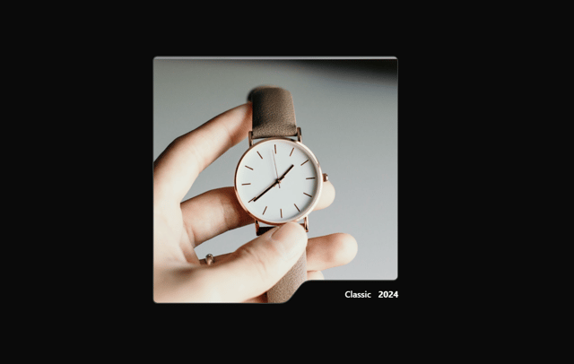
Reveal Card
6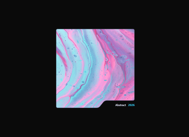
NotchCard
5
More in Navigation
View all

Sidebar
234

Tabs
60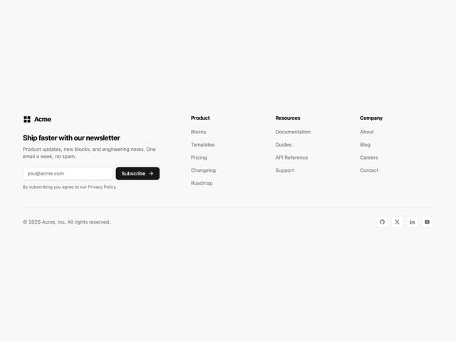
Newsletter Signup Footer
16
Progress Bar Stepper
36

Footer 2
201
Navbar with Theme Toggle
43

Navbar
71

Pagination
86
