
About
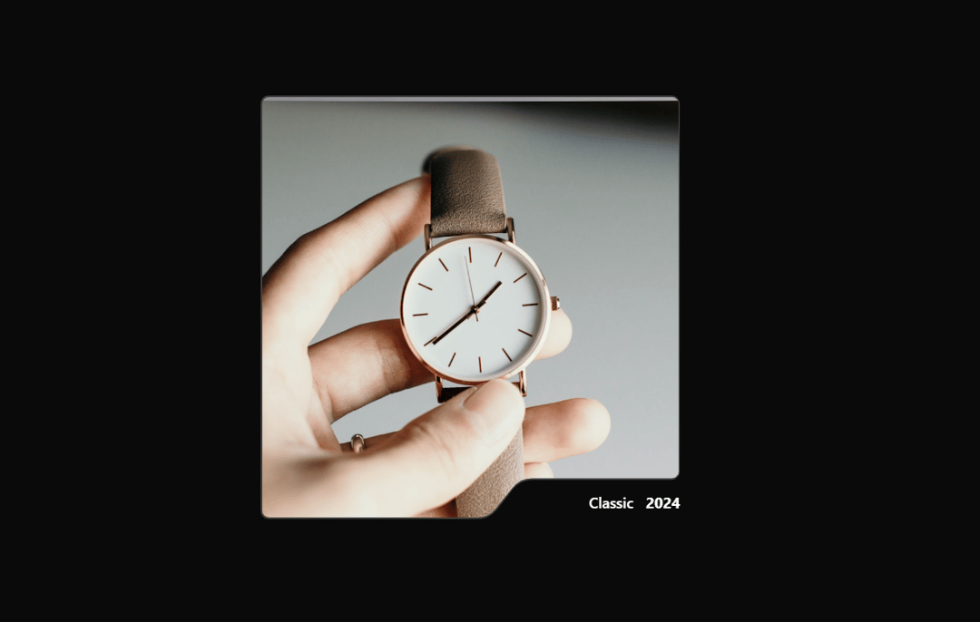
A masked card component with a signature notched border shape, featuring a smooth elliptical clip-path reveal animation on hover. Supports customizable base and hover images, accent colors, and text labels.
Built with React and Tailwind. Copy the prompt and paste it into Claude Code, Cursor or Lovable: your agent adds Reveal Card to your project and fits it to your theme.
Code
How Reveal Card is used: the demo's code. The component's own source comes with a free account.
Usage.tsx
import { HelmetCard } from "@/components/ui/reveal-card";

export default function DemoOne() {
  return (
    <HelmetCard
      className="mx-4 sm:mx-0"
      baseImage="https://cdn.21st.dev/assets/mirror/b6/b62e91dc190961e10226f06318078d76ba06e2fadef20eb5a0b87e4ed4af453c.jpg"
      hoverImage="https://cdn.21st.dev/assets/mirror/ed/ed738d7d4810f94b4ec89ba8bf7c122648474e49c851541cbef96567bd2ca529.jpg"
      label="Classic"
      year="2024"
    />
  );
}
More by AAYUSH duhan
View all
Card Fan Carousel
3.9K
Ink Reveal
1.3K
Liquid Morph Floating Menu
874
CascadeText
642
HalftoneTrail
208
Liquid Gradient
87
NotchCard
5