
About
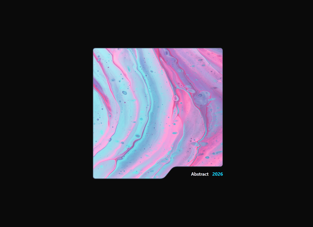
A shaped image card with a notched bottom-right corner, featuring a clip-path hover reveal effect and animated SVG border overlay. Fully customizable colors, images, timing, and labels via props.
Built with React and Tailwind. Copy the prompt and paste it into Claude Code, Cursor or Lovable: your agent adds NotchCard to your project and fits it to your theme.
Code
How NotchCard is used: the demo's code. The component's own source comes with a free account.
Usage.tsx
import { HelmetCard } from "../components/ui/notch-card";

const BASE = "https://cdn.21st.dev/assets/mirror/52/52cd94ff7f0548f96d4940934c0e39eb3600f61be57dec3b96aeb4dcf2d396a9.jpg";
const HOVER = "https://cdn.21st.dev/assets/mirror/3e/3e88eb223a2a661616fb85cb6759a24ec4872df806391989f2ddbdef07335077.jpg";

export default function DemoOne() {
  return (
    <div className= "flex items-center justify-center min-h-screen w-full bg-[#101400]" >
    <HelmetCard
        baseImage={ BASE }
  hoverImage = { HOVER }
  label = "Abstract"
  year = "2026"
  accentColor = "#00d4ff"
  borderColor = "#3a4a5a"
  bgColor = "#1a2a3a"
    />
    </div>
  );
}
More by AAYUSH duhan
View all
Card Fan Carousel
3.9K
Ink Reveal
1.3K
Liquid Morph Floating Menu
874
CascadeText
642
HalftoneTrail
208
Liquid Gradient
87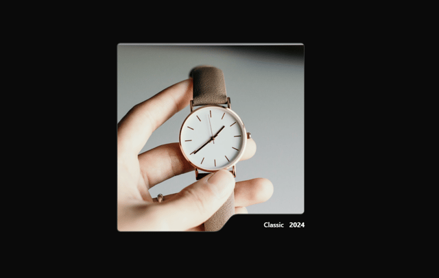
Reveal Card
6