
About
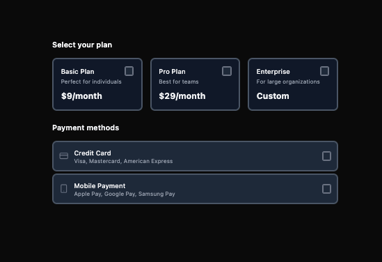
Here is Checkbox component
Built with React and Tailwind. Copy the prompt and paste it into Claude Code, Cursor or Lovable: your agent adds Checkbox to your project and fits it to your theme.
Code
How Checkbox is used: the demo's code. The component's own source comes with a free account.
Usage.tsx
import { Checkbox } from "@ark-ui/react/checkbox";
import {
  CheckIcon,
  CreditCardIcon,
  SmartphoneIcon,
  MonitorIcon,
} from "lucide-react";

export default function CheckboxCards() {
  return (
    <div className="space-y-6">
      <div>
        <h3 className="text-base font-semibold text-gray-900 dark:text-white mb-4">
          Select your plan
        </h3>
        <div className="grid grid-cols-1 md:grid-cols-3 gap-4">
          <Checkbox.Root className="cursor-pointer group h-full">
            <div className="border-2 border-gray-300 dark:border-gray-600 rounded-lg p-4 bg-white dark:bg-gray-900 shadow-xs group-data-[state=checked]:border-blue-500 group-data-[state=checked]:bg-blue-50 group-data-[state=checked]:shadow-md dark:group-data-[state=checked]:bg-blue-950 transition-all duration-200 hover:border-gray-400 hover:shadow-md dark:hover:border-gray-400 h-full flex flex-col">
              <div className="flex items-start justify-between flex-1">
                <div className="flex-1 flex flex-col">
                  <Checkbox.Label className="block text-sm font-medium text-gray-900 dark:text-gray-100 cursor-pointer">
                    Basic Plan
                  </Checkbox.Label>
                  <p className="text-xs text-gray-500 dark:text-gray-400 mt-1">
                    Perfect for individuals
                  </p>
                  <p className="text-lg font-bold text-gray-900 dark:text-gray-100 mt-auto pt-2">
                    $9/month
                  </p>
                </div>
                <Checkbox.Control className="w-5 h-5 bg-white border-2 border-gray-300 rounded data-[state=checked]:bg-blue-500 data-[state=checked]:border-blue-500 dark:bg-gray-800 dark:border-gray-500 dark:data-[state=checked]:bg-blue-500 dark:data-[state=checked]:border-blue-500 transition-all duration-200 flex items-center justify-center">
                  <Checkbox.Indicator>
                    <CheckIcon className="w-3.5 h-3.5 text-white" />
                  </Checkbox.Indicator>
                </Checkbox.Control>
              </div>
            </div>
            <Checkbox.HiddenInput />
          </Checkbox.Root>

          <Checkbox.Root className="cursor-pointer group h-full">
            <div className="border-2 border-gray-300 dark:border-gray-600 rounded-lg p-4 bg-white dark:bg-gray-900 shadow-xs group-data-[state=checked]:border-blue-500 group-data-[state=checked]:bg-blue-50 group-data-[state=checked]:shadow-md dark:group-data-[state=checked]:bg-blue-950 transition-all duration-200 hover:border-gray-400 hover:shadow-md dark:hover:border-gray-400 h-full flex flex-col">
              <div className="flex items-start justify-between flex-1">
                <div className="flex-1 flex flex-col">
                  <Checkbox.Label className="block text-sm font-medium text-gray-900 dark:text-gray-100 cursor-pointer">
                    Pro Plan
                  </Checkbox.Label>
                  <p className="text-xs text-gray-500 dark:text-gray-400 mt-1">
                    Best for teams
                  </p>
                  <p className="text-lg font-bold text-gray-900 dark:text-gray-100 mt-auto pt-2">
                    $29/month
                  </p>
                </div>
                <Checkbox.Control className="w-5 h-5 bg-white border-2 border-gray-300 rounded data-[state=checked]:bg-blue-500 data-[state=checked]:border-blue-500 dark:bg-gray-800 dark:border-gray-500 dark:data-[state=checked]:bg-blue-500 dark:data-[state=checked]:border-blue-500 transition-all duration-200 flex items-center justify-center">
                  <Checkbox.Indicator>
                    <CheckIcon className="w-3.5 h-3.5 text-white" />
                  </Checkbox.Indicator>
                </Checkbox.Control>
              </div>
            </div>
            <Checkbox.HiddenInput />
          </Checkbox.Root>

          <Checkbox.Root className="cursor-pointer group h-full">
            <div className="border-2 border-gray-300 dark:border-gray-600 rounded-lg p-4 bg-white dark:bg-gray-900 shadow-xs group-data-[state=checked]:border-blue-500 group-data-[state=checked]:bg-blue-50 group-data-[state=checked]:shadow-md dark:group-data-[state=checked]:bg-blue-950 transition-all duration-200 hover:border-gray-400 hover:shadow-md dark:hover:border-gray-400 h-full flex flex-col">
              <div className="flex items-start justify-between flex-1">
                <div className="flex-1 flex flex-col">
                  <Checkbox.Label className="block text-sm font-medium text-gray-900 dark:text-gray-100 cursor-pointer">
                    Enterprise
                  </Checkbox.Label>
                  <p className="text-xs text-gray-500 dark:text-gray-400 mt-1">
                    For large organizations
                  </p>
                  <p className="text-lg font-bold text-gray-900 dark:text-gray-100 mt-auto pt-2">
                    Custom
                  </p>
                </div>
                <Checkbox.Control className="w-5 h-5 bg-white border-2 border-gray-300 rounded data-[state=checked]:bg-blue-500 data-[state=checked]:border-blue-500 dark:bg-gray-800 dark:border-gray-500 dark:data-[state=checked]:bg-blue-500 dark:data-[state=checked]:border-blue-500 transition-all duration-200 flex items-center justify-center">
                  <Checkbox.Indicator>
                    <CheckIcon className="w-3.5 h-3.5 text-white" />
                  </Checkbox.Indicator>
                </Checkbox.Control>
              </div>
            </div>
            <Checkbox.HiddenInput />
          </Checkbox.Root>
        </div>
      </div>

      <div>
        <h3 className="text-base font-semibold text-gray-900 dark:text-gray-100 mb-4">
          Payment methods
        </h3>
        <div className="flex flex-col gap-1">
          <Checkbox.Root className="cursor-pointer group">
            <div className="border-2 border-gray-300 dark:border-gray-600 rounded-lg p-3 bg-white dark:bg-gray-800 shadow-xs group-data-[state=checked]:border-blue-500 group-data-[state=checked]:bg-blue-50 group-data-[state=checked]:shadow-md dark:group-data-[state=checked]:bg-blue-950 transition-all duration-200 hover:border-gray-400 hover:shadow-md dark:hover:border-gray-500">
              <div className="flex items-center gap-3">
                <CreditCardIcon className="w-5 h-5 text-gray-400 dark:text-gray-500" />
                <div className="flex-1">
                  <Checkbox.Label className="block text-sm font-medium text-gray-900 dark:text-gray-100 cursor-pointer">
                    Credit Card
                  </Checkbox.Label>
                  <p className="text-xs text-gray-500 dark:text-gray-400">
                    Visa, Mastercard, American Express
                  </p>
                </div>
                <Checkbox.Control className="w-5 h-5 bg-white border-2 border-gray-300 rounded data-[state=checked]:bg-blue-500 data-[state=checked]:border-blue-500 dark:bg-gray-800 dark:border-gray-500 dark:data-[state=checked]:bg-blue-500 dark:data-[state=checked]:border-blue-500 transition-all duration-200 flex items-center justify-center">
                  <Checkbox.Indicator>
                    <CheckIcon className="w-3.5 h-3.5 text-white" />
                  </Checkbox.Indicator>
                </Checkbox.Control>
              </div>
            </div>
            <Checkbox.HiddenInput />
          </Checkbox.Root>

          <Checkbox.Root className="cursor-pointer group">
            <div className="border-2 border-gray-300 dark:border-gray-600 rounded-lg p-3 bg-white dark:bg-gray-800 shadow-xs group-data-[state=checked]:border-blue-500 group-data-[state=checked]:bg-blue-50 group-data-[state=checked]:shadow-md dark:group-data-[state=checked]:bg-blue-950 transition-all duration-200 hover:border-gray-400 hover:shadow-md dark:hover:border-gray-500">
              <div className="flex items-center gap-3">
                <SmartphoneIcon className="w-5 h-5 text-gray-400 dark:text-gray-500" />
                <div className="flex-1">
                  <Checkbox.Label className="block text-sm font-medium text-gray-900 dark:text-gray-100 cursor-pointer">
                    Mobile Payment
                  </Checkbox.Label>
                  <p className="text-xs text-gray-500 dark:text-gray-400">
                    Apple Pay, Google Pay, Samsung Pay
                  </p>
                </div>
                <Checkbox.Control className="w-5 h-5 bg-white border-2 border-gray-300 rounded data-[state=checked]:bg-blue-500 data-[state=checked]:border-blue-500 dark:bg-gray-800 dark:border-gray-500 dark:data-[state=checked]:bg-blue-500 dark:data-[state=checked]:border-blue-500 transition-all duration-200 flex items-center justify-center">
                  <Checkbox.Indicator>
                    <CheckIcon className="w-3.5 h-3.5 text-white" />
                  </Checkbox.Indicator>
                </Checkbox.Control>
              </div>
            </div>
            <Checkbox.HiddenInput />
          </Checkbox.Root>
        </div>
      </div>
    </div>
  );
}
Dependencies
More by Abraham
View all

Signature Pad
106
Carousel
81
timeline-animation
65
Basic Toast
56
Calendar
54
QR Code
51
Menu
50
Steps
43
More in Pricing
View all
Pricing Section
582

Pricing Section
173

Pricing Card
365
pricing section
158

Pricing Cards
86
Colorful-Pricing
85
Glowing Pricing Tiers
45

RuixenPricing05
102


