
About
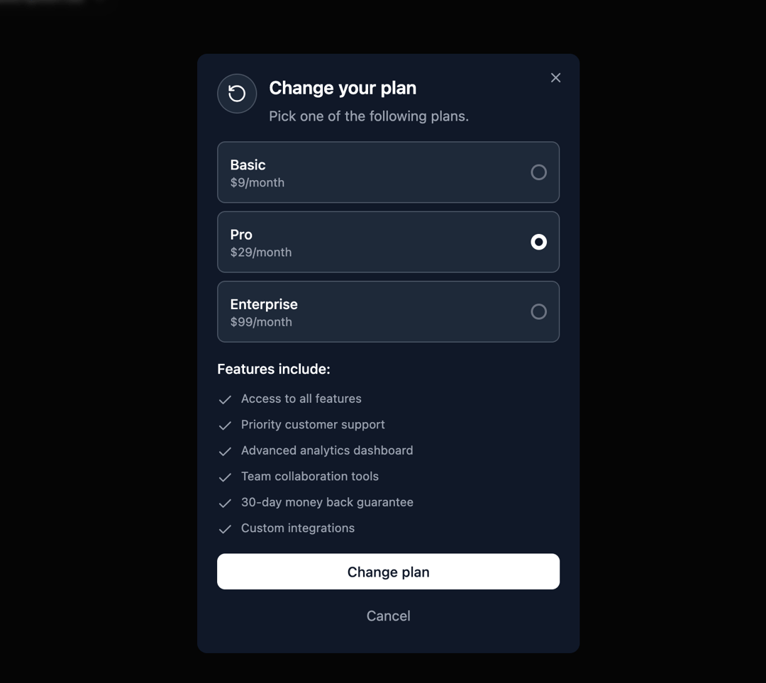
Here is Dialog component
Built with React and Tailwind. Copy the prompt and paste it into Claude Code, Cursor or Lovable: your agent adds Dialog to your project and fits it to your theme.
Code
How Dialog is used: the demo's code. The component's own source comes with a free account.
Usage.tsx
"use client";

import { Dialog } from "@ark-ui/react/dialog";
import { Portal } from "@ark-ui/react/portal";
import { X, RotateCcw, Check } from "lucide-react";
import { useState } from "react";

export default function ChooseSubscriptionDialog() {
  const [selectedPlan, setSelectedPlan] = useState("pro");

  const plans = [
    {
      id: "basic",
      name: "Basic",
      price: "$9/month",
    },
    {
      id: "pro",
      name: "Pro",
      price: "$29/month",
    },
    {
      id: "enterprise",
      name: "Enterprise",
      price: "$99/month",
    },
  ];

  const features = [
    "Access to all features",
    "Priority customer support",
    "Advanced analytics dashboard",
    "Team collaboration tools",
    "30-day money back guarantee",
    "Custom integrations",
  ];

  return (
    <Dialog.Root>
      <Dialog.Trigger asChild>
        <button className="rounded-lg border border-gray-300 dark:border-gray-600 bg-white dark:bg-gray-800 px-4 py-2 text-sm text-gray-900 dark:text-gray-100 hover:bg-gray-50 dark:hover:bg-gray-700 transition-colors cursor-pointer inline-flex items-center justify-center">
          Choose Subscription
        </button>
      </Dialog.Trigger>
      <Portal>
        <Dialog.Backdrop className="data-[state=open]:animate-backdrop-in data-[state=closed]:animate-backdrop-out fixed inset-0 z-50 bg-black/50 backdrop-blur-xs" />
        <Dialog.Positioner className="fixed inset-0 z-50 flex items-center justify-center p-4">
          <Dialog.Content className="data-[state=open]:animate-dialog-in data-[state=closed]:animate-dialog-out relative w-full max-w-sm rounded-lg bg-white dark:bg-gray-900 p-5 shadow-lg">
            <Dialog.CloseTrigger asChild>
              <button className="absolute right-3 top-3 p-1 text-gray-400 hover:text-gray-600 dark:hover:text-gray-300 transition-colors cursor-pointer">
                <X className="h-4 w-4" />
              </button>
            </Dialog.CloseTrigger>

            <div className="space-y-4">
              <div className="flex items-start space-x-3">
                <div className="flex h-10 w-10 items-center justify-center rounded-full border border-gray-300 dark:border-gray-600 bg-gray-50 dark:bg-gray-800">
                  <RotateCcw className="h-5 w-5 text-gray-600 dark:text-white" />
                </div>
                <div className="space-y-1">
                  <Dialog.Title className="text-lg font-semibold text-gray-900 dark:text-white">
                    Change your plan
                  </Dialog.Title>
                  <Dialog.Description className="text-sm text-gray-600 dark:text-gray-400">
                    Pick one of the following plans.
                  </Dialog.Description>
                </div>
              </div>

              <div className="space-y-4">
                {/* Plan Options */}
                <div className="space-y-2">
                  {plans.map((plan) => (
                    <button
                      key={plan.id}
                      onClick={() => setSelectedPlan(plan.id)}
                      className="w-full p-3 rounded-md border border-gray-300 dark:border-gray-600 bg-white dark:bg-gray-800 hover:border-gray-400 dark:hover:border-gray-500 text-left flex items-center justify-between transition-colors"
                    >
                      <div>
                        <div className="text-gray-900 dark:text-white font-medium text-sm">
                          {plan.name}
                        </div>
                        <div className="text-gray-600 dark:text-gray-400 text-xs">
                          {plan.price}
                        </div>
                      </div>
                      <div
                        className={`w-4 h-4 rounded-full border-2 flex items-center justify-center ${
                          selectedPlan === plan.id
                            ? "border-gray-900 dark:border-white bg-gray-900 dark:bg-white"
                            : "border-gray-400 dark:border-gray-500"
                        }`}
                      >
                        {selectedPlan === plan.id && (
                          <div className="w-2 h-2 rounded-full bg-white dark:bg-gray-900"></div>
                        )}
                      </div>
                    </button>
                  ))}
                </div>

                {/* Features Section */}
                <div className="space-y-3">
                  <h3 className="text-sm font-medium text-gray-900 dark:text-white">
                    Features include:
                  </h3>
                  <div className="space-y-2">
                    {features.map((feature, index) => (
                      <div key={index} className="flex items-start space-x-2">
                        <Check className="h-4 w-4 text-gray-600 dark:text-gray-400 mt-0.5 shrink-0" />
                        <span className="text-xs text-gray-600 dark:text-gray-400">
                          {feature}
                        </span>
                      </div>
                    ))}
                  </div>
                </div>

                {/* Action Buttons */}
                <div className="space-y-2">
                  <Dialog.CloseTrigger asChild>
                    <button className="w-full px-3 py-2 text-sm bg-gray-900 dark:bg-white text-white dark:text-gray-900 hover:bg-gray-800 dark:hover:bg-gray-100 rounded-md transition-colors cursor-pointer inline-flex items-center justify-center font-medium">
                      Change plan
                    </button>
                  </Dialog.CloseTrigger>

                  <Dialog.CloseTrigger asChild>
                    <button className="w-full px-3 py-2 text-sm text-gray-600 dark:text-gray-400 hover:text-gray-800 dark:hover:text-gray-300 transition-colors cursor-pointer inline-flex items-center justify-center">
                      Cancel
                    </button>
                  </Dialog.CloseTrigger>
                </div>
              </div>
            </div>
          </Dialog.Content>
        </Dialog.Positioner>
      </Portal>
    </Dialog.Root>
  );
}
Dependencies
More by Abraham
View all

Signature Pad
107
Carousel
81
timeline-animation
65
Basic Toast
56
Calendar
54
QR Code
51
Menu
50
Steps
43
More in Pricing
View all

Pricing Section
175
Pricing Section
584

Pricing Cards
88

Pricing Card
368
Bento Pricing Component
14

Pricing
125
pricing section
160
Glowing Pricing Tiers
48


