
About
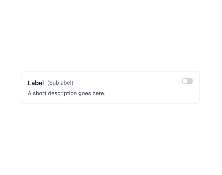
Here is Switch component
Built with React and Tailwind. Copy the prompt and paste it into Claude Code, Cursor or Lovable: your agent adds Switch to your project and fits it to your theme.
Code
How Switch is used: the demo's code. The component's own source comes with a free account.
Usage.tsx
"use client";

import { Switch } from "@ark-ui/react/switch";

export default function SwitchInCard() {
  return (
    <div className="bg-white dark:bg-gray-800 w-full px-4 py-12 rounded-xl flex items-center justify-center">
      <div className="w-full max-w-md">
        <Switch.Root className="flex items-start justify-between p-4 border border-gray-200 rounded-lg bg-white hover:bg-gray-50 transition-colors duration-200 dark:border-gray-700 dark:bg-gray-800 dark:hover:bg-gray-750">
          <div className="flex-1 min-w-0 pr-4">
            <div className="flex items-center gap-2 mb-1">
              <Switch.Label className="text-base font-medium text-gray-900 dark:text-gray-100">
                Label
              </Switch.Label>
              <span className="text-sm text-gray-500 dark:text-gray-400">
                (Sublabel)
              </span>
            </div>
            <p className="text-sm text-gray-600 dark:text-gray-400">
              A short description goes here.
            </p>
          </div>
          <Switch.Control className="relative inline-flex w-7 p-0.5 items-center rounded-full bg-gray-300 transition-colors duration-200 ease-in-out data-[state=checked]:bg-blue-500 data-focus-visible:ring-2 data-focus-visible:ring-gray-300/50 data-[state=checked]:data-focus-visible:ring-blue-500/50 dark:bg-gray-600 dark:data-[state=checked]:bg-blue-500 shrink-0">
            <Switch.Thumb className="w-3 h-3 rounded-full bg-white shadow-sm transition-transform duration-200 ease-in-out data-[state=checked]:translate-x-full" />
          </Switch.Control>
          <Switch.HiddenInput />
        </Switch.Root>
      </div>
    </div>
  );
}
Dependencies
More by Abraham
View all

Signature Pad
107
Carousel
81
timeline-animation
65
Basic Toast
56
Calendar
54
QR Code
51
Menu
50
Steps
43
More in Cards
View all
Stats cards with links
33

Course Design Cards
1.1K

Card
70
Statistics Card 2
264
Statistics Card 10
263

Card
17

Card Studio
9
The Item one
3
