
About
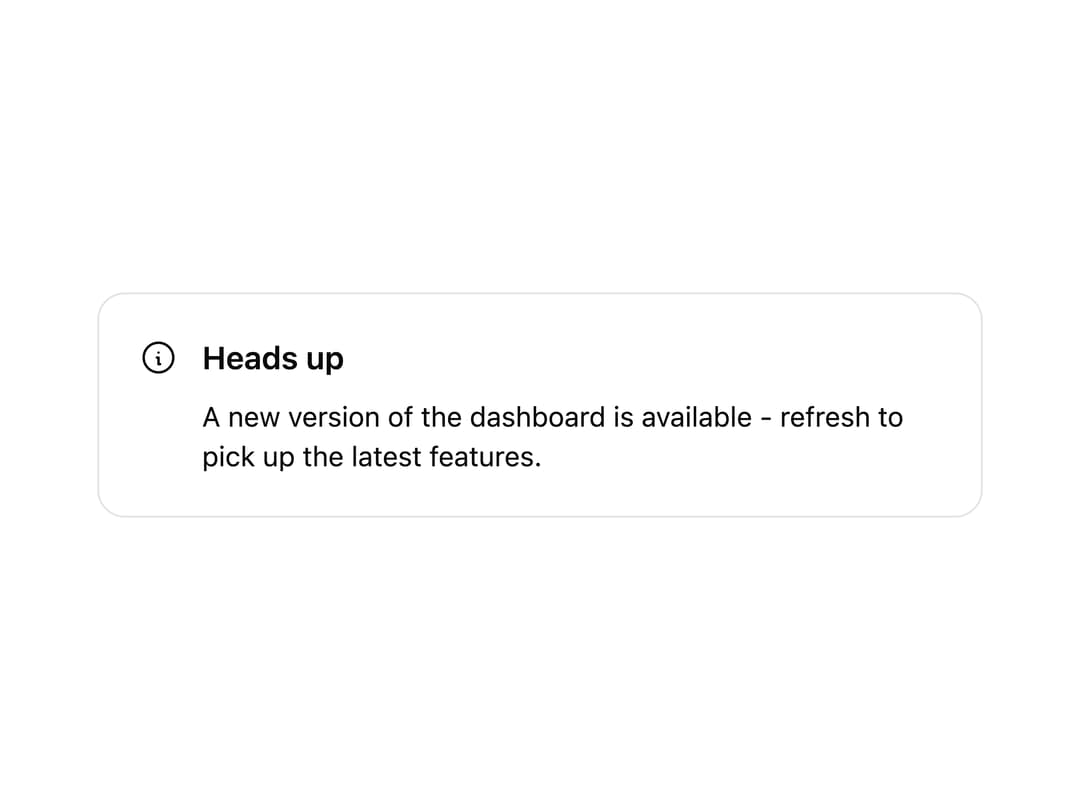
A dismissible alert banner for surfacing status messages, warnings, or announcements with an icon, title, description, and optional actions.
Built with React and Tailwind. Copy the prompt and paste it into Claude Code, Cursor or Lovable: your agent adds Alert to your project and fits it to your theme.
Code
How Alert is used: the demo's code. The component's own source comes with a free account.
Usage.tsx
import {
  Alert,
  AlertIcon,
  AlertTitle,
  AlertDescription,
} from "@/components/ui/alert";
import { InfoCircle } from "@appica/icons-react";

export default function AlertDefault() {
  return (
    <div className="w-full max-w-md">
      <Alert>
        <AlertIcon>
          <InfoCircle />
        </AlertIcon>
        <AlertTitle>Heads up</AlertTitle>
        <AlertDescription>
          A new version of the dashboard is available - refresh to pick up the
          latest features.
        </AlertDescription>
      </Alert>
    </div>
  );
}
Dependencies
More by appica-dev
View all
Border Beam
42
Text Animate
19
Carousel
14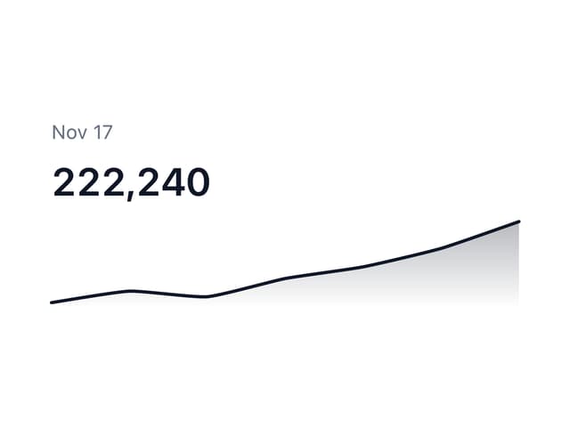
Sparkline
7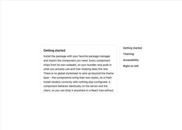
Table of Contents
6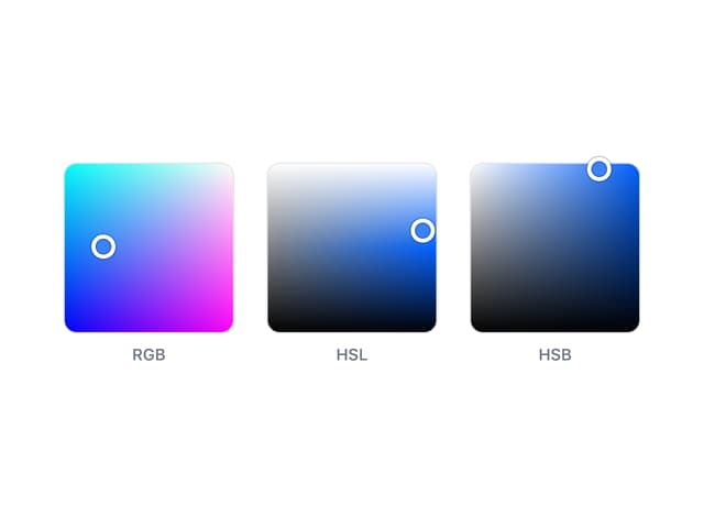
Color Area
6
Avatar
6
Background Pattern
3