
About
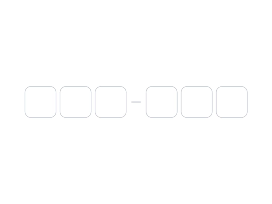
A compound one-time-code input made of individual digit boxes that auto-advance while typing, support pasting a full code, and can be grouped with a separator.
Built with React and Tailwind. Copy the prompt and paste it into Claude Code, Cursor or Lovable: your agent adds OTP Field to your project and fits it to your theme.
Code
How OTP Field is used: the demo's code. The component's own source comes with a free account.
Usage.tsx
import {
  OTPField,
  OTPFieldInput,
  OTPFieldSeparator,
} from "@/components/ui/otp-field";

export default function OTPFieldWithSeparator() {
  return (
    <OTPField length={6} aria-label="Verification code">
      <OTPFieldInput aria-label="Digit 1 of 6" />
      <OTPFieldInput aria-label="Digit 2 of 6" />
      <OTPFieldInput aria-label="Digit 3 of 6" />
      <OTPFieldSeparator />
      <OTPFieldInput aria-label="Digit 4 of 6" />
      <OTPFieldInput aria-label="Digit 5 of 6" />
      <OTPFieldInput aria-label="Digit 6 of 6" />
    </OTPField>
  );
}
Dependencies
More by appica-dev
View all
Border Beam
42
Text Animate
18
Carousel
13
Table of Contents
6
Sparkline
6
Color Area
6
Avatar
6
Background Pattern
3