
About
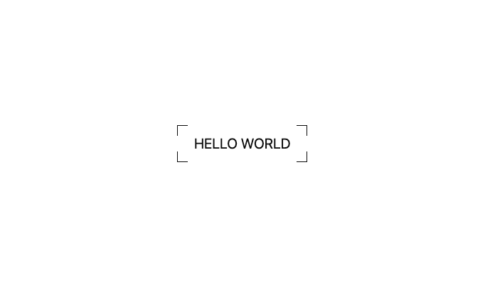
CornerFrameText is a semantic, reusable UI component that displays a line of text wrapped in elegant corner-frame borders, consistent with the CornerFrameAnimatedButton style — but without any hover effects or background animations. Ideal for static headers, labels, or decorative inline elements.
Built with React and Tailwind. Copy the prompt and paste it into Claude Code, Cursor or Lovable: your agent adds Corner Frame Text to your project and fits it to your theme.
Code
How Corner Frame Text is used: the demo's code. The component's own source comes with a free account.
Usage.tsx
import CornerFrameText from '@/components/ui/corner-frame-text'

export default function DemoText() {
  return (
    <div className="min-h-screen flex items-center justify-center">
      <CornerFrameText text="HELLO WORLD" as="h1" className="text-xl" />
    </div>
  )
}
More by Arunachalam
View all
Scroll media expansion hero
10.7K
Profile Card Testimonial Carousel
1.2K
Modern Animated Sign In
1.1K
Bottom Nav Bar
805
Adaptive Notch Navigation Bar
663
Toast
659
Connected Carousel
383
Animated File Tree
337
More in Text
View all

Vertical Cut Reveal Characters
103
Motion Blur Text
36

NeonRGBTextEffect
144
Text Reveal
27

Rainbow Text Effect
47
Random Letter Swap
46

Blur Reveal
300
Text Color
545