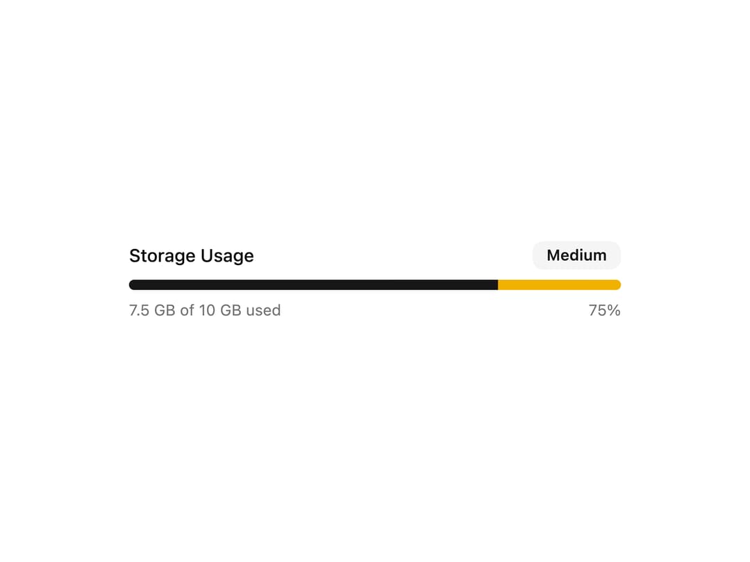
About
A progress bar showing storage usage with a color-coded status badge indicating usage level.
Built with React and Tailwind. Copy the prompt and paste it into Claude Code, Cursor or Lovable: your agent adds Storage Usage Progress to your project and fits it to your theme.
Code
How Storage Usage Progress is used: the demo's code. The component's own source comes with a free account.
Usage.tsx
import ProgressComponent from "@/components/ui/progress7";

export default function Default() {
  return (
    <div className="flex min-h-64 w-full items-center justify-center p-6">
      <ProgressComponent />
    </div>
  );
}
More by Bundui.io
View all

Fluid particles background
758
Floating paths
638
Text Gradient Scroll
614
Stars
536
Image Comparison
429
Magnetic Button
402
Marquee Effect
318
Wavy
194