
About
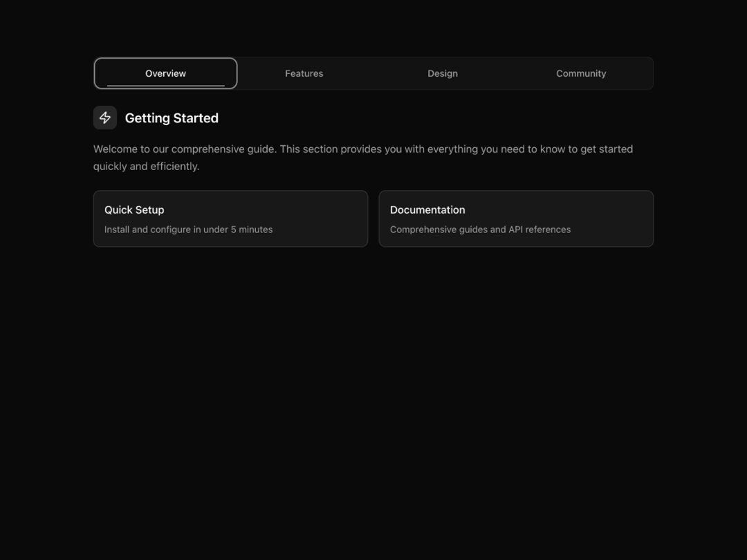
A modern animated tabs component with a smooth, fluid underline transition and accessible keyboard navigation.
Built with React and Tailwind. Copy the prompt and paste it into Claude Code, Cursor or Lovable: your agent adds Animated Tabs to your project and fits it to your theme.
Code
How Animated Tabs is used: the demo's code. The component's own source comes with a free account.
Usage.tsx
"use client";

import React from "react";
import { motion } from "framer-motion";
import { AnimatedTabs } from "@/components/ui/animated-tabs";
import { Code, Palette, Zap, Users } from "lucide-react";
import { cn } from "@/lib/utils";

export default function AnimatedTabsDemo() {
  const demoTabs = [
    {
      label: "Overview",
      content: (
        <div className="space-y-4">
          <div className="flex items-center gap-3 mb-4">
            <div className="p-2 bg-primary/10 rounded-lg">
              <Zap className="w-5 h-5 text-primary" />
            </div>
            <h3 className="text-xl font-semibold text-foreground">
              Getting Started
            </h3>
          </div>
          <p className="text-muted-foreground leading-relaxed">
            Welcome to our comprehensive guide. This section provides you with
            everything you need to know to get started quickly and efficiently.
          </p>
          <div className="grid grid-cols-1 md:grid-cols-2 gap-4 mt-6">
            <motion.div
              initial={{ opacity: 0, x: -20 }}
              animate={{ opacity: 1, x: 0 }}
              transition={{ delay: 0.1 }}
              className="p-4 bg-card border border-border rounded-lg"
            >
              <h4 className="font-medium text-foreground mb-2">Quick Setup</h4>
              <p className="text-sm text-muted-foreground">
                Install and configure in under 5 minutes
              </p>
            </motion.div>
            <motion.div
              initial={{ opacity: 0, x: 20 }}
              animate={{ opacity: 1, x: 0 }}
              transition={{ delay: 0.2 }}
              className="p-4 bg-card border border-border rounded-lg"
            >
              <h4 className="font-medium text-foreground mb-2">Documentation</h4>
              <p className="text-sm text-muted-foreground">
                Comprehensive guides and API references
              </p>
            </motion.div>
          </div>
        </div>
      ),
    },
    {
      label: "Features",
      content: (
        <div className="space-y-4">
          <div className="flex items-center gap-3 mb-4">
            <div className="p-2 bg-secondary/10 rounded-lg">
              <Code className="w-5 h-5 text-secondary-foreground" />
            </div>
            <h3 className="text-xl font-semibold text-foreground">
              Core Features
            </h3>
          </div>
          <div className="space-y-3">
            {[
              "Smooth animations with Framer Motion",
              "Full keyboard navigation support",
              "Accessibility-first design with ARIA",
              "Dark and light theme compatibility",
              "TypeScript support out of the box",
            ].map((feature, index) => (
              <motion.div
                key={feature}
                initial={{ opacity: 0, y: 10 }}
                animate={{ opacity: 1, y: 0 }}
                transition={{ delay: index * 0.1 }}
                className="flex items-center gap-3 p-3 bg-accent/30 rounded-lg border border-border/40"
              >
                <div className="w-2 h-2 bg-primary rounded-full" />
                <span className="text-foreground">{feature}</span>
              </motion.div>
            ))}
          </div>
        </div>
      ),
    },
    {
      label: "Design",
      content: (
        <div className="space-y-4">
          <div className="flex items-center gap-3 mb-4">
            <div className="p-2 bg-accent/10 rounded-lg">
              <Palette className="w-5 h-5 text-accent-foreground" />
            </div>
            <h3 className="text-xl font-semibold text-foreground">
              Design System
            </h3>
          </div>
          <p className="text-muted-foreground leading-relaxed">
            Built with modern design principles and carefully crafted
            interactions that feel natural and responsive.
          </p>
          <div className="bg-gradient-to-br from-primary/5 via-transparent to-secondary/5 p-6 rounded-xl border border-border/40">
            <div className="grid grid-cols-4 gap-4">
              {["Primary", "Secondary", "Accent", "Muted"].map((color, index) => (
                <motion.div
                  key={color}
                  initial={{ opacity: 0, scale: 0.8 }}
                  animate={{ opacity: 1, scale: 1 }}
                  transition={{ delay: index * 0.1 }}
                  className="text-center"
                >
                  <div
                    className={cn(
                      "w-12 h-12 rounded-lg mx-auto mb-2",
                      index === 0 && "bg-primary",
                      index === 1 && "bg-secondary",
                      index === 2 && "bg-accent",
                      index === 3 && "bg-muted"
                    )}
                  />
                  <span className="text-xs text-muted-foreground">{color}</span>
                </motion.div>
              ))}
            </div>
          </div>
        </div>
      ),
    },
    {
      label: "Community",
      content: (
        <div className="space-y-4">
          <div className="flex items-center gap-3 mb-4">
            <div className="p-2 bg-muted/10 rounded-lg">
              <Users className="w-5 h-5 text-muted-foreground" />
            </div>
            <h3 className="text-xl font-semibold text-foreground">
              Join Our Community
            </h3>
          </div>
          <p className="text-muted-foreground leading-relaxed">
            Connect with other developers, share your projects, and get help
            from our growing community of makers and builders.
          </p>
          <div className="grid grid-cols-1 md:grid-cols-3 gap-4 mt-6">
            {[
              { label: "Discord", count: "2.5K", description: "Active members" },
              { label: "GitHub", count: "850", description: "Contributors" },
              { label: "Twitter", count: "12K", description: "Followers" },
            ].map((stat, index) => (
              <motion.div
                key={stat.label}
                initial={{ opacity: 0, y: 20 }}
                animate={{ opacity: 1, y: 0 }}
                transition={{ delay: index * 0.1 }}
                className="text-center p-4 bg-card border border-border rounded-lg hover:border-primary/20 transition-colors"
              >
                <div className="text-2xl font-bold text-foreground">
                  {stat.count}
                </div>
                <div className="text-sm font-medium text-foreground mb-1">
                  {stat.label}
                </div>
                <div className="text-xs text-muted-foreground">
                  {stat.description}
                </div>
              </motion.div>
            ))}
          </div>
        </div>
      ),
    },
  ];

  return (
    <div className="w-full max-w-4xl mx-auto p-6">
      <AnimatedTabs
        tabs={demoTabs}
        defaultIndex={0}
        className="w-full"
      />
    </div>
  );
}
Dependencies
More by Caio Bonato
View all
Liquid Metal Hero
1.3K
Globe Hero
967
Modern Timeline
657
Grain Gradient Hero Section
447
Onboarding Checklist
125
Animated Gradient Button
55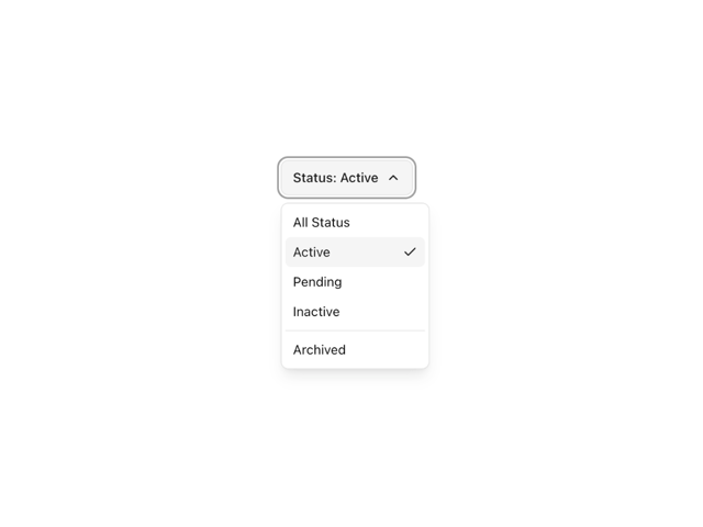
Simple Dropdown
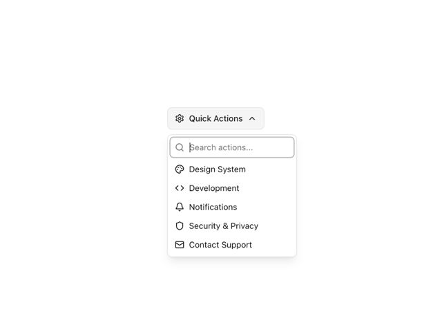
Searchable Dropdown