
About
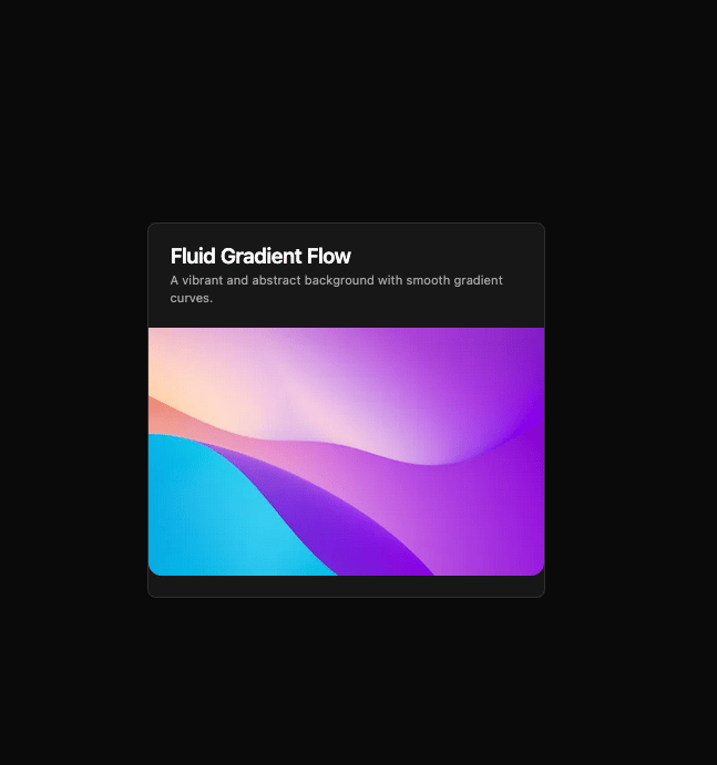
Here is Card component
Built with React and Tailwind. Copy the prompt and paste it into Claude Code, Cursor or Lovable: your agent adds Card Studio to your project and fits it to your theme.
Code
How Card Studio is used: the demo's code. The component's own source comes with a free account.
Usage.tsx
import { Card, CardContent, CardHeader, CardDescription, CardTitle } from '@/components/ui/card'

const CardBottomImageDemo = () => {
  return (
    <Card className='max-w-md pb-0'>
      <CardHeader>
        <CardTitle>Fluid Gradient Flow</CardTitle>
        <CardDescription>A vibrant and abstract background with smooth gradient curves.</CardDescription>
      </CardHeader>
      <CardContent className='px-0'>
        <img
          src='https://cdn.21st.dev/assets/mirror/c4/c42f8a5ef909381b7bdcec2504764dce0d99a75267eac2225ecf84879e39eb31.png'
          alt='Banner'
          className='aspect-video h-70 rounded-b-xl object-cover'
        />
      </CardContent>
    </Card>
  )
}

export default CardBottomImageDemo
More by Clevision
View all

Calendar
106
Collapsible
43
Button Group
37
Buttons
33
Radio Group 1
30
Combobox
27
Basic Avatar
24
Switch
23
More in Cards
View all

Statistics Card 2
264

Course Design Cards
1.1K
Card
70
Stats cards with links
39
The Item one
3
Statistics Card 7
292

Item
10
Dashboard with Collapsible Sidebar
2.4K

