
About
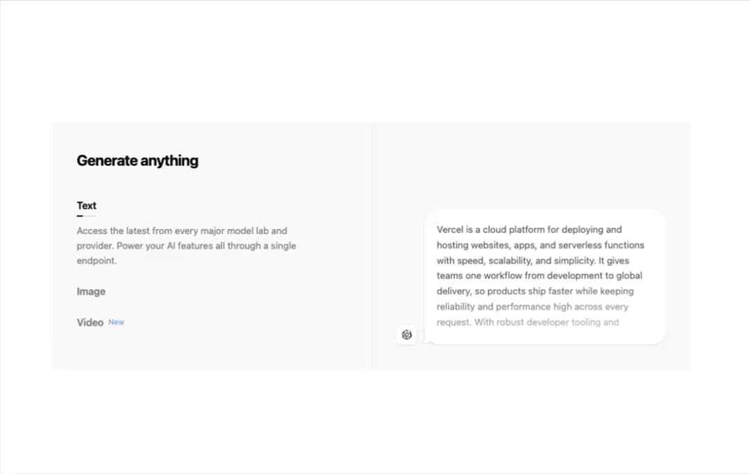
An animated feature tabs panel (text, image, video) with Vercel-style illustrations like streaming text, an animated globe wireframe, and an audio waveform visualizer, auto-cycling with a progress indicator.
Built with React and Tailwind. Copy the prompt and paste it into Claude Code, Cursor or Lovable: your agent adds Tabs Illustration Vercel to your project and fits it to your theme.
Code
How Tabs Illustration Vercel is used: the demo's code. The component's own source comes with a free account.
Usage.tsx
"use client";

import GenerateAnything from "@/components/ui/tabs-illustration-vercel";

function TabsIllustrationVercelDemo() {
  return (
    <div className="w-full max-w-5xl min-w-5xl">
      <GenerateAnything />
    </div>
  );
}

export default TabsIllustrationVercelDemo;
More by cult/ui
View all
3D Carousel
2.5K
Logo Carousel
1.1K
Feature Carousel
504
Popover Form
419
Floating Panel
245
Expandable
126
Dock
119
Hero Liquid Metal
101
More in Features
View all

Features 8
3.1K
Features 2
322

Grid Feature Cards
1.9K

Feature Sections
52
Feature with advantages
278
Feature Section with card gradient
169
Feature Modern
17
Features 4
368


