
About
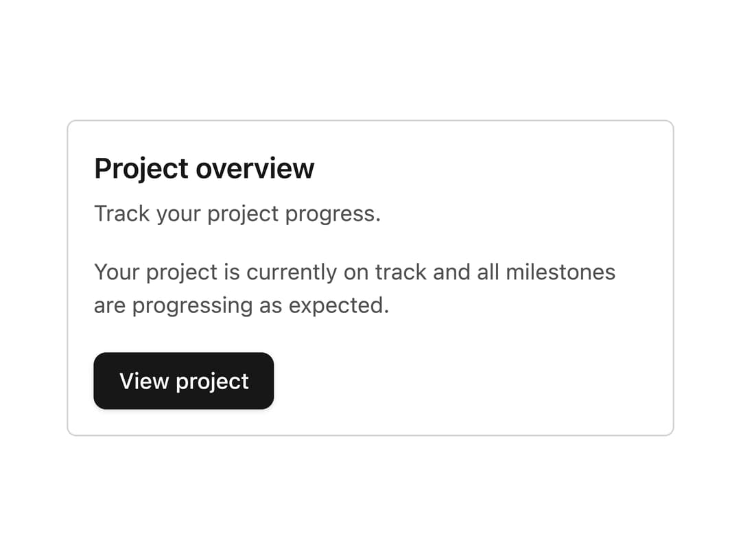
A flexible container for grouping related content and actions, with filled, elevated, outlined and ghost visual styles, plus header/title/description/content/footer sub-parts. Ported from the RockSolid (SolidJS) UI library by Darshan Rajadhyaksha.
Built with React and Tailwind. Copy the prompt and paste it into Claude Code, Cursor or Lovable: your agent adds Card to your project and fits it to your theme.
Code
How Card is used: the demo's code. The component's own source comes with a free account.
Usage.tsx
import Card, {
  CardHeader,
  CardTitle,
  CardDescription,
  CardContent,
  CardFooter,
} from "@/components/ui/card";
import { Button } from "@/components/ui/button";

export default function CardDemo() {
  return (
    <div className="flex items-center justify-center p-10">
      <Card className="max-w-sm">
        <CardHeader>
          <CardTitle>Project overview</CardTitle>
          <CardDescription>Track your project progress.</CardDescription>
        </CardHeader>
        <CardContent>
          Your project is currently on track and all milestones are progressing
          as expected.
        </CardContent>
        <CardFooter>
          <Button>View project</Button>
        </CardFooter>
      </Card>
    </div>
  );
}
Dependencies
More by darshan-rajadhyaksha
View all
Backdrop
1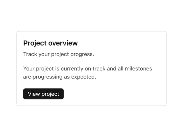
Card Content
Breadcrumbs

Checkbox
Textarea

Card Title
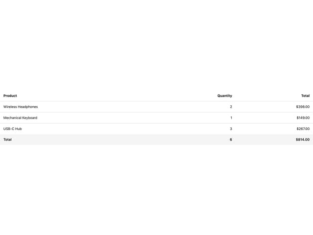
Table
Accordion
More in Cards
View all
Stats cards with links
33

Course Design Cards
1.1K

Card
70
Statistics Card 2
264
Statistics Card 10
263

Card
17

Card Studio
9
The Item one
3
