About
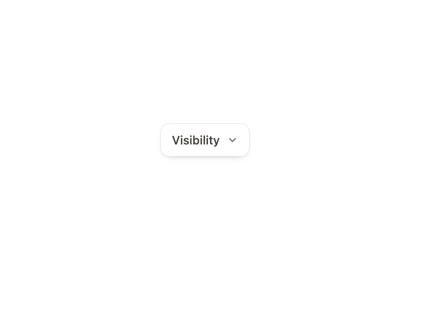
An accessible listbox dropdown with a highlight that travels between options, full keyboard navigation, and typeahead search.
Built with React and Tailwind. Copy the prompt and paste it into Claude Code, Cursor or Lovable: your agent adds Dropdown to your project and fits it to your theme.
Code
How Dropdown is used: the demo's code. The component's own source comes with a free account.
Usage.tsx
"use client";

import { Dropdown } from "@/components/ui/dropdown";
import { useState } from "react";

const VISIBILITY = [
  { value: "private", label: "Only me", hint: "default" },
  { value: "team", label: "Anyone at Acme" },
  { value: "link", label: "Anyone with the link" },
  { value: "public", label: "Public on the web" },
];

export default function DropdownDemo() {
  const [visibility, setVisibility] = useState("private");

  return (
    <div className="grid w-full place-items-center pb-[96px]">
      <Dropdown
        label="Visibility"
        items={VISIBILITY}
        value={visibility}
        onChange={setVisibility}
      />
    </div>
  );
}
Dependencies
More by Özer
View all

Password Strength
1.3K
OTP Input
802
Loading Button
601
Progress Bar
588
Reorder List
310
Task Steps
276
Hold to Confirm
250
Reading Progress
169