About
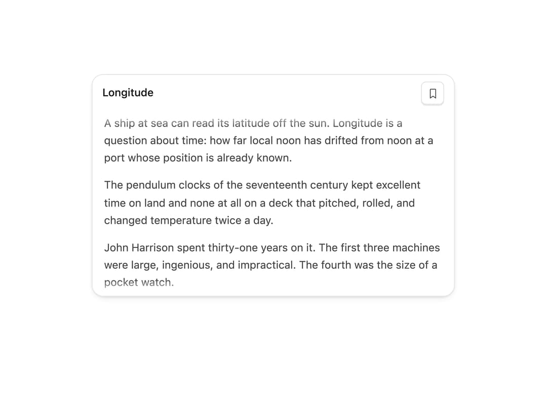
A scrollable container with a top bar that slides away as you scroll down and reveals itself when you scroll back up, with a matching useHideOnScroll hook.
Built with React and Tailwind. Copy the prompt and paste it into Claude Code, Cursor or Lovable: your agent adds Hide On Scroll to your project and fits it to your theme.
Code
How Hide On Scroll is used: the demo's code. The component's own source comes with a free account.
Usage.tsx
"use client";

import { HideOnScroll } from "@/components/ui/hide-on-scroll";
import { useState } from "react";

const article = [
  "A ship at sea can read its latitude off the sun. Longitude is a question about time: how far local noon has drifted from noon at a port whose position is already known.",
  "The pendulum clocks of the seventeenth century kept excellent time on land and none at all on a deck that pitched, rolled, and changed temperature twice a day.",
  "John Harrison spent thirty-one years on it. The first three machines were large, ingenious, and impractical. The fourth was the size of a pocket watch.",
  "H4 lost five seconds on the passage to Jamaica in 1761 — about a minute and a quarter of longitude, comfortably inside what the prize demanded.",
  "The Board of Longitude paid him in instalments, over fourteen years, and never in full.",
  "Within a generation the chronometer was ordinary. Ships carried three, because two that disagree tell you nothing at all.",
];

const BOOKMARK = "M184,224l-56-40L72,224V48a8,8,0,0,1,8-8h96a8,8,0,0,1,8,8Z";

export function HideOnScrollDemo() {
  const [saved, setSaved] = useState(false);

  return (
    <div className="mx-auto w-full max-w-[440px]">
      <HideOnScroll
        maxHeight={268}
        label="Longitude"
        bar={
          <>
            <span className="min-w-0 flex-1 truncate text-[13px] font-medium text-ink">
              Longitude
            </span>
            <button
              type="button"
              aria-pressed={saved}
              aria-label={saved ? "Remove bookmark" : "Bookmark"}
              onClick={() => setSaved((v) => !v)}
              className={`mat-cap press flex size-7 items-center justify-center rounded-[6px] transition-colors duration-150 ${
                saved ? "text-[#4568FF] dark:text-[#93B0FF]" : "text-ink-2"
              }`}
            >
              <svg width="15" height="15" viewBox="0 0 256 256" aria-hidden>
                <path
                  d={BOOKMARK}
                  fill={saved ? "currentColor" : "none"}
                  stroke="currentColor"
                  strokeWidth="16"
                  strokeLinecap="round"
                  strokeLinejoin="round"
                />
              </svg>
            </button>
          </>
        }
      >
        <div className="space-y-3 px-3.5 pb-4 pt-1">
          {article.map((line, i) => (
            <p key={i} className="text-[13px] leading-relaxed text-ink-2">
              {line}
            </p>
          ))}
        </div>
      </HideOnScroll>
    </div>
  );
}

export default HideOnScrollDemo;
Dependencies
More by Özer
View all

Password Strength
1.3K
OTP Input
802
Loading Button
601
Progress Bar
588
Reorder List
310
Task Steps
276
Hold to Confirm
250
Reading Progress
169