About
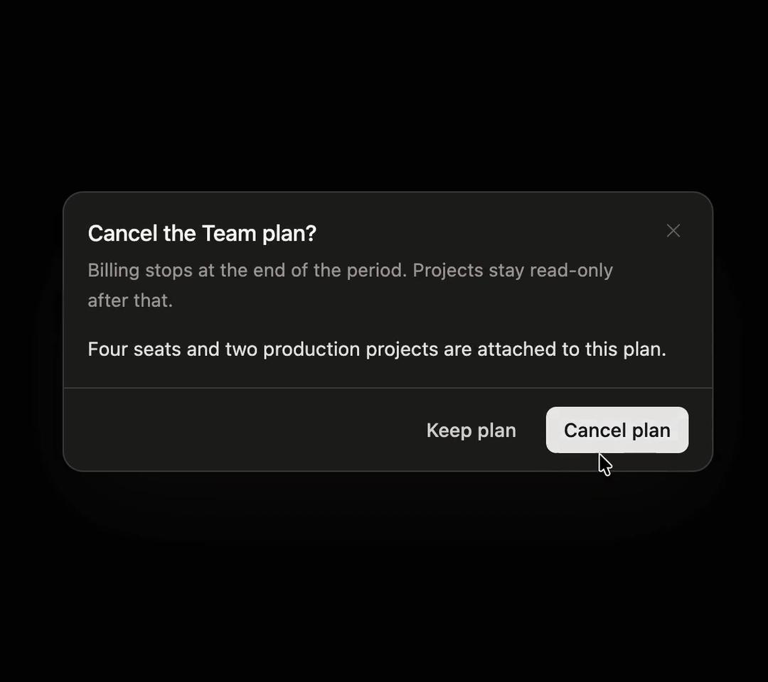
An accessible, animated modal dialog with focus trapping, scroll locking, backdrop and escape dismissal, and title/description/footer slots.
Built with React and Tailwind. Copy the prompt and paste it into Claude Code, Cursor or Lovable: your agent adds Modal to your project and fits it to your theme.
Code
How Modal is used: the demo's code. The component's own source comes with a free account.
Usage.tsx
"use client";

import { Modal } from "@/components/ui/modal";
import { useRef, useState } from "react";

export default function ModalDemo() {
  const [confirming, setConfirming] = useState(false);
  const keepRef = useRef<HTMLButtonElement>(null);

  return (
    <div className="flex min-h-[360px] items-center justify-center p-6">
      <button
        type="button"
        onClick={() => setConfirming(true)}
        className="rounded-lg border border-stone-200 bg-white px-3.5 py-2 text-[13px] font-medium text-stone-700 shadow-sm transition-colors hover:bg-stone-50 dark:border-white/[0.16] dark:bg-[#1D1D1A] dark:text-stone-200 dark:hover:bg-white/[0.06]"
      >
        Cancel subscription
      </button>

      <Modal
        open={confirming}
        onClose={() => setConfirming(false)}
        initialFocusRef={keepRef}
        title="Cancel the Team plan?"
        description="Billing stops at the end of the period. Projects stay read-only after that."
        footer={
          <>
            <button
              ref={keepRef}
              type="button"
              onClick={() => setConfirming(false)}
              className="rounded-[7px] px-3 py-1.5 text-[13px] font-medium text-stone-600 transition-colors hover:bg-stone-100 dark:text-stone-300 dark:hover:bg-white/10"
            >
              Keep plan
            </button>
            <button
              type="button"
              onClick={() => setConfirming(false)}
              className="rounded-[7px] bg-stone-900 px-3 py-1.5 text-[13px] font-medium text-white transition-colors hover:bg-stone-800 dark:bg-white dark:text-stone-900 dark:hover:bg-stone-200"
            >
              Cancel plan
            </button>
          </>
        }
      >
        <p>Four seats and two production projects are attached to this plan.</p>
      </Modal>
    </div>
  );
}
Dependencies
More by Özer
View all

Password Strength
1.3K
OTP Input
802
Loading Button
601
Progress Bar
588
Reorder List
310
Task Steps
276
Hold to Confirm
250
Reading Progress
169