About
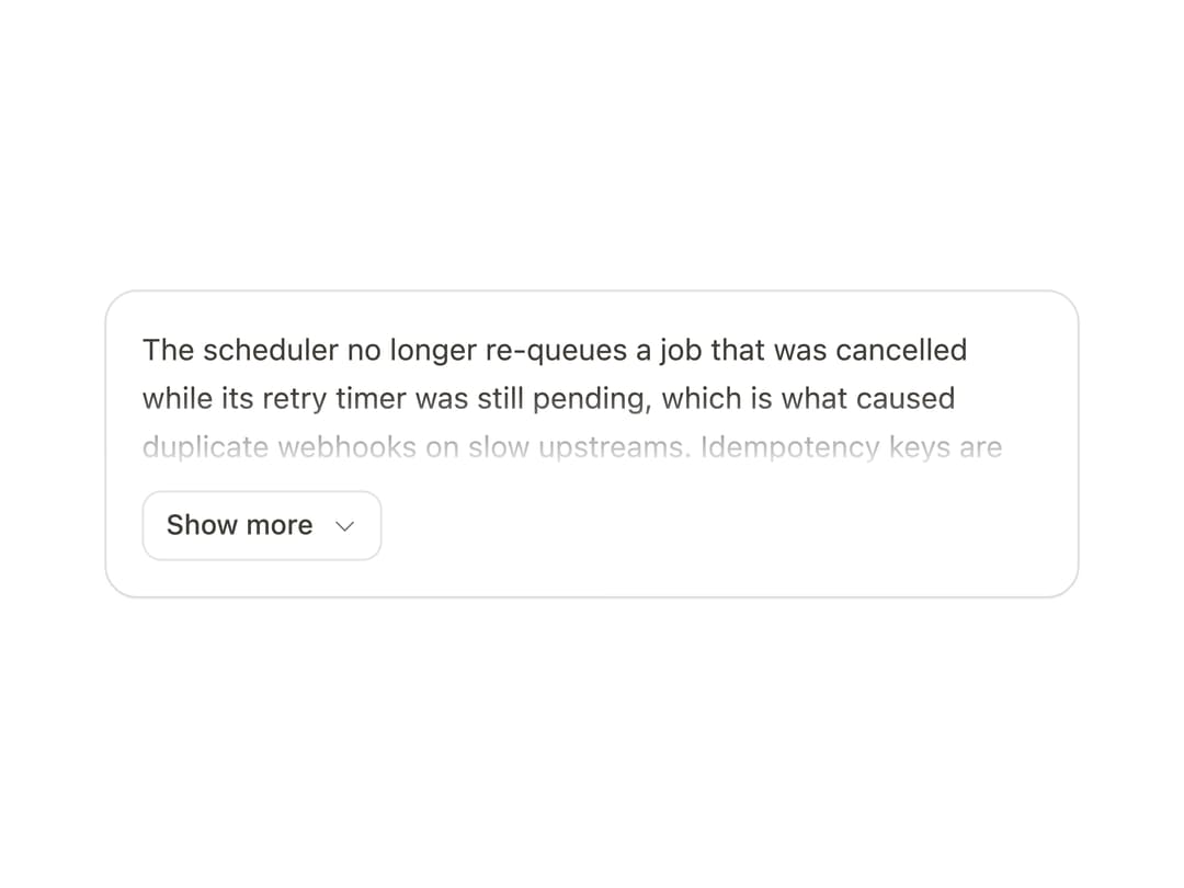
An expandable text block that clamps to a set number of lines and springs open to reveal the rest, animating height without reflowing the text.
Built with React and Tailwind. Copy the prompt and paste it into Claude Code, Cursor or Lovable: your agent adds Show More to your project and fits it to your theme.
Code
How Show More is used: the demo's code. The component's own source comes with a free account.
Usage.tsx
"use client";

import { ShowMore } from "@/components/ui/show-more";

export function ShowMoreDemo() {
  return (
    <div className="mat-panel mx-auto w-full max-w-[440px] rounded-[14px] p-4">
      <ShowMore lines={3} maxHeight={168} label="Release notes">
        <p>
          The scheduler no longer re-queues a job that was cancelled while its
          retry timer was still pending, which is what caused duplicate webhooks
          on slow upstreams. Idempotency keys are now written before the first
          attempt rather than after it, so a crash between the two no longer
          produces a second delivery. Retention for delivery logs moved from
          seven days to thirty. The dashboard reads them from a partitioned
          table, so the range picker stays fast past a million rows. Two
          deprecated fields on the event payload were removed after a full
          release of warnings.
        </p>
      </ShowMore>
    </div>
  );
}

export default ShowMoreDemo;
Dependencies
More by Özer
View all

Password Strength
1.3K
OTP Input
803
Loading Button
602
Progress Bar
588
Reorder List
310
Task Steps
276
Hold to Confirm
250
Reading Progress
169