About
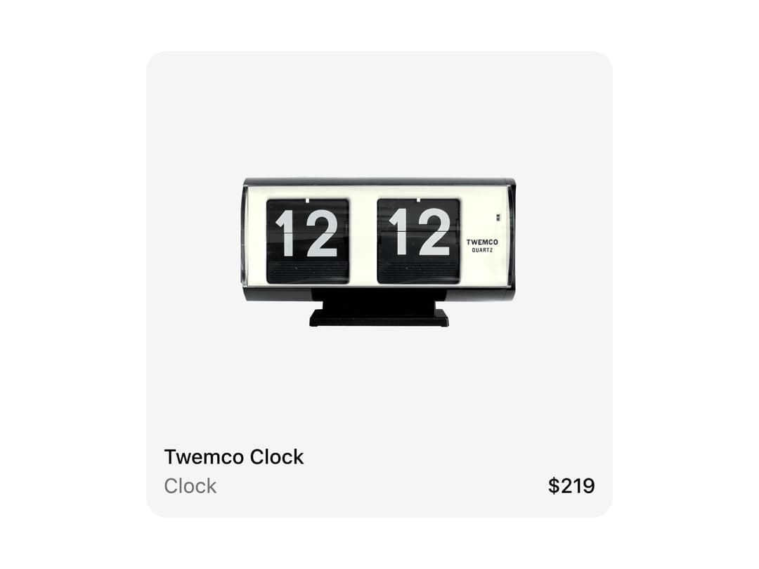
A compound card component for e-commerce product listings with an image well, an overlaid wishlist badge, and a title/subtitle/price footer.
Built with React and Tailwind. Copy the prompt and paste it into Claude Code, Cursor or Lovable: your agent adds Product Card to your project and fits it to your theme.
Code
How Product Card is used: the demo's code. The component's own source comes with a free account.
Usage.tsx
import {
  ProductCard,
  ProductCardContent,
  ProductCardHeader,
  ProductCardImage,
  ProductCardMetric,
  ProductCardSubtitle,
  ProductCardTitle,
} from "@/components/ui/product-card";

export default function ProductCardInner() {
  return (
    <ProductCard variant="inner">
      <ProductCardImage
        src="https://cdn.21st.dev/assets/localized/fb1c2b03e0bf5da10d8286d5496e559f07f5d7e011f8f4922a601974467d7986.png"
        alt="Twemco Clock"
      >
        <ProductCardContent>
          <ProductCardHeader>
            <ProductCardTitle>Twemco Clock</ProductCardTitle>
            <ProductCardSubtitle>Clock</ProductCardSubtitle>
          </ProductCardHeader>
          <ProductCardMetric>$219</ProductCardMetric>
        </ProductCardContent>
      </ProductCardImage>
    </ProductCard>
  );
}
More by deltacomponents
View all
Basic Dropdown
65
Scramble text
30
Admonition
28
Auth Form
13
MP3 Player
12
Modal Drop
9
Admin Inset Layout
More in Cards
View all

Statistics Card 2
263
Card
70
Stats cards with links
39

Course Design Cards
1.1K
The Item one
3

Card Studio
7
Statistics Card 7
290

Item
10
