
About
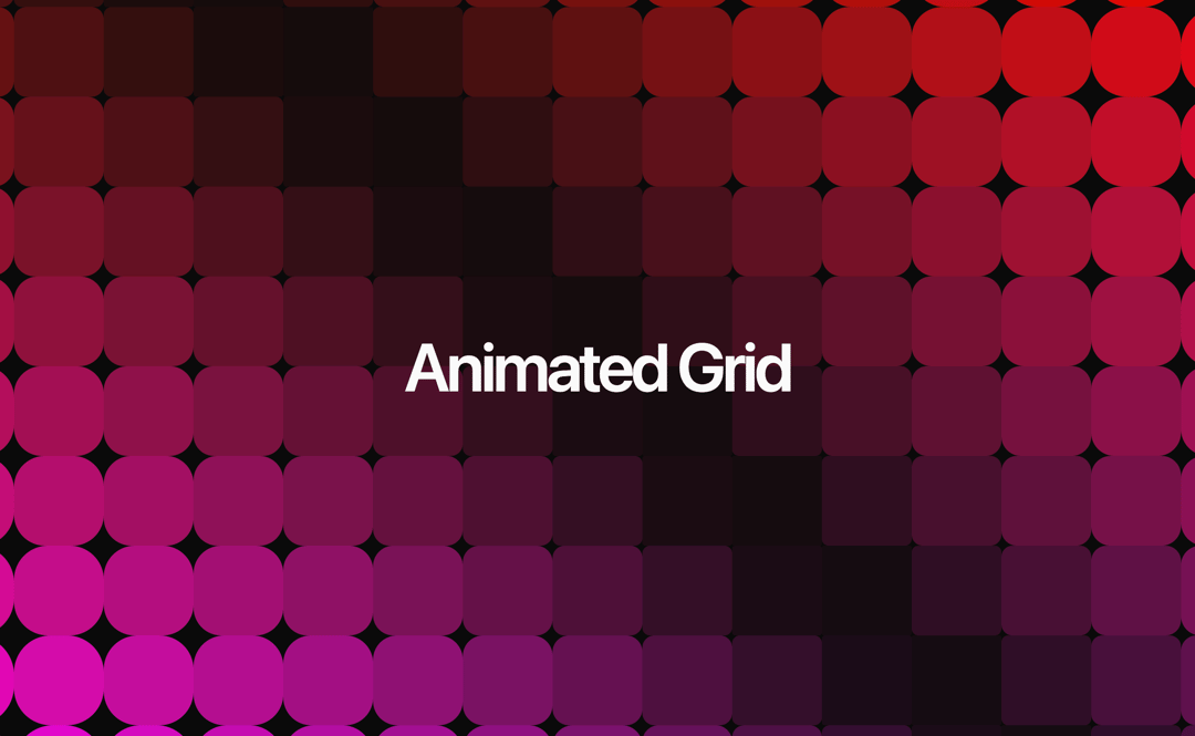
The component features a customizable grid with color interpolation and staggered border-radius animations. You can adjust the grid size, cell dimensions, and animation timing through props, making it flexible for different use cases.
Built with React and Tailwind. Copy the prompt and paste it into Claude Code, Cursor or Lovable: your agent adds Animated Grid to your project and fits it to your theme.
Code
How Animated Grid is used: the demo's code. The component's own source comes with a free account.
Usage.tsx
import { AnimatedGrid } from "@/components/ui/animated-grid";

export default function DemoOne() {
  return (
    <div className= "relative flex h-screen w-full flex-col items-center justify-center overflow-hidden rounded-xl" >

<AnimatedGrid
  startColor={[255, 0, 0]}
  endColor={[255, 0, 255]}
  animationStartColor={[255, 0, 0]}
  animationEndColor={[255, 0, 255]}
  rows={10}
  cols={15}
  cellSize="6rem"
  animationDuration="2s"
/>


      <span className="pointer-events-none absolute z-10 text-center text-7xl leading-none font-semibold tracking-tighter whitespace-pre-wrap" >
        Animated Grid
          < /span>
          < /div>
  )
}More by Ali Imam
View all

Liquid Glass Button
6.6K
Shader Animation
3.7K
WebGL Shader
2.6K
Shader Lines
2.3K
Shiny Button
2.2K
GLSL Hills
2.1K
Canvas
1.8K
Glowing Shadow
1.5K
More in Heroes
View all

SaaS Template
2.4K
Centered Hero with Image Fan
924

Hero
1.2K

Responsive Hero Banner
2K

Hero Section 6
881
Hero Golden Spiral
101

Home Section
65

Minimalist Hero Fashion
284
