
About
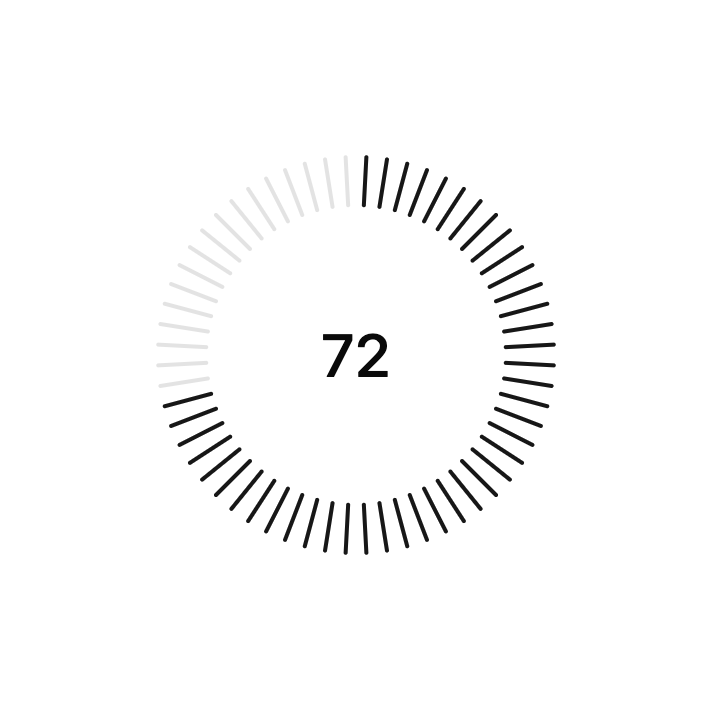
A flexible visual indicator for displaying values, progress, and ranges.
Built with React and Tailwind. Copy the prompt and paste it into Claude Code, Cursor or Lovable: your agent adds Gauge Line to your project and fits it to your theme.
Code
How Gauge Line is used: the demo's code. The component's own source comes with a free account.
Usage.tsx
"use client"

import * as React from "react"

"use client"

import {
  Gauge,
  GaugeIndicator,
  GaugeRange,
  GaugeTrack,
  GaugeValueText,
} from "@/components/ui/gauge-line"

export default function DemoOne() {
  return (
    <Gauge value={72}>
      <GaugeIndicator>
        <GaugeTrack />
        <GaugeRange />
      </GaugeIndicator>
      <GaugeValueText />
    </Gauge>
  )
}More by Ali Imam
View all

Liquid Glass Button
6.7K
Shader Animation
3.7K
WebGL Shader
2.6K
Shader Lines
2.3K
Shiny Button
2.2K
GLSL Hills
2.1K
Canvas
1.8K
Glowing Shadow
1.5K