
About
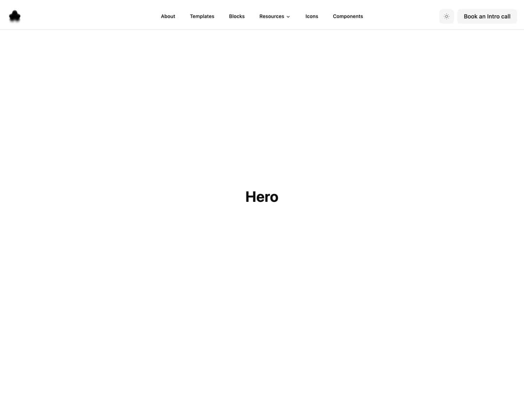
header navigation bar menu
Built with React and Tailwind. Copy the prompt and paste it into Claude Code, Cursor or Lovable: your agent adds Header-01 to your project and fits it to your theme.
Code
How Header-01 is used: the demo's code. The component's own source comes with a free account.
Usage.tsx
import { Header } from "@/components/ui/header-01";

export default function DemoOne() {
  return (
    <div className="flex flex-col min-h-screen w-full overflow-hidden">
      <Header />
      <main className="flex-1">
        <section className="h-screen flex items-center justify-center">
          <h1 className="text-4xl font-bold">Hero</h1>
        </section>
        <section className="h-screen flex items-center justify-center">
          <h1 className="text-4xl font-bold">Section</h1>
        </section>
      </main>
    </div>
  );
}
Dependencies
More by Ali Imam
View all

Liquid Glass Button
6.7K
Shader Animation
3.7K
WebGL Shader
2.6K
Shader Lines
2.3K
Shiny Button
2.2K
GLSL Hills
2.1K
Canvas
1.8K
Glowing Shadow
1.5K