
About
Scroll Progress
Built with React and Tailwind. Copy the prompt and paste it into Claude Code, Cursor or Lovable: your agent adds Scroll Progress to your project and fits it to your theme.
Code
How Scroll Progress is used: the demo's code. The component's own source comes with a free account.
Usage.tsx
import { ScrollProgress } from "@/components/ui/scroll-progress"

const Demo = () => {
  return (
    <div className="z-10 rounded-lg border border-secondary p-4">
      <ScrollProgress className="top-[65px]" />
      <h2 className="pb-4 font-bold">
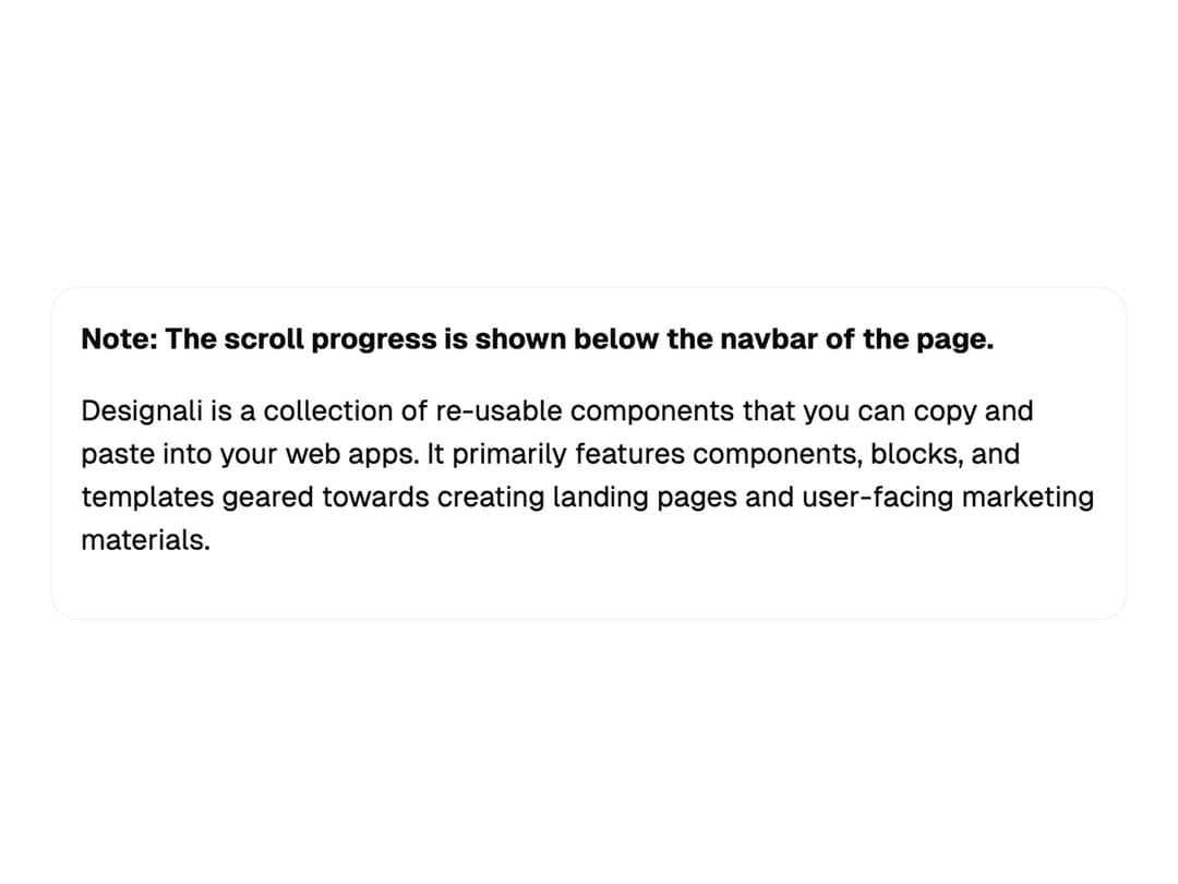
        Note: The scroll progress is shown below the navbar of the page.
      </h2>
      <p className="pb-4">
        Designali is a collection of re-usable components that you can copy and
        paste into your web apps. It primarily features components, blocks, and
        templates geared towards creating landing pages and user-facing
        marketing materials.
      </p>
    </div>
  )
}

export default { Demo }More by Ali Imam
View all

Liquid Glass Button
6.7K
Shader Animation
3.7K
WebGL Shader
2.6K
Shader Lines
2.3K
Shiny Button
2.2K
GLSL Hills
2.1K
Canvas
1.8K
Glowing Shadow
1.5K