
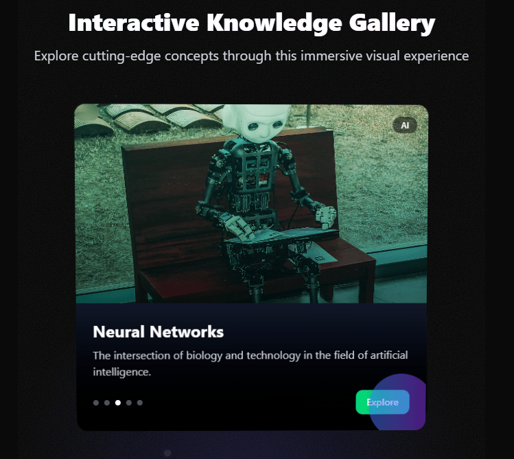
Features This advanced 3D interactive card gallery includes: 3D Perspective Effects: Dynamic rotation based on mouse position Perspective transformations that respond to user interaction Parallax depth effects between card elements Advanced Animations: Smooth transitions between cards with cubic-bezier easing Card scaling and position animations Floating particles in the background Pulse animations on interactive elements Glassmorphism & Modern UI: Backdrop blur effects Semi-transparent overlays Dynamic gradient backgrounds that follow mouse movement Noise texture overlay for added depth Responsive Design: Adapts between horizontal carousel on desktop Vertical stacking on mobile devices Fluid typography and spacing Interactive Elements: Navigation controls with visual feedback Progress indicators Hover state animations Click interactions to change the active card Visual Polish: Custom gradient overlays unique to each card Dynamic depth-of-field effect (blur on inactive cards) Atmospheric lighting that responds to mouse position Category badges with glassmorphism effect To use this component, make sure to install Framer Motion: bash npm install framer-motion This component represents a highly polished, production-ready UI element that combines advanced CSS techniques with modern React patterns to create an immersive, interactive experience.
Built with React and Tailwind. Copy the prompt and paste it into Claude Code, Cursor or Lovable: your agent adds 3D Interactive Card Gallery to your project and fits it to your theme.
Code
How 3D Interactive Card Gallery is used: the demo's code. The component's own source comes with a free account.
Usage.tsx
import React from 'react';
import InteractiveCardGallery from '@/components/ui/3d-interactive-card-gallery';

function DemoOne() {
  return (
    <div className="App">
      <InteractiveCardGallery />
    </div>
  );
}

export default DemoOne;
Dependencies
More by Dhileep Kumar GM
View all

Aether Flow Hero
1.9K
Woven Light Hero
1.5K
AnomalousMatterHero
1.5K
PulseFit hero
922
Mountain Scene
859
HolographicCard
820
3D Animation
765
Cybernetic Bento Grid
556
More in Cards
View all

Statistics Card 2
264

Course Design Cards
1.1K
Card
70
Stats cards with links
39
The Item one
3

Card Studio
7
Statistics Card 7
292

Item
10
