About
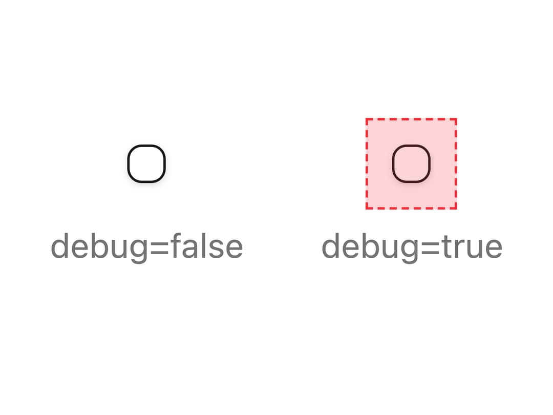
A wrapper that extends the clickable/tappable area around a small interactive element like a checkbox or icon button, improving accessibility and touch targets without changing its visual size.
Built with React and Tailwind. Copy the prompt and paste it into Claude Code, Cursor or Lovable: your agent adds Hitbox to your project and fits it to your theme.
Code
How Hitbox is used: the demo's code. The component's own source comes with a free account.
Usage.tsx
import { Hitbox } from "@/components/ui/hitbox";
import { Checkbox } from "@/components/ui/checkbox";

export default function HitboxDebugDemo() {
  return (
    <div className="flex items-center gap-8">
      <div className="flex flex-col items-center gap-4">
        <Hitbox debug={false}>
          <Checkbox />
        </Hitbox>
        <p className="text-sm text-muted-foreground">debug=false</p>
      </div>
      <div className="flex flex-col items-center gap-4">
        <Hitbox debug>
          <Checkbox />
        </Hitbox>
        <p className="text-sm text-muted-foreground">debug=true</p>
      </div>
    </div>
  );
}
Dependencies
More by Dice UI
View all

Compare Slider
75
Sortable
49
Circular Progress
41
Status
29
Pending
27
Banner
19
Stack
8
Scroller
5