
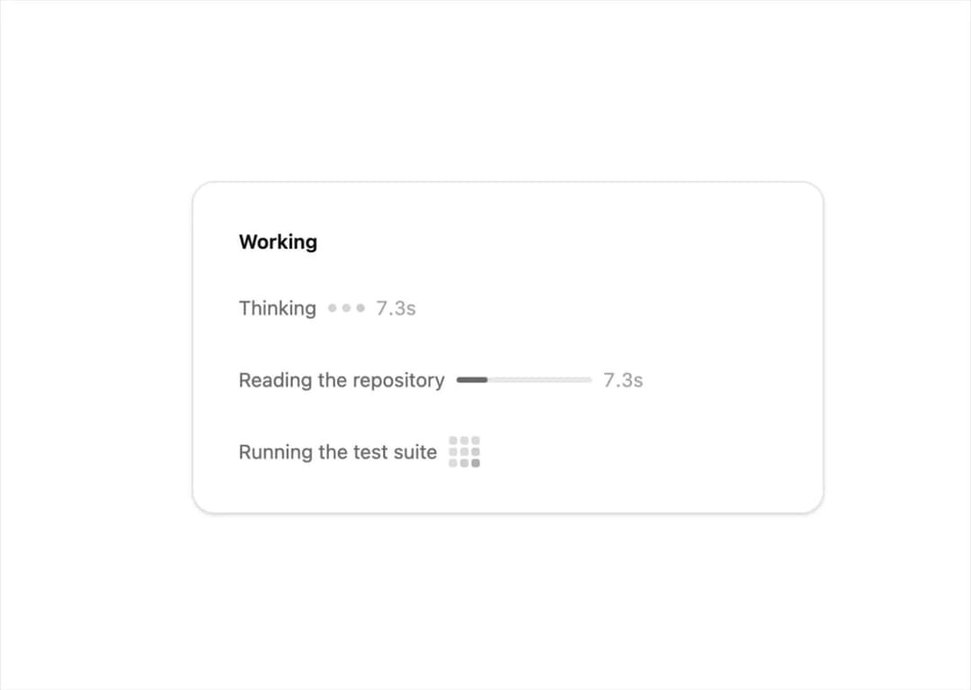
About
Working indicator in dots, bar and grid variants with an optional elapsed timer, tuned so it reads as progress rather than noise. Respects prefers-reduced-motion.
Built with React and Tailwind. Copy the prompt and paste it into Claude Code, Cursor or Lovable: your agent adds AI Loader to your project and fits it to your theme.
Code
How AI Loader is used: the demo's code. The component's own source comes with a free account.
Usage.tsx
"use client";

import Component from "@/components/ui/ai-loader";

export default function DemoOne() {
  return (
    <div className="flex min-h-[440px] w-full items-center justify-center bg-background p-10">
      <div className="w-full max-w-md rounded-2xl border bg-card p-8 shadow-sm">
        <p className="font-semibold text-foreground text-sm">Working</p>
        <div className="mt-6 space-y-7">
          <Component label="Thinking" showElapsed variant="dots" />
          <Component label="Reading the repository" showElapsed variant="bar" />
          <Component label="Running the test suite" variant="grid" />
        </div>
      </div>
    </div>
  );
}
Dependencies
More by Edu Calvo
View all

Scrollable Card Stack
235
AI Task List
160
Siri Orb
160
Cursor Follow
154
Pixel Flow Field
142
Agent Avatar
130
Gravity Stars
112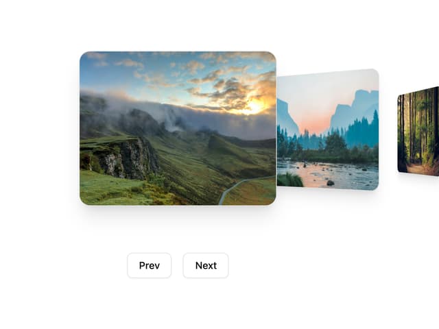
Coverflow Carousel
95
More in AI chats
View all

AI Actions
319
Agent Chat
17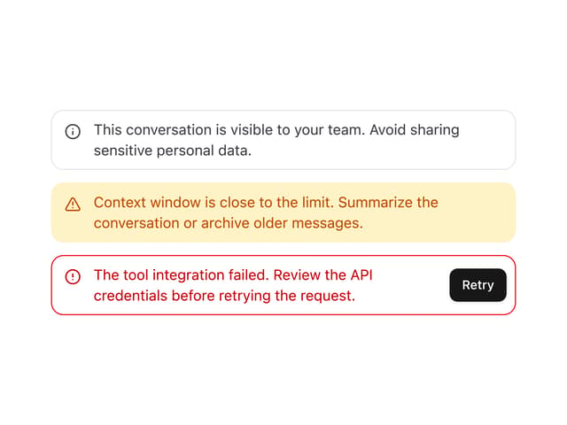

System Message
54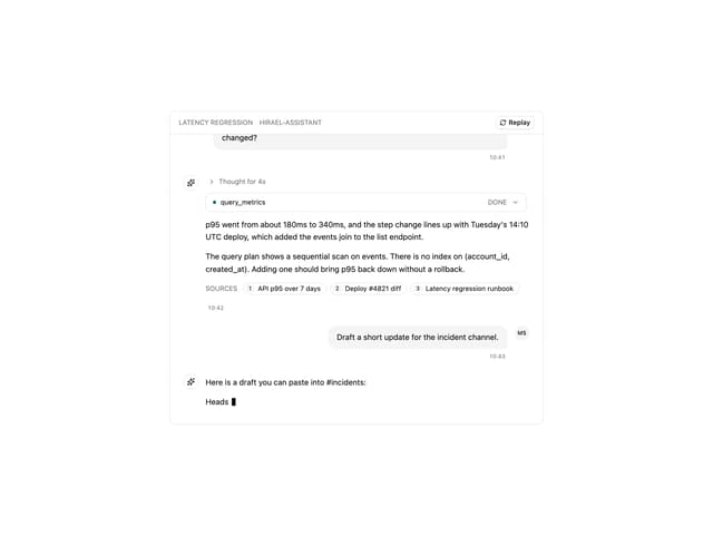
Message Thread
35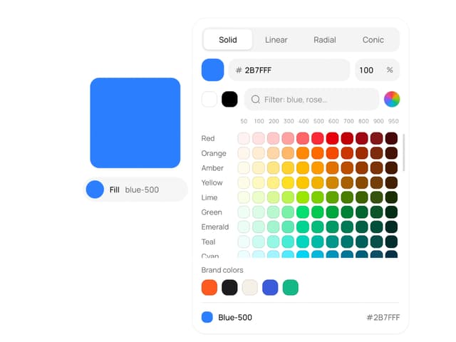
Color Picker
81

Modal Card
101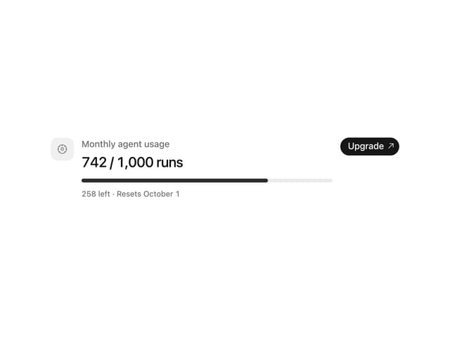
Quota Banner
21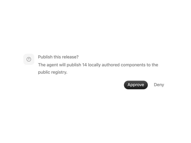
Approval Card
14


