
About
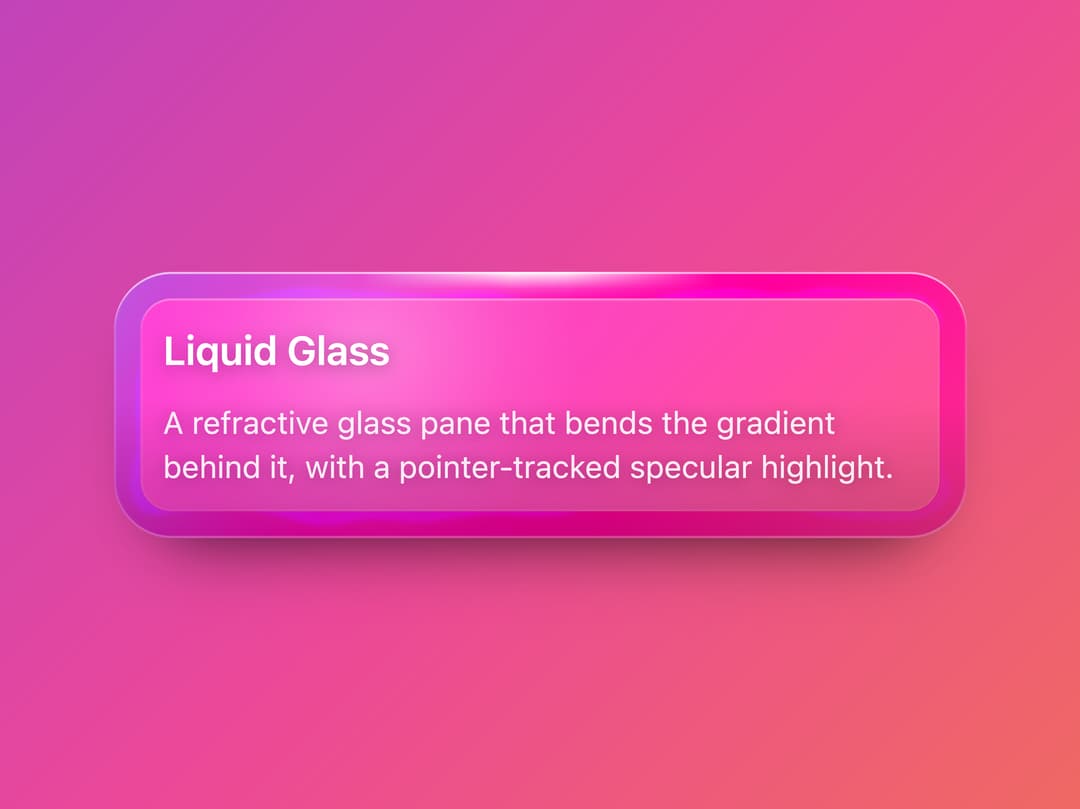
A frosted glass panel with a refractive rim that visibly bends its backdrop, a pointer-tracked specular highlight, and a real drop shadow, for wrapping content over photos or gradients.
Built with React and Tailwind. Copy the prompt and paste it into Claude Code, Cursor or Lovable: your agent adds Glass Card to your project and fits it to your theme.
Code
How Glass Card is used: the demo's code. The component's own source comes with a free account.
Usage.tsx
import GlassCard from "@/components/ui/glass-card";

export default function GlassCardDemo() {
  return (
    <div className="flex h-screen w-full items-center justify-center bg-[linear-gradient(135deg,#7c3aed,#ec4899,#f59e0b)] p-8">
      <GlassCard className="max-w-sm">
        <h3
          className="text-lg font-semibold text-white"
          style={{ textShadow: "0 1px 8px rgba(0,0,0,0.35)" }}
        >
          Liquid Glass
        </h3>
        <p
          className="mt-2 text-sm text-white/90"
          style={{ textShadow: "0 1px 8px rgba(0,0,0,0.35)" }}
        >
          A refractive glass pane that bends the gradient behind it, with a
          pointer-tracked specular highlight.
        </p>
      </GlassCard>
    </div>
  );
}
Dependencies
More by Edu Calvo
View all

Scrollable Card Stack
235
AI Task List
160
Siri Orb
160
Cursor Follow
154
Pixel Flow Field
142
Agent Avatar
130
Gravity Stars
112
Coverflow Carousel
95
More in Cards
View all
Stats cards with links
33

Course Design Cards
1.1K

Card
70
Statistics Card 2
264
Statistics Card 10
263

Card
17

Card Studio
9
The Item one
3
