
About
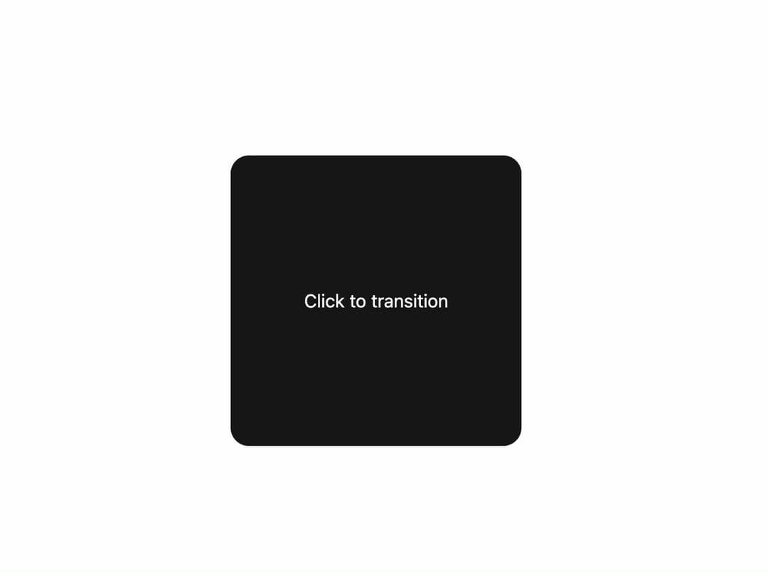
A wavy, hand-warped circle reveal transition that wipes between two pieces of UI content, keyed by a transitionKey prop.
Built with React and Tailwind. Copy the prompt and paste it into Claude Code, Cursor or Lovable: your agent adds Warped Circle Transition to your project and fits it to your theme.
Code
How Warped Circle Transition is used: the demo's code. The component's own source comes with a free account.
Usage.tsx
"use client";

import { useState } from "react";
import WarpedCircleTransition from "@/components/ui/warped-circle-transition";

const settings = { duration: 1120 };

export default function Demo(props: Partial<typeof settings>) {
  const s = { ...settings, ...props };
  const [key, setKey] = useState(0);

  return (
    <div
      className="flex h-screen w-full items-center justify-center bg-background"
      onClick={() => setKey((k) => k + 1)}
    >
      <WarpedCircleTransition transitionKey={key} duration={s.duration}>
        <div className="flex h-64 w-64 items-center justify-center rounded-2xl bg-primary text-primary-foreground">
          Click to transition
        </div>
      </WarpedCircleTransition>
    </div>
  );
}
More by Edu Calvo
View all

Scrollable Card Stack
234
Siri Orb
160
AI Task List
159
Cursor Follow
153
Pixel Flow Field
141
Agent Avatar
128
Gravity Stars
111
Coverflow Carousel
94
More in Dashboards
View all
Dashboard with Collapsible Sidebar
2.4K

Sidebar
231

SaaS Template
2.4K

Chat template
597

Financial Bento Grid
71
Stats Bento
1.1K

Statistics Card 2
263
Stats cards with links
39


